Short Premium Research Dissection (Part 13)
Posted by Mark on April 4, 2019 at 06:56 | Last modified: December 11, 2018 11:00Following up to the last paragraph of Part 12, my characterization of the long call (LC) seems to understate. The author emphasizes an increased win rate (from 62% to 82%) with the 25-delta LC. This is much more than my “once every 10 years” but only noticeable on the chart’s right edge. She explains this by saying the combined positions have no upside loss potential. I would like to see a matched PnL comparison (with vs. without the LC) for trades where the underlying increased in price to better understand this. A PnL histogram might also work.
Let’s do a parameter check. Building on the second paragraph of Part 11, we now have four different values each for the DTE and entry IV, four values for profit target, three values for allocation (unless allocation affects everything proportionally?), four values for stop-loss, and three values for LC delta. This is a total of 2,304 different strategy permutations. The Part 12 graph includes only [closest to] 60 DTE trades under all VIX conditions, -100% stop-loss, but no profit target (stay tuned).
The call vertical, created by adding the LC, will decay slower than the naked. The author doesn’t seem to care much about getting out of trades sooner to maximize PnL per day (and % winners). The latter is a Tasty Trade mantra, which I mentioned just above the table shown in Part 10. Maybe this is why PnL per day is not a statistic she presents. I just wonder whether omitting it leaves out a big part of the story.
In the next sub-section we get the sixth “hypothetical portfolio growth” graph:
I’ve stopped griping about the lack of detailed methodology (last mentioned below the table shown here), but in broad terms this is 5% allocation, -100% SL, and [closest to] 60 DTE. The fifth graph was identical minus the VIX < 30 curve. After seeing the VIX filters dramatically underperform, she added the red curve.
This seems like curve-fitting. She writes:
> The VIX below 30 filter outperformed everything we’ve tested thus far
> because multiple losing trades were avoided by not re-entering short
> straddles after being stopped out of previous trades when the market
> started to plummet in 2008.
I get the impression she realized when the biggest losses occurred and selected a filter value to avoid those losses. In fact, it doesn’t take a 30 VIX to cause huge losses. If VIX doubles from the lower teens, then huge losses may be incurred. This happened in February 2018. I would prefer to see a filter that exits trades (or prevents entry of new trades) when VIX spikes above resistance or hits an x-day high that only happens 5-10% of the time.* I’d still like to leave a sufficiently large sample size (e.g. at least 30-50 out of 4000 trading days since 2001 although we should be mindful of data clumping).
She provides no statistics in this sub-section. As always, I’d like to see the standard battery. I’d also like to see a comparison of these statistics between the VIX < 30 filter and no VIX filter.
I will continue next time.
* Looking back throughout the entire data set and selecting a VIX level that only occurs x%
of the time as a filter creates a future leak because it applies future information to trades
made earlier in the backtest. Selecting an x-day high that only occurs y% of the time
throughout the entire data set is similarly flawed.
Short Premium Research Dissection (Part 12)
Posted by Mark on April 1, 2019 at 05:52 | Last modified: December 7, 2018 11:10As it turns out, the table presented last time is prelude to a discussion of buying cheap OTM calls to cut upside risk.
She begins with this:
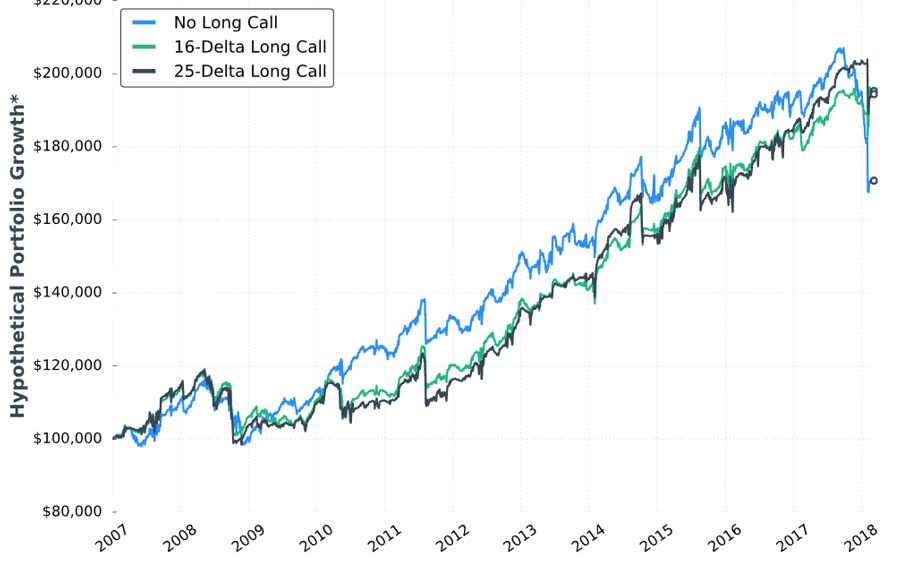
This is the fourth “hypothetical portfolio growth” graph presented thus far. I discussed my confusion over these in the second-to-last paragraph of Part 7. I continued by addressing the asterisk in the second paragraph of Part 8. Here we see that same asterisk but no corresponding footnote! I’m still hoping to get some context around “hypothetical portfolio growth.”
Looking at the graph, I question whether the long call is worth the cost. Although the long call lowers profit potential, the author writes it “eliminates the possibility of large losses if the market increases substantially.” Despite being in a bull market since 2009, the graph suggests the long call did not outperform until 2018 (right edge of the graph corresponds to February). Do we really want to pay all that money for insurance against a once-in-a-lifetime event? I would probably answer yes if I saw statistically significant differences in metrics I really want to know (see below).
Stepping back for a broader perspective, if we’re going to try and protect against an acute rally then surely there are once-in-a-lifetime downside events we should also try to protect against. I’m reminded of this third paragraph. The goal is never to find a separate Band Aid to cover everything: a sure indication of curve-fitting.
On a related note, as our author throws different conditions into the mix in an effort to improve the strategy, she gives us little perspective on how they compare with each other. I’ve made repeated mention of the fact that she does not include a thorough battery of trade statistics. Different people favor different metrics, but choosing a few common ones to include consistently with every backtest should satisfy most.
Here are the statistics presented in this sub-section:
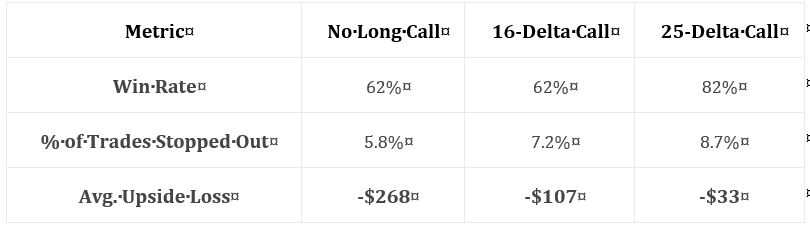
While these numbers are impressive, they leave too much to the imagination. In particular, I want to know how overall profitability is affected (e.g. average trade, profit factor). I want to know how standard deviation (SD) of returns is affected. I want to know how PnL per day is affected (DIT should be proportional). I want to see CAGR and CAGR / max DD %.*
The author emphasizes the markedly reduced drawdowns with long calls added. I wonder whether an indicator may be used as a trigger to buy the long call. I’d rather buy the long call 10% of the time, for example, rather than 100% of the time—especially when it’s only going to help me once every 10 years. Some ideas to be tested include a minimum momentum value, x-day high on the underlying, or others mentioned in the third-to-final paragraph here.
* The statistics I have listed multiple times include things like: distribution of DIT and losses including max/min/average
[percentiles], average trade [ROI percentiles], average win, PF, max DD %, CAGR, CAGR/max DD %, SD winners,
SD losers, SD returns, total return, PnL per day, etc.
Short Premium Research Dissection (Part 11)
Posted by Mark on March 29, 2019 at 04:22 | Last modified: December 6, 2018 07:04Because of the peculiar way our author settled on the -100% stop-loss (SL) level, I would like to see this graph and table redone for other values as a consistency check. I can’t trust her conclusions based on one set of parameters.
I am surprised to find myself wanting additional graphs and tables, though. Reviewing the first paragraph of Part 9, we now have four different values each for the first two variables, four values for profit target, three values for allocation (unless allocation affects everything proportionally?), and four values for SL. This is a total of 768 different strategy permutations.
It is not like me to want hundreds of different graphs because I’m not sure I would know how to make sense of them. This reminds me of the last sentence of the second-to-last paragraph here. If we approach this by holding three parameters constant while varying the fourth over a range and then taking the reasonable values for the fourth and using those to test varying the other three to optimize all four, then do we have to repeat the process by starting out in succession with each of the other three parameters to vary first?
This gets very complicated. I feel the need to review Tomasini and Jaekle:* now!
Let’s press on with her next data table (PT is profit target):
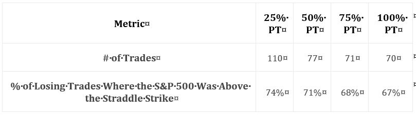
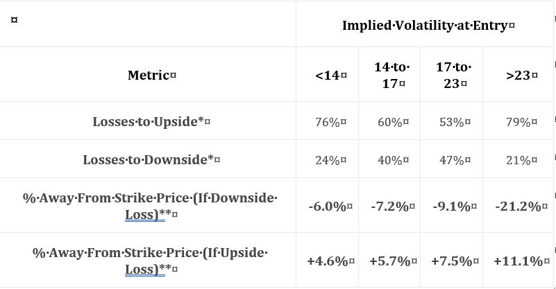
This suggests the majority of losses is coincident with market appreciation. She goes on to claim most trades hitting the -100% SL are caused by sharp market declines. I’d like to see these numbers and percentages included in the table.
Another thought I have regards her nebulous methodology. These are small sample sizes. Why not backtest daily trades (as explained in the second paragraph here)? If not daily, then trades could at least be run starting every x days or every week. The groups might have to be redefined, but I certainly don’t think it’s asking too much to see at least 24 – 48 trades per year.
She claims 81% of losing trades (in a 100% PT / -100% SL portfolio) that do not get stopped out are victims of market appreciation. 81% does not appear in the table. Including some data in the table and leaving other data out is sloppy.
As I mentioned in the second paragraph here, all this suggests initiating trades OTM to the upside.
Our author does not tackle this, however. I will discuss her alternative next time.
* Jaekle, U, & Tomasini, E (2009). Trading Systems: A New Approach to System Development and Portfolio Optimisation.
Hampshire, Great Britain: Harriman House.
Short Premium Research Dissection (Part 10)
Posted by Mark on March 26, 2019 at 07:06 | Last modified: December 6, 2018 06:26This blog mini-series is a critique of a premium selling research report that I purchased.
In the next sub-section, the author makes a command decision to stick with the -100% SL level. Her reasoning goes back to the first table here showing the 10th %’ile P/L to be -83% (60 DTE). Since only 10% of trades will even reach 83% loss, she eliminates -150% and -200%.
I like the reasoning, but this is not how I would expect parameters to be optimized. This seems to come out of nowhere and has nothing to do with PnL. I think useful statistics could result in a meaningful evidence-based conclusion. By not using her own statistics, she implies they don’t help. If that is true, then she needs to present different ones.
On a related note, she continues:
> Based on this logic and the results found above, I believe
> the -100% stop-loss level is a great starting point for…
> [a systematic trading approach].
Again, I like the logic, but it’s not based on “results.” That is the evidence-based aspect I really want to see. As a “great starting point,” she could now go on to use statistics to choose between 50% and 100%, but she doesn’t.
Instead, she moves on to study profit target. Keeping DTE fixed at [monthly expiration closest to?] 60, allocation fixed at 5%, and stop-loss at -100%, she gives us the third “hypothetical portfolio graph” seen in the report thus far (confusing, as discussed in the last paragraph here) for 25%, 50%, 75%, and 100% profit targets:
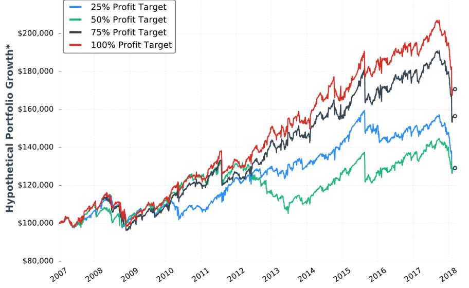
A control group should be included anytime a new condition is introduced. I would like to see data for “no profit target.”
She writes:
> To me, this makes complete sense because most short
> premium options trades will be winners. By cutting those winners
> short and booking smaller profits, there’s less profit
> accumulation to absorb the inevitable losses. When booking
> smaller profits, the overall probability of success
> needs to be incredibly high to remain profitable over time.
This makes sense, but it directly contradicts Tasty Trade studies. The latter have always shown better performance with winners managed sooner. Could it be a matter of days in trade and P/L per day? She offers a few statistics:
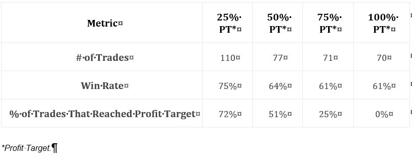
Along with the graph, this table suggests the 25% profit target group to be less profitable despite having significantly more trades. It’s therefore not about P/L per day because we are seeing a lower DIT and therefore more overall trades.
I’d still like to see more statistics, and this amounts to the same list I’ve been including over and over throughout the mini-series: distribution of DIT and losses including max/min/average [percentiles], average trade [percentiles], average win, PF, max DD %, CAGR, CAGR/max DD %, standard deviation (SD) of winners, SD losers, SD returns, total return, PnL per day, etc. The table alone does not indicate what PT level is most profitable: it should.
Categories: System Development | Comments (0) | PermalinkShort Premium Research Dissection (Part 9)
Posted by Mark on March 21, 2019 at 07:08 | Last modified: January 9, 2019 07:44As stated in the last paragraph of my previous post, I want to track the author’s order of optimization. First, she looks at DTE (30, 45, 60, and 75 DTE). Next, she looks at entry IV (VIX < 14, 14-17, 17-23, and > 23). Third, she looks at % of trades to hit 25% and 50% profit targets stratified by same IV (just mentioned). Fourth, she varies allocation (2.5%, 5%, and 10% of the portfolio with each trade) based on -100% loss limit and 60 DTE. Technically, she isn’t optimizing yet since she has yet to choose particular values for these four independent variables.
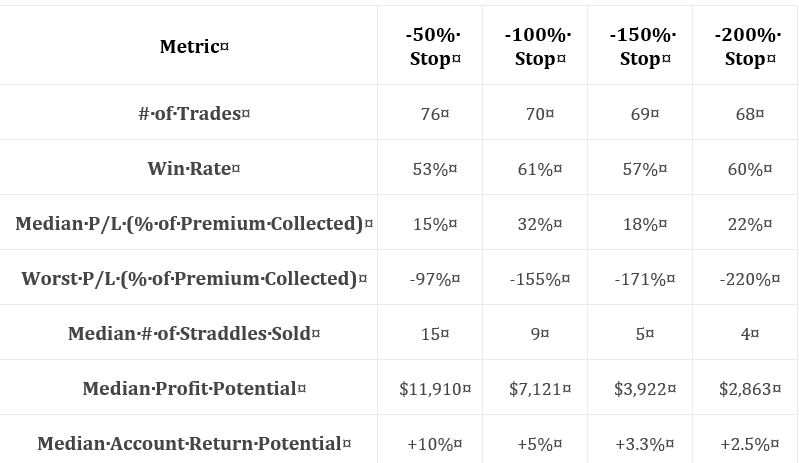
The next sub-section discusses the impact of changing the stop-loss (SL) level. She includes a graph and the following table, which I began discussing in Part 7:

My standard critique applies. I don’t know the exact methodology behind these numbers. I don’t know the exact date range (somewhere around 2007-2018 may be estimated from graph), but I do know sample size this time (second row). I don’t have enough statistics. I’d like to see things like distribution of DIT and/or losses including max/min/average [percentiles], average trade [percentiles], average win, PF (see below), max DD %, CAGR, CAGR/max DD %, standard deviation (SD) of winners, SD losers, SD returns, total return (which can only be estimated from the graph), PnL per day, etc.
I still don’t know what to do with median P/L as a percentage of premium collected (see Part 8, paragraphs 4-5).
I also don’t know what “median account return potential” is and she never mentions it in the text. Return on what? Buying power reduction (BPR) would make sense but she hasn’t mentioned or defined that (see final paragraph), either.
She says more contracts is more leverage, which can become more dangerous (“particularly overnight”). I’d like to see average BPR to better understand leverage. She says SL level is inversely proportional to number of contracts. She also claims number of contracts to be directly proportional to the frequency of SL being hit, but I don’t see win rate increasing from left to right along row #3. Hmm…
My eyes agree that the -50% SL equity curve (not shown here) is most volatile, but I’d like to see a supporting metric.
Finally, she claims larger SL levels allow for a better chance to exit trades closer to the SL—presumably cutting down on those excessive losses discussed in paragraphs 2-3 of Part 7 (linked above). She never quantifies the excess loss, though, which leaves its impact hard to understand. I can only shrug my shoulders at this.
I see a lot of mess and very little precision here.
Here’s another challenge to her reasoning about excess loss: who cares? Looking past the nebulous normalization details, a loss of 220% is 10 times the median P/L of 22%. Regardless of SL level, that is devastating. This suggests another metric to monitor: median PnL / worse PnL. As listed seven paragraphs above, I then want to know more about the distribution of these losses to see how often and in what magnitude they occur. This suggests median PnL / average loss, which hints at PF.
I will continue next time.
Categories: System Development | Comments (0) | PermalinkShort Premium Research Dissection (Part 8)
Posted by Mark on March 18, 2019 at 06:47 | Last modified: December 4, 2018 05:13I left off discussing confusion over “hypothetical performance growth,” which is included multiple times throughout the report.
Adding insult to injury, note the single asterisk next to “-50% stop limit” and “hypothetical portfolio growth” on the performance graph pasted here. All footnotes there take the format as shown at the bottom of the graph. It makes no sense to me how/why “50% loss on premium collected” relates specifically to the hypothetical portfolio growth. I wonder if this was an error and whether a different footnote was intended to provide a better description of the Y-axis title.
While I was initially uncertain about profitability, the table and graph together in Part 7 provide a pretty clear demonstration. I generally like average return to be normalized for risk (see paragraphs 5-6 here). As an example, consider a strategy where adjustments may triple required margin from $10K to $30K. Citing 10% returns on $10K for some trades is not as meaningful when other trades return 5% on $30K. Trading such a strategy always requires having at least $30K set aside. The 10% on $10K, then, is more accurately 3.3% on $30K. Failure to normalize can be deceptively attractive.
Both “median P/L %” and “worst P/L %” both fail to normalize, which makes them hard to interpret. They are both reported as percentages “of premium collected,” which varies widely across trades (no distribution was given). I feel* it makes a difference if the median 32% profit, for example, includes a disproportionate number of low (high) returns in volatile (stable) markets where the most (least) premium is collected. Calculating a percentage of the largest premium collected would minimize these numbers. This is bad (good) for median P/L (worst P/L) because it is positive (negative).
Buying power reduction (BPR) would be a better basis for normalization than [largest] premium collected, which is not position size. As I mentioned in the last paragraph of Part 5, some explanation of BPR could be useful.
In the next sub-section, she writes:
> One of the most difficult aspects of backtesting is that we can change a
> number of variables at a time and get drastically different results… the
> more variables we have to change, the more combinations we can… test.
>
> I like to change just one variable at a time to see how the strategy’s
> historical performance changes. However, sometimes changing one
> variable changes the characteristics of the strategy entirely.
I think this is where we have to be really careful with regard to curve-fitting. If the process is going to be optimizing variables in an effort to find a viable trading strategy, then it may matter which variable is optimized first. If a certain parameter range is found to be effective, then would the range still be effective if a different variable were optimized [first]? I think this is important to study and, at the same time, I’m not convinced that I know how to do it (I am reminded of the footnote here).
Moving forward, I hope to watch to see whether she does this. Failure to do so could be branded as curve-fitting.
* I do mean feel rather than think because these concepts are too complex for me to prove at the moment.
Remember that mental wheel spinning mentioned near the end of this post? Here we go again!
Short Premium Research Dissection (Part 7)
Posted by Mark on March 15, 2019 at 07:26 | Last modified: December 3, 2018 10:53Picking up where we left off, she closes this sub-section with a comment about EOD backtesting. Realized losses can go far beyond the 100%-of-credit-received stop-loss. This is something to note when position sizing the trade. The implication is that watching the markets intraday can limit many of the excessive losses, but it’s debatable whether this wins out in the end (see here). A trade P/L (and/or maximum adverse excursion) histogram would give us better context.
Rather than explain them away, the excess losses could be accepted as partial compensation for excluded transaction fees in the backtest. This omission is commonly seen in backtesting and I believe it to be a huge flaw (future blog post).
Onto the next table:
As discussed at the end of Part 6, I want to see a broader range of statistics. At first glance, I couldn’t even determine profitability. I now see that “median P/L” indicates the strategy is profitable, but as always with “average trade” metrics, distribution [frequency and magnitude] of losses/drawdowns needs to be studied for a more complete understanding. A full understanding also assumes a well-defined methodology, which we are not getting. Nebulous methodology and incomplete statistics form a common refrain throughout this report.
With this table, she may have had particular reasons for providing these statistics and omitting others. She says stop-loss is inversely proportional to contract size and therefore volatility of returns. She also says stop-loss is inversely proportional to difference between largest loss and stop-loss. This is an interesting point. As mentioned above, distribution of losses would reveal the broader landscape. In any case, it’s fine to be drawing other conclusions as long as she gives performance its requisite heap of multi-faceted attention at some point.
Throughout the report, we see graphs like the following:
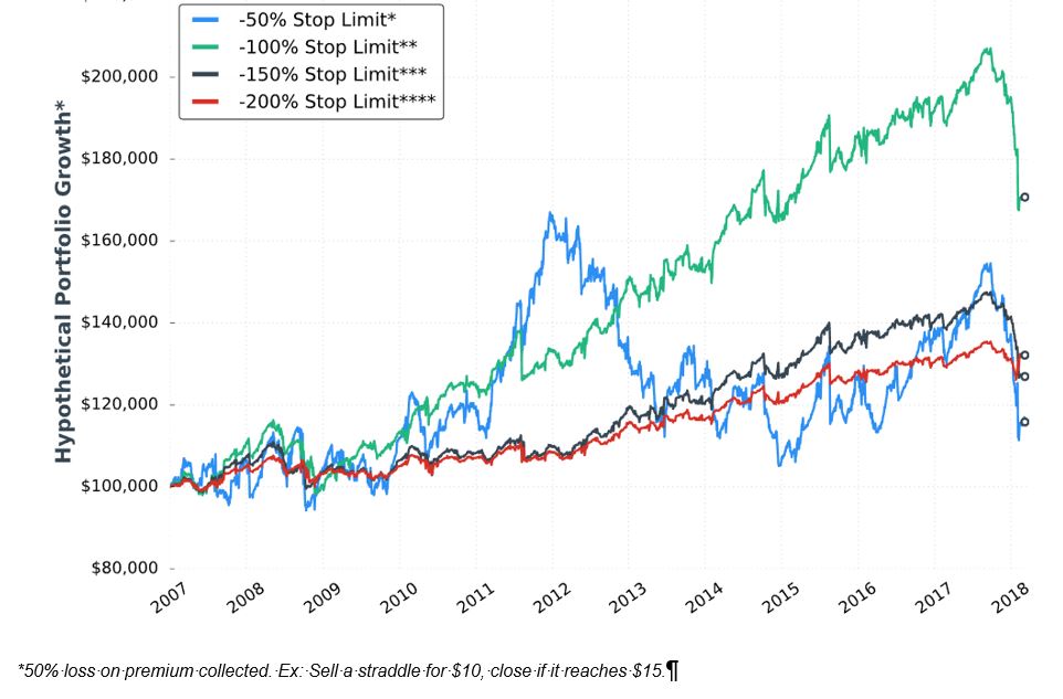
I’m not exactly sure how to interpret this. It would be nice to have a control group against which to compare (see here) because on the surface, a 60% [gross] return in 11+ years is not impressive.
When presenting these graphs, she focuses less on total return. She seems to focus more on volatility of returns [possibly better understood with a dedicated metric like standard deviation or CAGR / max DD%] and relative performance of the equity curves shown. I don’t think she presents a single graph of this type anywhere in the report that shows an eye-popping total return, which makes me wonder whether I’m understanding properly. She really should have given some explanation about the meaning and limitations of “hypothetical performance growth.”
I will continue next time.
Categories: System Development | Comments (0) | PermalinkShort Premium Research Dissection (Part 6)
Posted by Mark on March 12, 2019 at 07:15 | Last modified: November 30, 2018 09:14I left off with the author’s introduction to fixed position size.
She proceeds to discuss position size as related to trade risk. She explains 100% loss as being equal to credit received when entering the trade. Dividing credit into account value equals percent allocation, which should remain constant. This eliminates the problem of variable trade size mentioned in the final excerpt here. She believes this to be better than sizing positions based on margin (buying power reduction, or BPR), which is not something I had previously considered.
> Of course, margin requirements are real and we must consider
> how much margin we’ll use when implementing a strategy. As a
> rule of thumb, the smaller my loss limit is, the more contracts
> I’ll be able to trade (resulting in higher margin requirements).
> On the other hand, using larger loss limits results in less
> contracts and therefore less margin.
This is where I would like to see details on straddle BPR. As discussed in this second paragraph, just because I can enter a position does not mean I can continue to hold it. Portfolio margin changes constantly. In the report, she may be referencing standard margin, which for naked options is a complex calculation.
The author believes any straddle adjustments to be overly complex and inferior to closing and starting a new trade. Rather than jump to conclusions, I would like to study some basic adjustments as mentioned in the second-to-last paragraph here.
She talks about selling straddles with a target time frame of 60 DTE. I would assume this means selling the straddle closest to 60 DTE but does that mean monthly and/or weekly expiration cycles? I should not need to make assumptions (see fifth paragraph here). Methodology needs to be thoroughly detailed and this report is repeatedly lacking on that front. The folks at Tasty Trade also struggle with this (see fifth paragraph here).
She gives us some initial statistics on strangles:
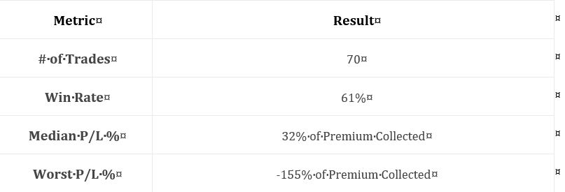
As discussed in several parts of my Automated Backtester Research Plan, I want to see a broader array of statistics. Examples include distribution of DIT including max/min/average (maybe percentiles), average trade, average win, average loss, profit factor, max drawdown (DD) percentage, compound annual growth rate (CAGR), CAGR/max DD %, standard deviation (SD) of winners, SD losers, SD returns, and total return. In addition to methodology description, inadequate complement of trade statistics is another recurring issue I had with this report.
She does not study daily trades (see second paragraph here). I would be interested to see daily trades backtested and grouped (e.g. 56-60 DTE, 61-65, 51-55, 46-50, 41-45, etc.) or run monthly for each DTE with a statistical analysis to make sure no significant differences exist. Her serial backtest appears to include 70 trades in ~11 years, which is not that many.
I will continue next time.
Categories: System Development | Comments (0) | PermalinkShort Premium Research Dissection (Part 5)
Posted by Mark on March 7, 2019 at 06:12 | Last modified: November 29, 2018 08:40Section 2 ends with:
> We’ve already covered a great deal of analysis, and we could surely
> continue to analyze market movements/general options strategy
> performance forever.
>
> However, I don’t want to bore you with the details you’re less
> interested in, and I feel we have enough data here to start
> developing systematic options strategies.
I’m not bored because I think raw data like this can be the beginning to meaningful strategy elements (e.g. starting the structure above the money as mentioned in the second paragraph here). Also as discussed in that final paragraph, getting an “accurate documentation of research flow along with everything that was [not] considered, included, or left out” is very important to boost credibility and to make sure real work was done no matter how confusing or boring it may seem. In college, I worked with a lab partner to know the actual work was done. Here, I’m not looking over the author’s shoulder to see her spreadsheets and backtesting engine. How else am I to know the data being presented is real?
I paid good money for this research, which precludes any “less is more” excuse. I am reminded of the third paragraph here. Don’t complain about being overwhelmed by data unless you give me a logical reason why that’s a problem. I want to see as much research as possible to feel confident it’s robust rather than fluke. I want to know the surrounding parameter space was explored as discussed here and here.
A full description of research methodology is very important. I wrote that at the very least, it should be included once per section. The sections in this report are comprised of many sub-sections—sometimes with multiple tables in each. To clarify, then, I would like to see the research methodology in every sub-section if not alongside every single table or graph. Like speed limit signs posted after every major intersection to inform cars regardless of where they turn in, research methodology should be redundant enough to see no matter where I pick up with the reading. The methodology can easily be a footnote(s) to a table or even a reference to an earlier portion of text.
Part 3 of her report continues the discussion of short straddles with the importance of a consistent trade size. She writes:
> If a trader uses a fixed number of contracts per trade, their actual
> trade size would decrease as their account grows, and increase as
> their account falls (generally speaking).
This makes sense for trade size as a % of account value, or relative trade size. Trade size itself, which I think has more to do with notional risk or buying power reduction (BPR), is proportional to underlying price and unrelated to account value.
I would like to see an explanation of BPR for short straddles. We will continue next time to see if this is relevant.
Categories: System Development | Comments (0) | PermalinkShort Premium Research Dissection (Part 4)
Posted by Mark on March 4, 2019 at 06:59 | Last modified: November 27, 2018 10:13She continues with the following table:
I find this table interesting because it gives clues about how the naked straddle might be biased in order to be more profitable. Once again, the middle two volatility groups show a greater failure rate to the downside. I don’t know why this is and I wouldn’t want to make too much of it especially without knowing whether the differences are statistically significant (see critical commentary in the third-to-last paragraph here). I do see that overall, failure rate is unanimously higher to the upside, which makes me wonder about centering the straddles above the money.
I would like to see the distribution of losing trades over time in order to evaluate stability. Are many losing trades clumped together in close proximity—perhaps in bearish environments? “Since 2007,”* we have been mostly in a bull market. We won’t always been in a bull market. Do the statistics look different for bull and bear? If so, then is there something robust we can use as a regime filter to identify type of market environment? Consider a simple moving average. We could test over a range of periods (e.g. 50 to 250 days by increments of 25) to get sample sizes above and below. We could then look at loss percentages. An effective regime filter would have statistically significantly different loss percentages above vs. below at a period(s) surrounded by other values that also show significant loss percentage differences above vs. below.
The last two rows are not crystal clear. The first row of the previous table (in Part 2) mentioned expiration. I’m guessing these are similarly average percentage price changes between trade entry and expiration. I shouldn’t have to guess. Methodology should be thoroughly explained for every section of text, at least, if not for every table (when needed).
Assuming these do refer to expiration, I would be interested to see corresponding values for winning trades and a statistical analysis with p-value along with sample sizes (as always!). I would expect to see significant differences. Non-significant differences would be an important check on research validity.
I have rarely found things to go perfectly the first time through in backtesting. While it might look bad to see confirming metrics fail to confirm, a corrective tweak would go a long way toward establishing report credibility. As a critical audience, which we should always be if prepared to risk our hard-earned money in live-trading, it is very important to see an accurate documentation of research flow along with everything that was [not] considered, included, or left out. Remember high school or college lab where you had to turn in scribbly/illegible lab notebooks at the end to make sure you did real work?
* Assuming this descriptor, given several sections earlier, still applies. Even if it does, the
descriptor itself does a poor job as discussed in the second full paragraph here.