Short Premium Research Dissection (Part 7)
Posted by Mark on March 15, 2019 at 07:26 | Last modified: December 3, 2018 10:53Picking up where we left off, she closes this sub-section with a comment about EOD backtesting. Realized losses can go far beyond the 100%-of-credit-received stop-loss. This is something to note when position sizing the trade. The implication is that watching the markets intraday can limit many of the excessive losses, but it’s debatable whether this wins out in the end (see here). A trade P/L (and/or maximum adverse excursion) histogram would give us better context.
Rather than explain them away, the excess losses could be accepted as partial compensation for excluded transaction fees in the backtest. This omission is commonly seen in backtesting and I believe it to be a huge flaw (future blog post).
Onto the next table:
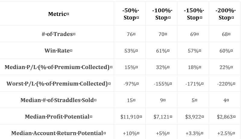
As discussed at the end of Part 6, I want to see a broader range of statistics. At first glance, I couldn’t even determine profitability. I now see that “median P/L” indicates the strategy is profitable, but as always with “average trade” metrics, distribution [frequency and magnitude] of losses/drawdowns needs to be studied for a more complete understanding. A full understanding also assumes a well-defined methodology, which we are not getting. Nebulous methodology and incomplete statistics form a common refrain throughout this report.
With this table, she may have had particular reasons for providing these statistics and omitting others. She says stop-loss is inversely proportional to contract size and therefore volatility of returns. She also says stop-loss is inversely proportional to difference between largest loss and stop-loss. This is an interesting point. As mentioned above, distribution of losses would reveal the broader landscape. In any case, it’s fine to be drawing other conclusions as long as she gives performance its requisite heap of multi-faceted attention at some point.
Throughout the report, we see graphs like the following:
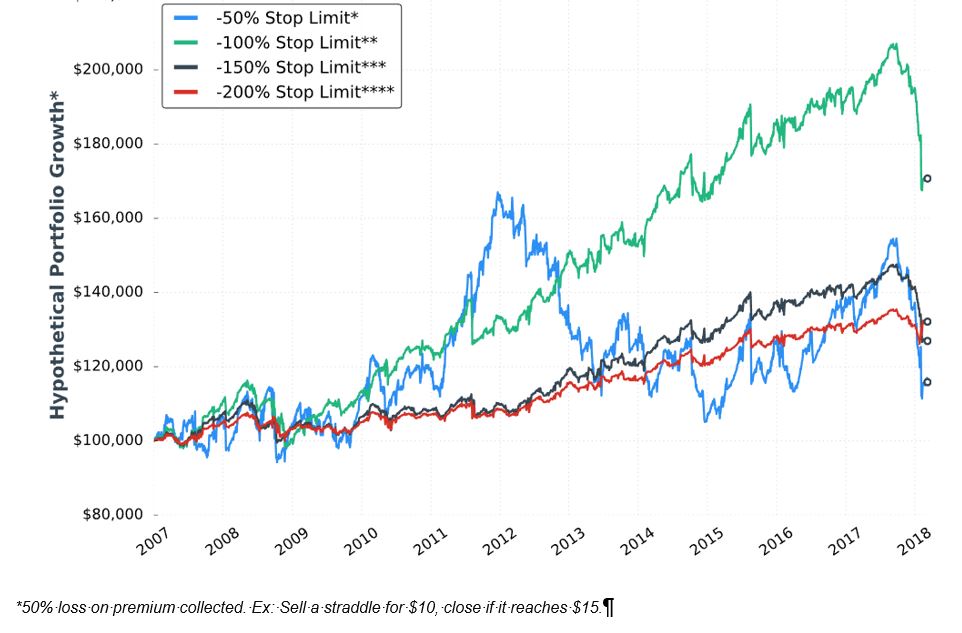
I’m not exactly sure how to interpret this. It would be nice to have a control group against which to compare (see here) because on the surface, a 60% [gross] return in 11+ years is not impressive.
When presenting these graphs, she focuses less on total return. She seems to focus more on volatility of returns [possibly better understood with a dedicated metric like standard deviation or CAGR / max DD%] and relative performance of the equity curves shown. I don’t think she presents a single graph of this type anywhere in the report that shows an eye-popping total return, which makes me wonder whether I’m understanding properly. She really should have given some explanation about the meaning and limitations of “hypothetical performance growth.”
I will continue next time.