Short Premium Research Dissection (Part 23)
Posted by Mark on May 10, 2019 at 06:30 | Last modified: December 20, 2018 06:04Today I continue with thoughts about our author’s comparison between high-risk and limited-risk strategies (Part 21 table).
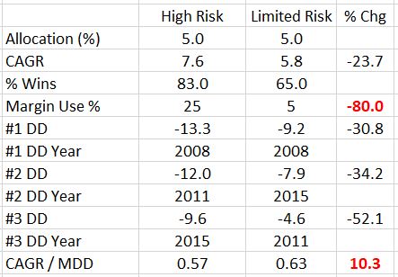
I wrote last time about normalizing for DDs and made mention of the top 3 included in her tables. Per my conservative approach, I think it’s important to heed the worst DD and possibly position size based on [150% of] that [since your worst DD is always ahead of you as discussed in second and third paragraph here].
Just looking at worst losses can be misleading, however, which is why I am interested in seeing average* and distribution. One or two outliers [even out of many] can make a bad average look much worse. Given this possibility, I am interested in seeing (or quantifying) the whole [histogram] distribution. Average [win and average] loss along with percentiles (distribution) are part of my standard battery (see second paragraph here).
If the average loss is skewed by an outlier, then maybe I calculate the average without the extreme and attempt to add a hedge to cushion me from greater-than-average losses. I would never re-run the backtest and admire the much-improved performance, though (hello curve fitting). This is something I would do as proactive insurance if it can be done at a low enough cost to preserve profitability for the whole system.
If the average loss for high-risk is significantly larger and deemed to be trustworthy, then an increased position size for the limited-risk strategy may be justified. The standard battery would tell us these things.
Getting back to my Part 22 DD analysis, I am surprised the MDD difference between high and unlimited risk is only a few percentage points despite a horrific crash of 2008’s magnitude. This is only 5% of the total account, however, so perhaps the 34.2%—a percentage of a percentage (often misleading as described in the paragraph below first excerpt here)—better reflects the difference.
This got me looking more closely at the equity curves, which is where something clearly seems amiss. The high-risk equity curve(s) in Part 15 goes horizontal for roughly six months between 2008-9. This makes sense because of the VIX < 30 filter. The defined-risk curve(s) in Part 20, however, is V-shaped across that time interval. It makes sense that these defined-risk positions are hedged and therefore would lose less (or even profit?) during volatility crush but---VIX < 30! That is applicable to both. The defined-risk curve should be horizontal for the same 2008-9 period. If this throws off the remainder of the curve(s) then is her reported CAGR erroneously high? Are her reported DDs erroneously low?
Aside from all of the critical observations I have made throughout this mini-series, perhaps nothing is worse than obvious data flaws or inconsistencies. Any and all conclusions are based off the data and calculations made from it.
This is really bad news. I hope the mistake is mine.
* Arithmetic mean. Use of median is another potential way to correct for outlier distortions.
Short Premium Research Dissection (Part 22)
Posted by Mark on May 7, 2019 at 07:15 | Last modified: December 19, 2018 09:25I left off with discussion of our author’s differentiation between high-risk and limited-risk strategies.
Her final point in comparing the two:
> 5. Significantly lower margin requirements
For me, this is the most intriguing observation and one that raises questions. Apples-to-apples comparison of ROI should be normalized for margin use percentage (MUP).* In this table from Part 21, she states a fivefold difference in MUP between high- and limited-risk strategies. Position size for the latter could be doubled or tripled and still carry a lower MUP. In this case, total returns would significantly outpace high risk.
The issue of margin requirement (MR—also known as BPR and first mentioned in these last two paragraphs) is now very relevant. MR is directly proportional to MUP. In Part 15, I discussed her absurdity in mentioning MR without explaining the calculation behind it. This is necessary to understand the 25% vs. 5% difference. According to Tasty Trade:
> We are able to define Undefined Risk by the
> amount of margin that a brokerage firms
> [sic] requires… this is normally the loss…
> [due to] a 2 standard deviation move in the
> underlying… the broker… will hold this
> amount of capital as margin.
As described in the third paragraph here, PM is similar. The underlying price at 2 SD OTM moves with the market along a curved risk graph, which means PMR is dynamic. Also dynamic is the size of a 2 SD move, which is proportional to underlying price. The move gets smaller as underlying price decreases to ultimately put downward pressure on PMR as the market falls.
While MR calculation for the high-risk strategy should be dynamic on multiple fronts, the limited-risk MR is capped. I am therefore confused how our author arrived at the fixed fivefold difference between the two strategies. I would be a proponent of determining a maximum difference to cover most instances, but even if I give her the benefit of the doubt and assume this to be the case, I need explanation as to why fivefold would be it.
Aside from normalizing returns for MUP, I am also interested in normalizing for [M]DD (see last four paragraphs here). Because the concept suffers from future leak (see footnote), I would make conservative use of it. For example, given a fivefold DD difference I would consider doubling or tripling position size to compare total return.
If a 2-3x position size results in a proportional DD increase, then I wouldn’t do it. DD difference between the two strategies are roughly 30-50% (see Part 21 table). That would be overwhelmed by a 100%-200% change.
When I talk about normalizing for MR and MDD, CAGR/MDD seems to be a comprehensive metric. If the numbers are correct, [unknown sample size aside] then CAGR/MDD is ~10% better for the limited-risk strategy.
The drastic difference in MUP relates back to the author’s first point (Part 21). If MR is calculated correctly, then the question is whether I would implement a high-risk strategy that lost 13.3% in 2008 knowing it could have been far worse had the market crash been more severe.
I will continue next time.
* Suppose you and I put on the same trade for $30,000. If your trade takes up 1% of the account
and mine takes up 50%, then you can be much more brave with regard to holding and adjusting.
Short Premium Research Dissection (Part 21)
Posted by Mark on May 2, 2019 at 07:25 | Last modified: December 19, 2018 08:54I pick up today with comparison between the data provided last time and that shown in Part 15.
Tables are clearer than graphs and thankfully, albeit not the standard battery, our author provides one template for both.
She writes:
> You’ve likely noticed that the returns of the strategy above
> are less substantial than the returns of the high-risk
> strategy discussed in the previous section of the course
With all the inconsistent reporting of statistics and general sloppiness, I actually hadn’t realized until this mention. What effort she did not put forth to make this clear, I did:
I’m not sure why the second- and third-worst drawdown years are different between the two strategies. This didn’t quite cause me to raise an eyebrow although it didn’t escape my notice.
She omits inferential statistics, which means I cannot definitively talk about comparative differences. I last mentioned this in the paragraph below the table here, but the flaw is applicable throughout the report.
Looking past this critical oversight, my general takeaway is that limited risk sacrifices total return for a greater decrease in drawdowns. The limited-risk strategy has a lower winning percentage, which begs me to ask for distribution of losers (omitted). The 0.57 perplexes me since the other high-risk allocations posted 0.63, 0.628, and 0.625. If this is in error and 7.6% should be higher (corresponding to a similar CAGR/MDD), then this whole paragraph goes out the window.
The author distinguishes high- and limited-risk strategies in many ways:
> 1. Risk is known before entering trades.
This really makes all the difference. Defined risk provides a level of comfort. Everything below is corollary.
> 2. Losses cannot exceed limits.
Only a stop-loss can limit losses in a high-risk trade, but a big gap opening is always possible (see last excerpt here).
> 3. No need to watch market intraday
This is huge and follows straight from the first two. It means one could execute this strategy while still working a full-time job; it means one need not be tied to a computer screen or portable device.
> 4. Losing trades may be held longer.
This also follows straight from the first two and means trades have more time to recover (at the cost of PnL per day, perhaps, which gets overlooked per my discussion in the third paragraph here).
I will complete the list next time.
Categories: System Development | Comments (0) | PermalinkShort Premium Research Dissection (Part 20)
Posted by Mark on April 29, 2019 at 06:38 | Last modified: December 18, 2018 06:01I left off discussing allocation as a possible confounding variable rather than the independent variable our author tries to present. This is where she picks up in the next sub-section.
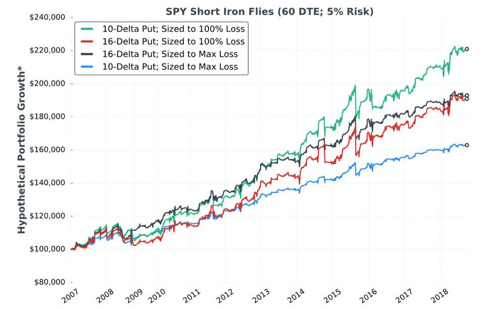
As discussed below the second table here, kudos to our author for giving us fuller study methodology. Positions include 16-delta put and 25-delta call. Trades are entered closest to 60 DTE only when VIX < 30. Trades are sized to max loss (rather than 100% stop-loss). Trades are closed at 75% profit target or at expiration. Again, she does not give us exact backtesting dates, number of trades, or a statistical analysis of differences. The latter puts me on curve-fitting watch once again; I will watch closely to see whether scope of conclusions are justified by data provided.
I immediately have a couple “parameter check” type questions (akin to first paragraph here). The highest total return in the previous sub-section utilized a 10-delta put sized to 100% loss. Here, she uses only a 16-delta put sized to max loss. On one hand, I’m happy she’s not just looking to curve-fit by presenting the best of the best. On another hand, I really want to see multiple permutations to avoid the possibility of fluke and to gain a broader perspective.
She starts out with the tenth “hypothetical performance growth” graph:
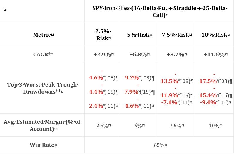
I appreciate the inclusion of CAGR and drawdowns in this table. I wish she had also included everything else the standard battery (see second paragraph of Part 19) provides.
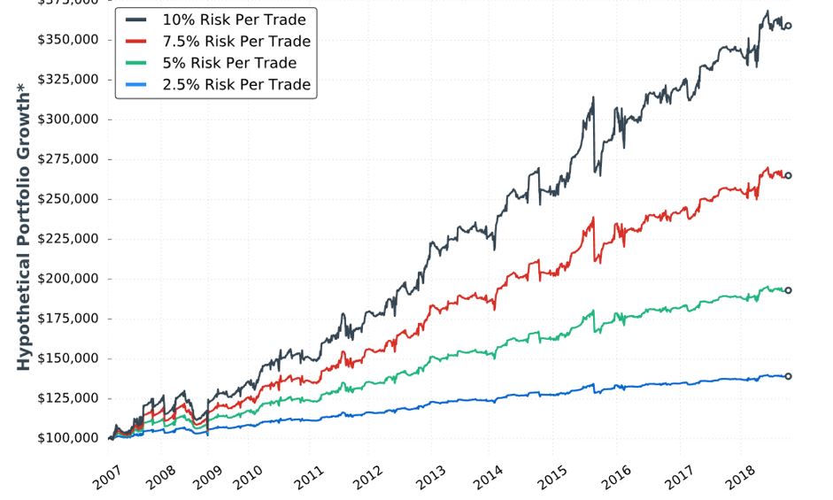
Eyeing the graph and doing some simple math between columns of the table suggests these data to be relatively proportional to allocation. I calculated CAGR/MDD to be 0.630, 0.630, 0.644, and 0.657 for 2.5%, 5%, 7.5%, and 10% risk, respectively. Unlike the paragraph below the table here, these numbers align closer.
My commentary below the graph in Part 15 applies here as well. To repeat, I have questioned whether allocation is directly proportional to performance. Tasty Trade has done studies where allocation beyond a given critical value (~30%) results in an irreversible performance decline. Our author caps allocation at 10%. I would like to see allocation backtested at least high enough to see that supposed decline. This would provide important context about position size limitations.
She continues with a potentially apples-to-oranges comparison between results discussed in Part 15. I question the sizing approach. The Part 15 strategy is sized per 100% loss (i.e. credit received). As discussed in the third paragraph above, the strategy here is sized per max loss. To be consistent, I think she should have sized per 100% loss here, too. Looking at the graph in Part 18, it probably does not matter since the red and black curves both end up around $180,000. It would matter for the green and blue curves, however, which are significantly different.
I will continue detailing this comparison next time.
Categories: System Development | Comments (0) | PermalinkShort Premium Research Dissection (Part 19)
Posted by Mark on April 26, 2019 at 07:02 | Last modified: December 17, 2018 05:32I continue the research review today with the graph and table shown in Part 18.
Anytime we get one of these “hypothetical portfolio growth” equity curves, I also want to see the standard battery. Going back to Part 15, this includes things like: number of trades, number of wins (losses), distribution of (winning/losing/all) DIT, distribution of losses including max/min/average [percentiles], average trade [ROI percentiles], average win, PF, number of trades, CAGR, max DD %, CAGR/max DD %, standard deviation (SD) winners, SD losers, SD returns, total return, PnL per day, BPR, CAGR/SD returns, etc. I have not been absolutely consistent with the battery, which is why I write “things like” and “etc.” when describing it. The gist is to include enough statistics to provide deep context for performance.
As mentioned in the second paragraph below the graph shown in Part 14, I don’t understand why daily trades were not studied. This would give us a much larger sample size. We wouldn’t get an equity curve, but the equity curve itself does not tell us certain essential details anyway (hence the standard battery).
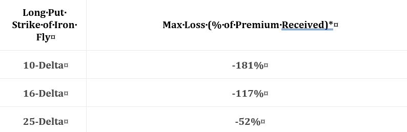
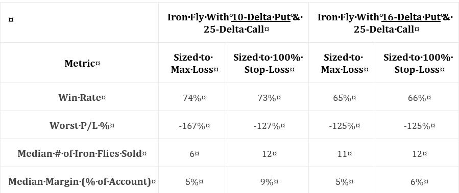
Our author concludes that sizing approach makes a huge (small) difference with the 10- (16-) delta put. She points out max loss potential is 181% for the 10-delta put, which is why the contract difference is so great between the two approaches. I would like to know number of winners/losers to the upside/downside because the 10-delta put would only underperform the 16 in the face of downside losers. She told us most of the losers actually occur to the upside (see this table).
Either way, I think max loss potential is less important than profitability. The green curve appears to increase ~120% in 11 years, which is 7-8% CAGR. That seems mediocre compared to the SPX average annual return (which would be nice to see plotted as a control comparison). I have struggled throughout over how to understand “hypothetical portfolio growth” (last questioned in Part 16). CAGR could be multiplied by “median margin percentage” to get a better idea of profit potential, but lacking the standard battery we have no drawdown or volatility (SD) information to complete the performance picture.
Our author next addresses why a stop-loss (SL) should be implemented with risk already defined:
> As the results… demonstrate, using a SL can allow for more contracts,
> which can amplify returns over time.
This is consistent with the green curve soaring far above the blue. However, the black curve slightly outperforms the red until the very end. Without inferential statistics, I would guess the SL helps in one of two cases (100% or none). Other SL levels could have been tested but were not. Is one of two sufficient to conclude it works and therefore include it as part of the strategy? If not then doing so may constitute curve-fitting.
I want to see a decent number of trades stopped out to know our author is not curve-fitting by sniping the worst (see second paragraph Part 14). Different SL levels will result in different numbers of trades being stopped out. I am skeptical because she did not explore this.
Another mitigating factor is because both total return and drawdown (or SD) are integral components of performance, differences due to leverage or contract size are not necessarily differences at all. Total return-to-drawdown (or SD) ratio is constant regardless of contract size until the extremes are reached (see paragraph below Part 15 graph).
Lumping together SL and position sizing also creates confusion. She position sizes based on a 100% SL, which is also used as the SL. Position sizing could be based on any SL level since it’s just the maximum acceptable loss divided by trade loss at the SL point. As an independent variable, SL level is just another parameter that increases total number of permutations in multiplicative style as shown in the second paragraph of Part 13. Muddling the picture even further is her treatment of allocation as an independent parameter for optimization when allocation is really just another facet of position sizing.
Categories: System Development | Comments (0) | PermalinkShort Premium Research Dissection (Part 18)
Posted by Mark on April 23, 2019 at 06:42 | Last modified: December 16, 2018 07:29Continuing on with my research review, the author of this research report next gives us the following:
This represents the “median of all trades,” but she does not tell us the process. How many trades? When did these trades occur? Are they varied across volatility levels? She says they are “60 day” but does that mean exactly 60 or closest to 60? Are they taken every day, every week, every month, or otherwise? We need sample details and the complete methodology.
She writes:
> Either way, the delta of the long put helps us determine
> how to size trades. When buying 10-delta puts, a trader
> could implement a 100% stop-loss to use more leverage,
> or size the position to the maximum loss and use less
> leverage and give up profit potential.
I originally thought these were good comments, but reading them again I think they are hardly worthwhile. She is saying the trade-off is more leverage versus less leverage—more leverage versus profit potential. Either is quite obvious.
The critical, missing data would explain how well these approaches perform.
She goes on to say sizing per 100% stop-loss should be similar to sizing per max loss with the 16-delta puts (-117% median loss potential). I would still be interested to see the histogram described in the last paragraph of my previous post.
> When buying 25-delta puts, it may not make sense to use
> a stop-loss at all because the maximum loss potential
> has been so small.
I’d much rather see claims based on backtested data to see how the different setups performed than claims based on a proxy (maximum loss potential) of unknown relevance.
In the next section she gives us incomplete data on two different strategies and the two sizing approaches in the ninth “hypothetical portfolio growth” graph and accompanying table:
Kudos to our author for giving us “full study methodology” here. Trades are entered closest to 60 DTE only when VIX < 30. Trades are closed at 75% profit target, when down premium received (stop-loss condition), or at expiration (sizing approach #2): whichever comes first.
I would actually call this a fuller methodology because some important details are left out. She does not give us exact backtesting dates, number of trades, or a statistical analysis of differences. I will therefore watch very closely to see what conclusions are made.
As an entirely different strategy, I think all questions about trade parameters are reopened (see second paragraph of Part 13). She omits the entire analysis, however, and steals the best values from the unlimited-risk strategy for DTE, VIX, profit target, and stop-loss. She was guilty of curve-fitting before. Here, she leaves the door open to fluke in case these particular trade parameters perform well while adjacent ones do not. This is a problem.
Categories: System Development | Comments (0) | PermalinkShort Premium Research Dissection (Part 17)
Posted by Mark on April 18, 2019 at 07:13 | Last modified: December 14, 2018 11:39Last time, I concluded critique of our author’s unlimited-risk strategy.
The next section begins:
> The short iron butterfly and short iron condor are limited-loss
> strategies, but can be highly risky when using large trade size.
I like this caveat. For many of us, an unanswered question lies between “unlimited risk” and “limited loss.” That answer has to do with position sizing, which is completely individual.
> None of the content below is a recommendation to implement an
> investment strategy. Rather, the research below is meant to help
> you make more informed trading decisions, and learn systematic
I concur with this disclaimer.
> trading strategies with historically-favorable performance.
Does she mean to imply that she tweaked the data to make the performance look favorable? Hopefully she never had any intent to curve-fit (even though I think she did as discussed in Parts 13–14) despite the results turning out to be profitable.
In describing the next strategy, she writes:
> We’ll… [construct] with a long 16-delta put, short ATM
> straddle, and a long 25-delta call. As we’ve been doing,
> we’ll look at options closest to 60 DTE.
The setup includes a fixed-delta legs, which I think is suspect. This is an asymmetrical butterfly with an embedded PCS. My preference would be to study various permutations rather than just the 16-delta put (see second and third paragraphs here). Assuming she has done this honestly—by writing up the research plan before looking at the results—this is not curve-fitting. It does leave the door open to fluke, however, in case these particular trade parameters perform well while adjacent ones do not.
As I have written about extensively (e.g. here and here), trust should always be an issue in the financial industry for reasons including widespread precedent. You may, but I will not (see second prerequisite here) assume she has been totally honest. Charging money for this research is an underlying motive to present positive performance. I want to see a strategy that performs, in large sample size, with variable-delta legs. I don’t need to see everything do well, but I should be able to discern a range of encouraging parameter values. As described in the first paragraph here, I want to see something honest.
The author explains two potential sizing methods:
> …based on the actual maximum loss is much safer because
> as long as you size the position correctly, you can’t suffer
> a loss larger than you’re comfortable with. When sizing…
Maximum loss would be incurred when the wider credit spread is ITM at expiration.
> based on a certain percentage loss on the premium received,
> it’s very possible to incur larger losses than you wanted
> because nothing guarantees trades can be exited exactly at
> the stop-loss level.
This is the “excess loss” that was last discussed below the first excerpt here.
Contract size will be similar either way when max loss approximates credit received (i.e. max profit). I would like to see a histogram of max profit : max loss. If a significant difference exists most of the time but max loss is extremely rare, then it may be worth position sizing based on max profit (and limited allocation) despite the increased risk.
I will continue next time.
Categories: System Development | Comments (0) | PermalinkShort Premium Research Dissection (Part 16)
Posted by Mark on April 15, 2019 at 06:02 | Last modified: December 13, 2018 09:14Our author stops after the discussion on allocation and restates the [curve-fit] strategy as her full trading plan.
We get a relatively thorough methodology description here, contrary to my reference in this first sentence of paragraph #5.
She follows with a reprint of the previous performance graph and table of statistics discussed with one slight alteration. The asterisk, last discussed in the third paragraph here, now has a corresponding footnote:
> *Please Note: Hypothetical computer simulated performance results
> are believed to be accurately presented. However, they are not
> guaranteed as to the accuracy or completeness and are subject to
> change without any notice. Hypothetical or simulated performance
> results have certain inherent limitations. Unlike an actual
> performance record, simulated results do not represent actual
> trading. Also, since the trades have not actually been executed, the
> results may have been under or over compensated for the impact,
> if any, or certain market factors such as liquidity, slippage and
> commissions. Simulated trading programs, in general, are also
> subject to the fact that they are designed with the benefit of
> hindsight. No representation is being made that any portfolio
> will, or is likely to achieve profits or losses similar to those
> shown. All investments and trades carry risks.
Was this footnote meant to accompany all “hypothetical portfolio growth” graphs (i.e. Part 8, paragraph #2)?
She advises:
> …be realistic about your sensitivity to portfolio drawdowns…
> choose a trade size you can stick to long-term. Changing…
> sizes based on how aggressive/conservative you’re feeling on
> a particular day can lead to worse results.
I agree. I also think this would have been a great place to illustrate what parameters matter to us as traders versus what parameters matter to investors screening us as potential money managers. This is good fodder for a future blog post.
She closes with a howitzer:
> …based on the drawdowns observed in these backtests, and
> the unpredictable nature of the stock market, I personally
> do not recommend implementing any of the “undefined-risk”
> strategies shown in this section. I displayed the research
> anyway because I want you to see what can go wrong…
While I would like a couple more sentences detailing why, I appreciate these honest conclusions. I believe “undefined risk” should be accompanied with the worst sales pitch ever.
She gives clues about her thinking as the next section begins:
> The problem more conservative traders may have… is
> that the downside loss potential is substantial,
> especially when sizing trades based on a certain
> percentage loss on the premium received.
“Substantial” probably means the -24.3%, -22.8%, and -18% drawdowns in 2008, 2011, and 2015 respectively: numbers mentioned earlier. I wish she had proceeded to describe “your worst drawdown is ahead of you” (third-to-last paragraph here).
Categories: System Development | Comments (0) | PermalinkShort Premium Research Dissection (Part 15)
Posted by Mark on April 12, 2019 at 07:21 | Last modified: January 9, 2019 07:55The next sub-section addresses allocation with the eighth “hypothetical portfolio growth” graph:
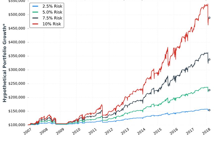
In my parameter checks (last done in this second paragraph), I have questioned whether allocation is directly proportional to performance. Tasty Trade has done studies where allocation beyond a given critical value (~30%) results in an irreversible performance decline. Our author caps allocation at 10%. I would like to see allocation backtested at least high enough to see that supposed decline. This would provide important context about position size limitations.
Our author provides the following statistics:

Everything is proportional in the table (e.g. values in the 10% allocation column are 4x those in the 2.5% allocation column) but not directly so (e.g. CAGR/MDD is 0.630, 0.628, 0.571, and 0.625, for 10% risk, 7.5% risk, 5% risk, and 2.5% risk respectively). I’d like some explanation why this is the case.
I think she did a decent job presenting statistics here. I like her presentation of the top three worst drawdowns (DD). She gives us CAGR too. I would still like to see the “standard battery” at the very least: distribution of DIT, complete distribution of losses including max/min/average [percentiles], average trade [ROI percentiles], average win, PF, max DD %, CAGR/max DD %, standard deviation (SD) winners, SD losers, SD returns, total return, PnL per day, etc.
She tells us the S&P 500 had CAGR near 8% (including dividends) during this time frame, which would only be realized with a 100% investment in the index. This 100% passive investment also incurred a max DD near -60% in 2008/2009. Whenever relevant, I would like to see an additional line on the graph corresponding to long shares. A similar control group was mentioned in the third-to-last paragraph here.
The author proceeds to give some discussion about margin requirement (MR), which I think is absurd. At the very least, she needs to explain “average estimated margin as a % of account” and how it is calculated. I last mentioned this in Part 9 with regard to buying power reduction. On a more advanced level, I would like to see some discussion of portfolio margin (see third paragraph). I never tracked MR in my own backtesting and have since found some occasions where MR > account equity (net liquidation value), which can signal a major problem.
Compounding the absurdity is the fact that maximum MR is even more important than average MR. Max MR is what determines whether I can continue to hold a position (as discussed in the fourth paragraph here). If max MR ever exceeds account value then I’m going to get a margin call and/or be forced to close the position. She should report max MR.*
* To determine contract size, Larry Williams once suggested dividing account value by
margin per contract plus 1.5 x most I would ever expect to lose.
Short Premium Research Dissection (Part 14)
Posted by Mark on April 9, 2019 at 06:55 | Last modified: January 11, 2019 06:59I left off discussing the possibility of curve fitting with the VIX filter. I discussed a related topic, future leaks, in the footnote.
Curve-fitting is accentuated when an additional condition snipes just a few horrific occurrences. That is what our author does.
An alternative method might have been to run the backtest with a VIX < n filter where n varies from 15-45 by increments of three. This could also be done as VIX > n to more clearly see number of occurrences being filtered out, where the breakeven cutoff occurs, and the consistency of returns around the VIX threshold.
Even this reeks of future leak because the threshold value during the backtesting period is determined by performance of trades that have not yet occurred. A walk-forward process (see here) might be the only way around.
She closes the sub-section with:
> Additionally, portfolio performance could have improved even further
> by exiting losing trades closer to the 100% stop-loss threshold.
Curve-fitting often involves an attempt to make results look the best, which is what the author sounds to be aiming for here. As discussed in this second paragraph, she discusses these excessive losses as a limitation of backtesting when, in fact, her own methodology is flawed because transaction fees are not included. I would rather see her embrace these excessive losses if only to reflect increased slippage during fast-moving markets.
The next sub-section addresses profit target with the seventh “hypothetical portfolio growth” graph:
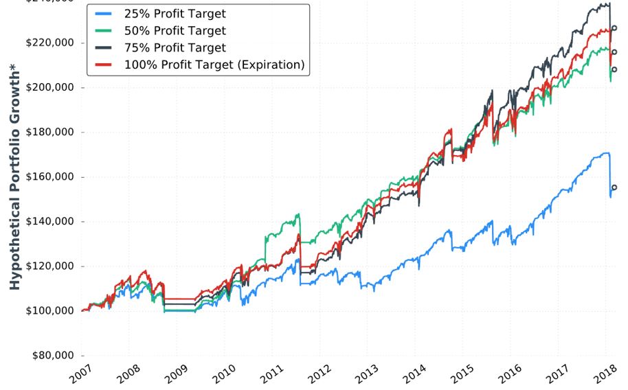
No statistics are given. None. I’d like to see the standard battery of statistics as listed in the footnote here.
I applaud her conclusion that the 50-100% profit targets perform the same. We don’t have the statistical analysis to conclude a real difference exists. If she would have claimed 75% to be the best, then I would have noted the black curve only takes the lead in the last three years. We might get more insight from the larger sample size generated in backtesting daily trades.
She writes:
> I believe each portfolio’s performance would have improved if
> losing trades were exited closer to the -100% stop-loss threshold,
> as some of the losses far exceeded that threshold.
As discussed above, she needs to embrace the excess losses or incorporate transaction fees into the backtesting.
> The 25% profit target underperformed the other groups because
> many trades reach… 25%… which leads to smaller profits
> and the same loss potential relative to the higher profit targets.
I agree. Once again, my issues with Tasty Trade come to mind, as mentioned in the paragraph above the table here.
She advocates closing trades prior to expiration because full risk and little additional reward remains. This is consistent with Tasty Trade research (unlike the third paragraph of Part 13, which seems to disagree). This makes me curious to see DIT and PnL/day numbers for the different profit target groups (including 100%).
In the sub-section header, she mentions the graph to be for VIX < 30 (along with 60 DTE, 5% allocation, and -100% stop-loss). This also incorporates a 25-delta long call (LC). She is therefore taking the best looking curves from the two previous conditions and trying to improve upon them even further. Her sequence is LC, volatility filter, and finally profit target. Although I still like her conclusion that the 50%/75%/100% profit targets perform about the same, I suspect curve-fitting even more because she has optimized only one sequence of parameters (see third paragraph here).
Categories: System Development | Comments (0) | Permalink