Coffee with Professional Commodity Trader (Part 3)
Posted by Mark on July 26, 2022 at 07:06 | Last modified: April 14, 2022 14:11I recently spent nearly two hours taking in a lot of sun and a conversation with NK, a professional commodity trader. Today I continue presentation of miscellaneous notes from the meeting.
- Because I feel my forte is in strategy development and analysis, I do not want a future job in the financial industry to center around sales. NK agreed, saying that he does not really enjoy talking to customers. He also doesn’t want to be personally responsible for their accounts.
- On a personal note, the latter is one reason why I haven’t been more aggressive in pursuing a money management career. If I have been able to do it for myself, though, then isn’t the logical next step to scale up and do the same for others (see second-to-last paragraph here)? Why not suggest people allocate up to 20% (this second-to-last paragraph) of their portfolios to my trading strategies? Is this mini-series convincing enough?
- NK enjoys working with farmers, who he generally finds humble and informal. He can be dressed down when meeting with them in person as opposed to having to wear a shirt and tie every day.
- Because they believe in their agricultural products, farmers like to be “long everything” (i.e. futures and call options).
- As farmers live and breathe crops and livestock, I live and breathe equities although I hardly want to be “long everything.” Despite over 14 years of full-time trading with decent performance against the benchmarks, I spend more time planning what to do if stocks tank with regard to hedging or even profiting from the downside.
- Unlike the buy-and-hold thesis marketed by retail financial services, I am not convinced that stocks will always rise. Why can’t US stocks do nothing for 30+ years like Japan has experienced with the Nikkei since Dec 1989? NK said that he invests in some Japanese small caps and knows their price history enough to realize Japan’s late-1980s equity market made the US Dotcom bubble look small in comparison (they have now overcorrected to the downside, though).
- For US equities, NK thinks we are due for a major correction or at least a couple years of sideways action because the Fed is currently less accommodative (runaway inflation). If the market were to crash, don’t expect a dovish Fed to save the day [predictions still don’t hold much weight for me no matter who they come from].
I will conclude next time.
Categories: About Me, Networking | Comments (0) | PermalinkCoffee with Professional Commodity Trader (Part 2)
Posted by Mark on July 21, 2022 at 06:40 | Last modified: April 13, 2022 16:16Today I continue with miscellaneous notes from two hours of sun exposure and a delish grande Carmel Frappuccino while conversing with professional commodity trader NK:
- I asked whether he has a desire to work full-time for himself and he said he has recently been doing some contingency planning since he doesn’t expect his current job to last forever. The owner of his firm is getting older and showing signs of questionable judgment and commitment to business decisions that are not in the firm’s best interests.
- NK and some co-workers have formed a trading business to manage assets for friends and family. Capital is invested in land (farms) and tradeable assets.
- NK disagreed with me that we have not had a large sample size of market shocks on which to backtest hedge strategies. Aside from fall 2008, we had the Flash Crash in May 2010, Aug 2011, Aug 2015, Feb 2018, and Mar 2020.
- NK said Brexit in Jun 2016 had a minor effect on the market. The Q4 2018 market selloff was similarly too gradual to really affect term structure and/or cause a major market shock. In contrast, China’s revaluation of the yuan in Aug 2015 had a big impact on stocks and caused IV to spike in a big way.
- With regard to stocks, NK buys stocks that look cheaply valued.
- NK thinks hogs are the best place to start if I want to start trading commodities.
- Look at weekly COT report as a directional guide because investors will not flip from significantly long one week to significantly short the next.
- If for no other reason then as a self-fulfilling prophecy, NK believes commodities are one segment where TA may actually work. He does not believe stock TA has any efficacy.
- NK does not believe short-term strategies are effective for commodities.
- NK does not believe any strategy will work forever. To always be on the lookout for new strategies or tweaks to augment currently profitable ones therefore makes good sense. I agree with this 100%.
- NK and I also agree that hefty doses of ego are on display when it comes to casual discussion about the markets and investing. For this reason, NK does not believe anything he sees on Twitter or other social media.
- NK claims to have made money trading on his own (including full-time for about six months in 2016-7 while between jobs). He doesn’t claim to have killed it, but he believes he has fared well. I would say the same for myself to date (see this blog mini-series).
I will continue next time.
Categories: Networking | Comments (0) | PermalinkCoffee with Professional Commodity Trader (Part 1)
Posted by Mark on July 18, 2022 at 07:15 | Last modified: April 13, 2022 12:38I recently met up with a professional commodities trader (NK) to talk about trading in general. We sat outside Starbucks and I enjoyed a Caramel Frappuccino in the sun for nearly two hours. Once I got through the whipped cream, I found the sun had melted the drink to liquid. 1-2 days later, I also regretted not having sat in the shade.
In any case, here are some miscellaneous notes about our conversation:
- NK believes the permanent portfolio (Harry Browne) is worth looking at with 25% allocated to cash.
- I was talking about potential benefits of time spreads and NK mentioned another (besides horizontal skew and weighted vega) that he couldn’t name or completely describe. This has something to do with IV getting cheaper as options move ITM (maybe involving the second or third derivative of IV).
- NK believes low IV makes options on GC and 6E prohibitive to sell.
- One thought about commodities that makes common sense is to go long (short) when term structure is in backwardation (contango) because price will then move in your favor over time.
- NK is a believer in LT trends for commodities.
- As trend followers, CTAs may have four good years followed by eight bad years, etc. The good years will far exceed the bad, and commodities are generally a good [e.g. inflation] hedge regardless.
- Another idea with commodities, which is probably something most CTAs (as trend followers) employ, is to go long (short) when price is above (below) the 200-SMA. They may get chopped up at times, but they should catch big trends and never incur catastrophic drawdowns.
- NK suggests watching for opportunities to sell options after limit moves when IV explodes because even if market directionally moves against the position, IV contraction may result in profit. He has seen cases where same-strike options in far-apart expirations have been priced equally due to term structure.
- Beware of wide bid/ask spreads on commodity options.
- NK sometimes trades futures options and other times the ETF (options?). He finds the pricing is different and may even be an arbitrage opportunity. As an example, ETF price based on options from the nearest two months of a futures market may not respond as expected if IV explodes in one of those two months (I forgot to ask at this juncture whether 60/40 tax treatment is a factor in making this decision).
- NK previously worked for a brokerage that messed up client PM at initial rollout causing them to blow out accounts.
- NK doesn’t personally trade with PM and didn’t know much about its calculation. He occasionally gets firmwide risk sheets and never realized why it’s broken down into categories between +/- 15% on market price.
I will continue next time.
Categories: Networking | Comments (0) | PermalinkBacktester Variables
Posted by Mark on July 14, 2022 at 06:44 | Last modified: June 22, 2022 08:34Last time I discussed modules including those used by an early version of my backtester. Today I introduce the variables.
For any seasoned Python programmer, this post is probably unnecessary. Not only can you understand the variables just by looking at the program, the names themselves make logical sense. This post is really for me.
Without further ado:
- first_bar is Boolean to direct the outer loop. This could be omitted by manually removing the data file headers.
- spread_count is numeric* to count number of trades.
- profit_tgt and max_loss are numerics. These could be made customizable or set as ranges for optimization.
- missing_s_s_p_dict is a dictionary for cases where long strike is found but short strike is not.
- control_flag is string to direct program flow (‘find_long’, ‘find_short’, ‘update_long’, or ‘update_short’).
- wait_until_next_day is Boolean to direct program flow.
- trade_date and current_date are self-explanatory with format “number of days since Jan 1, 1970.”
- P_price, P_delta, and P_theta are self-explanatory with P meaning “position.”
- H_skew and H_skew_orig are self-explanatory with H meaning “horizontal.”
- L_iv_orig and S_iv_orig are long (L) and short (S) original (at trade inception) option IV.
- ROI_current is current (or trade just closed) trade ROI.
- trade_status is a string: ‘INCEPTION’, ‘IN_TRADE’, ‘WINNER’, or ‘LOSER’.
- L_dte_orig and S_dte_orig are days to expiration for long and short options at trade inception, respectively.
- L_strike and S_strike are strike prices (possibly redundant as these should be equal).
- L_exp and S_exp are expiration dates with format “number of days since Jan 1, 1970.”
- S_exp_mo and L_exp_mo are expiration months in 3-letter format.
- L_price_orig and S_price_orig are option prices at trade inception.
- L_delta_orig and S_delta_orig are delta values at trade inception.
- L_theta and S_theta are current theta values.
- spread_width is number of days between long- and short-option expiration dates.
- P_t_d_orig and P_t_d are original and current TD ratio, respectively.
- PnL is trade pnl.
- test_counter counts number of times program reads current line (debugging).
- trade_list is list of trade entry dates (string format).
- P_price_orig_all is list of trade inception spread prices (for graphing purposes).
- P_theta_orig_price (name needs clarification) is position theta normalized for spread price at trade inception.
- P_theta_orig_price_all is list of position theta values normalized for spread price at trade inception (graphing).
- P_theta_all is list of position theta values at trade inception (graphing).
- feed_dir is path for data files.
- strike_file is the results file.
- column_names is first row of the results file.
- btstats is dataframe containing the results [file data].
- mte is numeric input for minimum number of months until long option expiration.
- width is numeric input for number of expiration months between spread legs.
- file is an iterator for data files.
- barfile is an open data file.
- line is an iterator for barfile.
- add_btstats is a row of results to be added to dataframe.
- realized_pnl is self-explanatory numeric used to calculate cumulative pnl.
- trade_dates_in_datetime is list of string (rather than “days since Jan 1, 1970”) trade entry dates.
- marker_list is list of market symbols ( ‘ ‘ or ‘d’).
- xp, yp, and m are iterators to unpack dataframe elements for plotting.
- ticks_array_raw creates tick array for x-axis.
- ticks_to_use determines tick labels for x-axis.
I will have further variables as I continue with program development and I can always follow-up or update as needed.
*—Exercise: write a code overlay that will print out all variable names and respective data types in a program.
Backtester Modules
Posted by Mark on July 11, 2022 at 07:18 | Last modified: June 22, 2022 08:34In Part 1, I reviewed the history and background of this backtester’s dream. I now continue with exploration of the backtesting program in a didactic fashion because as a Python beginner, I am still trying to learn.
Modular programming involves cobbling together individual modules like building blocks to form a larger application. I can understand a few advantages to modularizing code:
- Simplicity is achieved by allowing each module to focus on a relatively small portion of the problem, which makes development less prone to error. Each module is more manageable than trying to attack the whole beast at once.
- Reusability is achieved by applying the module to various parts of the application without duplicating code.
- Independence reduces probability that change to any one module will affect other parts of the program. This makes modular programming more amenable to a programming team looking to collaborate on a larger application.
The backtester is currently 290 lines long, which is hardly large enough for a programming team. It is large enough to make use of the following modules, though: os, glob, numpy, datetime, pandas, and matplotlib.pyplot.
I learned about numpy, datetime, pandas, and matplotlib in my DataCamp courses. I trust many beginners are also familiar so I won’t spend dedicated time discussing them.
The os and glob modules are involved in file management. The backtester makes use of option .csv files. According to Python documentation, the os module provides “a portable way of using operating system dependent functionality.” This will direct the program to a specific folder where the data files are located.
The glob module “finds all the pathnames matching a specified pattern according to the rules used by the Unix shell, although results are returned in arbitrary order.” I don’t know what the Unix shell rules are. I also don’t want results returned in arbitrary order. Regardless of what the documentation says, the following simple code works:
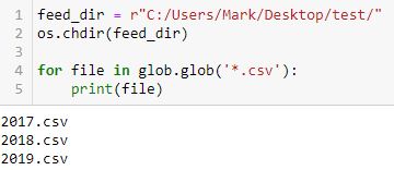
I created a folder “test” on my desktop and placed three Excel .csv files inside: 2017.csv, 2018.csv, and 2019.csv. Note how the filenames print in chronological order. For backtesting purposes, that is exactly what I need to happen.
Functions are a form of modular programming. When defined early in the program, functions may be called by name at multiple points later. I did not create any user-defined functions because I was having trouble conceptualizing how. The backtester does perform repetitive tasks, but loops seems sufficient do the work thus far.
If functions are faster, then it may worth making the change to implement them. As I go through the program more closely and further organize my thoughts,* I will be in a better position to make this assessment.
*—Don’t get me started on variable scope right now.
Time Spread Backtesting 2022 Q1 (Part 5)
Posted by Mark on July 5, 2022 at 06:25 | Last modified: April 15, 2022 15:51I’m in the process of manually backtesting time spreads through 2022 Q1 by entering a new trade every Monday (or Tuesday).
I left off describing the controversy of managing time spreads. Simply with regard to adjustment timing, I have mentioned:
- ROI% thresholds
- Repeating ROI% thresholds if PnL “recovers” (and the need to operationally define that word)
- TD
- Drawdown %
- Using the spread strike prices as adjustment thresholds
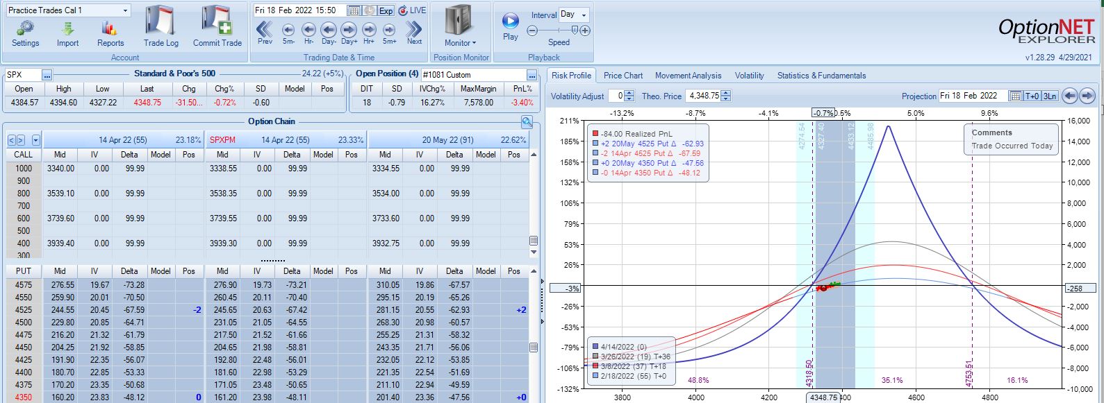
With SPX at 4474, trade #7 begins on 2/7/22 at the 4475 strike for $8,041: TD 46, IV 20.5%, horizontal skew -0.1%, NPV 367, and theta 47. This trade reaches PT on 24 DIT with one adjustment for a gain of 10.4%. Max DD is -12%.
With SPX at 4403, trade #8 begins on 2/14/22 at the 4425 strike for $5,528: TD 25, IV 23.5%, horizontal skew 0.1%, NPV 246, and theta 27. This trade reaches PT on 29 DIT with one adjustment for a gain of 12.4%. Max DD is -10.3%.
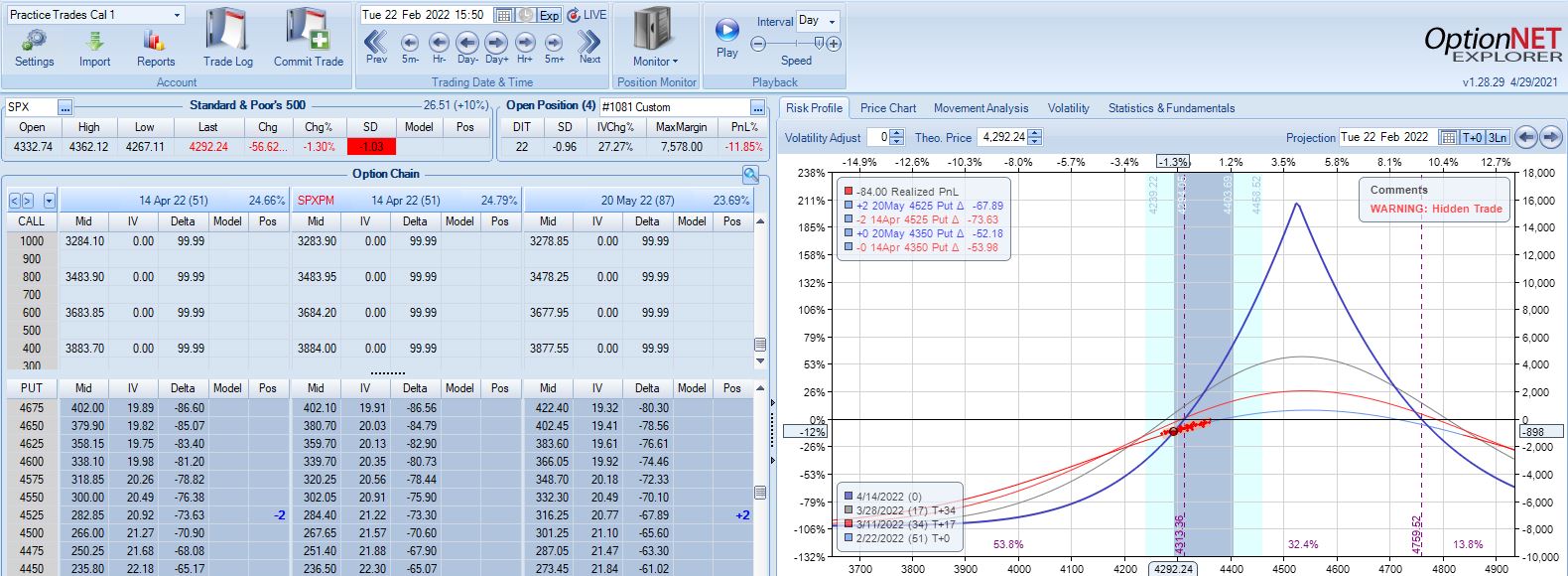
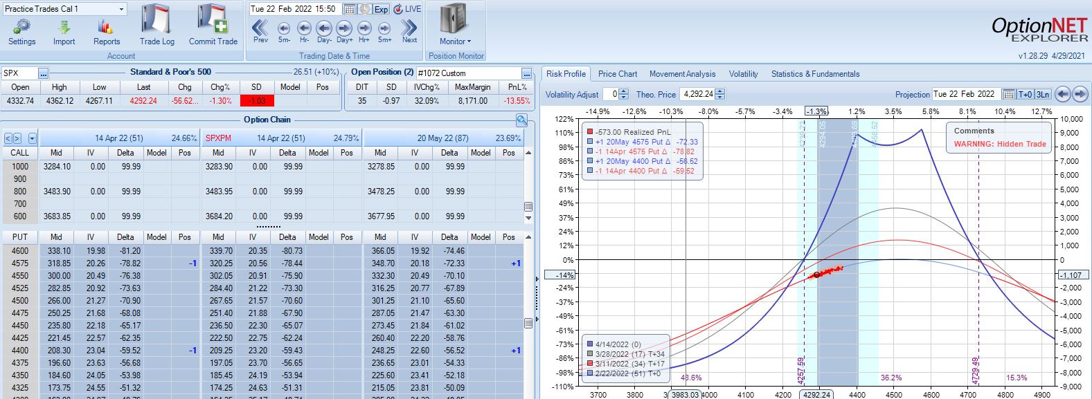
With SPX at 4292, trade #9 begins on 2/22/22 at the 4300 strike for $5,698: TD 37, IV 26.5%, horizontal skew 0.2%, NPV 246, and theta 32. This trade reaches PT on 15 DIT with no adjustments for a gain of 15.0%. Max DD is -3.7%.
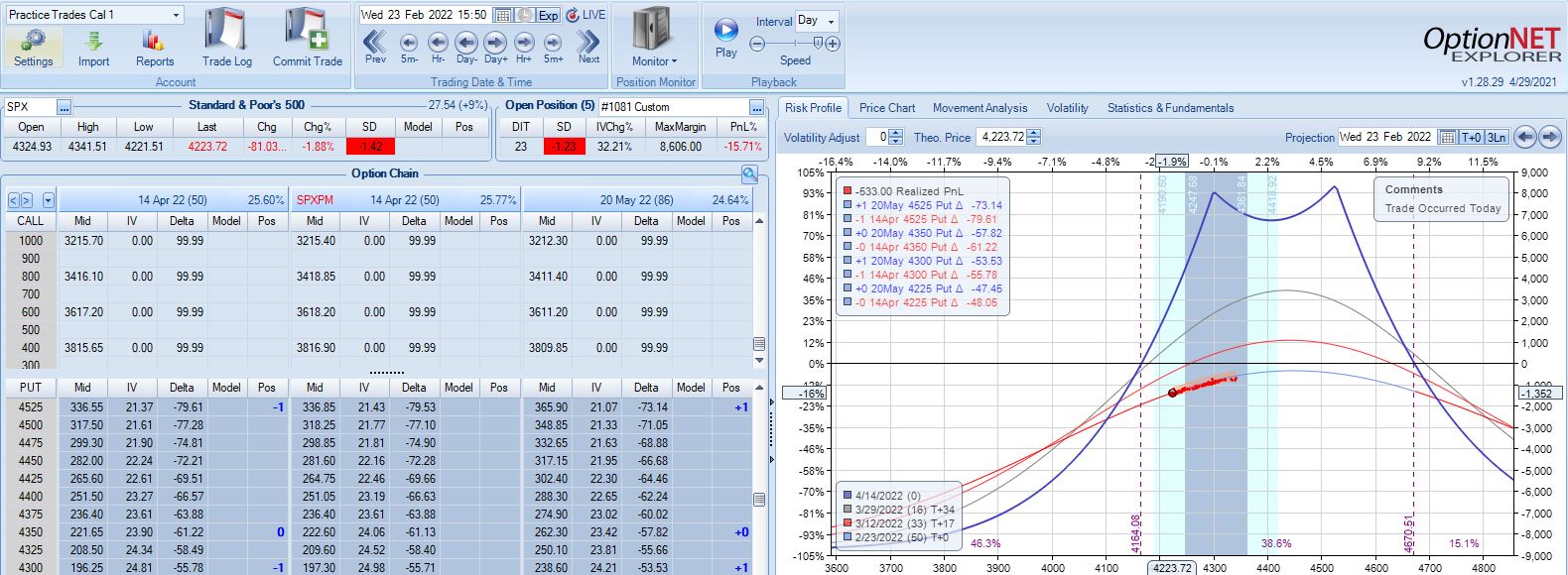
With SPX at 4366, trade #10 begins on 2/28/22 at the 4375 strike for $5,998: TD 37, IV 26.1%, horizontal skew 0.2%, NPV 261, and theta 35. This trade reaches PT on 15 DIT with no adjustments for a gain of 10.7%. Max DD is -3.5%.
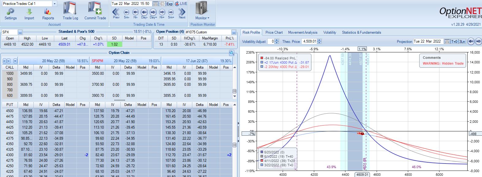
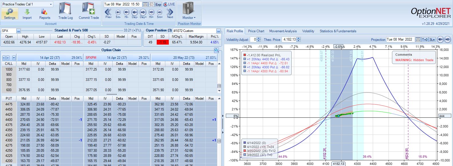
With SPX at 4201, trade #11 begins on 3/7/22 at the 4225 strike for $6,598: TD 37, IV 34.1%, horizontal skew 0.5%, NPV 262, and theta 48.
With SPX up 1.04 SD over 11 days, the first adjustment point is hit with trade down 9%:
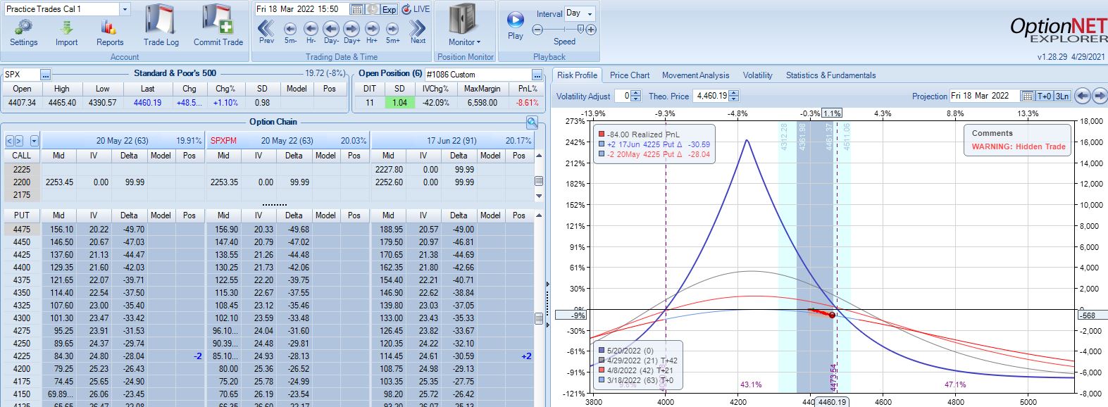
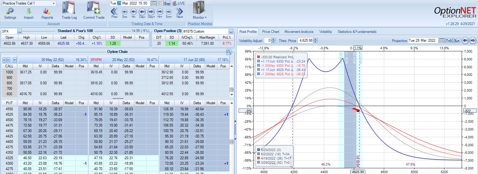
Trade down 13% after 22 DIT, but despite another scary look (see Part 4, first graph) this is not the second adjustment point:
PT is hit two weeks later with a gain of 11.3%. Max DD is the 13% shown above. Unlike trade #6, doing a pre-emptive adjustment this time is followed by max loss two weeks later (-20.1%).
I don’t necessarily think the base strategy is good or better just because trade management matters for trade #11. More than anything else, I feel lucky and I realize that at market pivots, I will feel equally unlucky going through other trades that proceed to lose.
While I await a larger sample size to make any determination about optimal strategy guidelines, I suspect this sort of ambiguity is what is what makes time spreads difficult to trade.
I will continue next time.
Categories: Backtesting | Comments (0) | PermalinkTime Spread Backtesting 2022 Q1 (Part 4)
Posted by Mark on July 1, 2022 at 07:22 | Last modified: April 15, 2022 15:22Today I continue manual backtesting of 2022 Q1 time spreads by entering a new trade every Mon (or Tues in case of holiday).
With SPX at 4403, trade #5 begins on 1/24/22 at the 4425 strike for $7,598: TD 29, IV 25.7%, horizontal skew 0.2%, NPV 334, and theta 43.
Profit target is hit 32 days later with trade up 15.82% and TD 20. Nothing to see here.
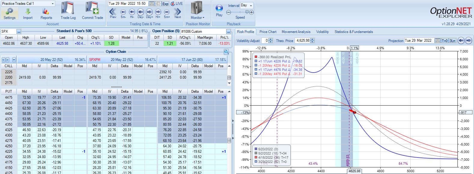
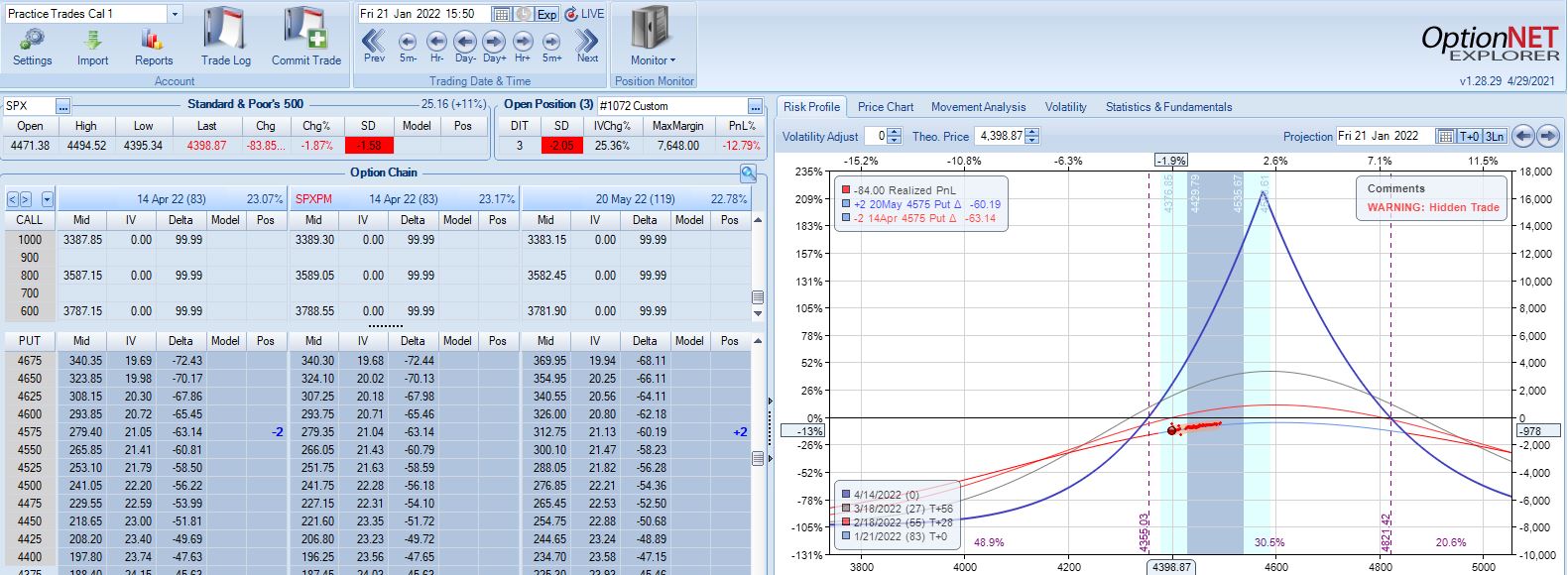
With SPX at 4515, trade #6 begins on 1/31/22 at the 4525 strike for $7,578: TD 32, IV 20.8%, horizontal skew -0.1%, NPV 356, and theta 41.
According to the base strategy, this is not an adjustment point with SPX down 0.79 SD over 18 days:
Trade is only down 3% and TD (not mentioned in base strategy guidelines) = 4. Graphically, expiration breakeven looks close such that another substantial SPX move lower could mean big trouble.
This is exactly what happens the very next trading day with a 1.03 SD selloff. The pre-emptive adjustment just mentioned would have the trade down less than 9% and just under 14% the day after: an even worse selloff at 1.42 SD. The trade would then go on to reach PT with a gain of 14.1% after 30 DIT.
Sticking with the base strategy would put me at an adjustment point the next trading day (22 DIT):
Trade is now down 12% after a 1.03 SD selloff in SPX, which is not as bad as I might have expected. What is somewhat frustrating about adjusting for the first time down 12% is the next adjustment point lingering a mere 2% away.
The lesson here may be to mind the numbers (TD 4 is much better than 1-2) rather than a graph that may not be properly scaled for best interpretation. A holiday separates the two graphs above, too; the extra day of time decay can help PnL.
The very next day (23 DIT), that 1.42 SD selloff puts the trade down 16%:
The base strategy does not address days between adjustments, which means I should adjust on back-to-back days as needed. My gut wants to minimize adjustments because of slippage loss,* and skipping this second adjustment gets me to PT with a gain of 13% after 32 DIT. The risk of skipping the second adjustment is that a big move catapults me well beyond -16% to max loss before a second adjustment can be made.
Adhering to trade guidelines and making adjustments on back-to-back days results in a 10% profit after 37 DIT. For this particular trade, the specifics of management really do not matter.
You can get a sense of why I find time spreads so challenging, though. “The devil’s in the details,” and there are lots of details in which to get lost.
I will continue next time.
* — I need to trade more time spreads to get a feel for how significant this is.
Time Spread Backtesting 2022 Q1 (Part 3)
Posted by Mark on June 28, 2022 at 07:21 | Last modified: April 14, 2022 16:29Today I continue backtesting time spreads on 2022 Q1 in ONE with the base strategy methodology described here.
With SPX at 4281, trade #3 begins on 3/9/22 at the 4300 strike for $6,718: TD 35, IV 30.2%, horizontal skew +0.3%, NPV 270, and theta 44.
The first adjustment point is hit at 13 DIT with trade down 7%:
One week later with trade down 9%, is this the second adjustment point?
The first adjustment was down 7% and trade recovered to -2% but never turned profitable. I didn’t specifically define “recover” in the base strategy guidelines, but in case it means “to profitability” then I should hold off until -14% for a second adjustment even though the graph suggests we may be on the slippery slope already. Without data from a large sample size I don’t necessarily think either way is wrong: I just need to be consistent.
Profit target is hit 15 days later with trade up 10.34%. Position is almost completely delta neutral at that point (TD = 358).
Thus far, I have covered three time spreads in 2022 beginning on Jan 4, Jan 18, and Mar 9. Let’s look at the rest assuming I enter a trade every Monday (or Tuesday in case of holiday).
With SPX at 4661, trade #4 begins on 1/10/22 at the 4675 strike for $6,528: TD 17, IV 14.7%, horizontal skew -0.8%, NPV 294, and theta 24.
On 8 DIT, first adjustment point is hit after a 2.44 SD SPX move lower with trade down 11%:
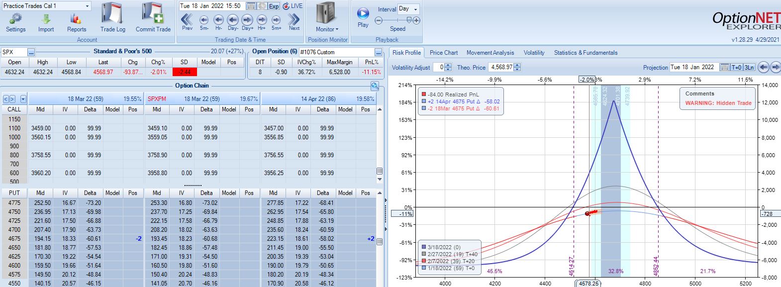
Second adjustment point is hit the very next day with SPX down 36 points and trade down 16%:
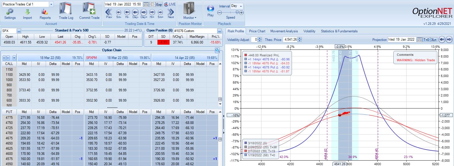
This adjustment is tricky with SPX at 4541 and current strikes at 4675/4575. If I roll to the nearest ITM strike at 4550, then I have spreads only 25 points apart. I could roll to an OTM strike that is at least 75 points away if not more. I could also close the 4675 spread and stick with one spread for now, but despite increasing TD, this also reduces theta ~50%, which could require staying in the trade much longer. One benefit of rolling to cut NPD by a target percentage (see fourth paragraph of Part 2) would be to eliminate this judgment call entirely.
Speaking of spreads only 25 points apart, I often see a recommendation to adjust (roll) time spreads when the underlying price moves beyond a strike. If the strike prices are extremely close, then another adjustment is almost a certainty and I would have to ask why bother even rolling into such a structure at all?
For our purposes here, I will roll to 4500 to leave at least 75 points between time spreads. That feels comfortable to me, but I have no data to support or oppose it.
Max loss is hit two days later on a 1.58 SD SPX move lower with trade down 20.1%. Staying with a market move of -2.2 SD over 11 days is going to be difficult no matter what the guidelines.
I will continue next time.
Categories: Backtesting | Comments (0) | PermalinkTime Spread Backtesting 2022 Q1 (Part 2)
Posted by Mark on June 23, 2022 at 06:52 | Last modified: April 11, 2022 14:23I just got done watching King Richard. Like Venus Williams in the movie, we can’t win them all. We don’t have to win them all, though, to have tremendous success. I think we’ll find this to be true with regard to Q1 2022 time spreads.
With SPX at 4569, trade #2 begins on 1/18/22 at the 4575 strike for $7,648: TD 27, IV 20.1%, horizontal skew -0.4%, NPV 336, and theta 30.
Three trading days later, a 1.58 SD move lower gets us to the first adjustment point down 13%:
Adjustment may be done a couple different ways. Creating the new strike ATM will maximize theta but cut NPD less. Alternatively, I can aim to cut NPD by a target amount (e.g. 50-75%). Placing the new strike farther OTM in this way will boost TD at the cost of a lower position theta, which means more time in the trade in order to hit PT. Whether either is better depends on statistical analysis of a large sample size. That’s precisely why I seek the Python backtester.
This adjustment lasts just over one month until the second adjustment point is reached down 14%:
Moving ahead two weeks, is this the third adjustment point?
Unlike the second adjustment, trade is now up 4.6% with TD = 8.
I generally feel it more important to adjust when down money especially if moving onto the “slippery slope” portion of the T+0 curve. Such is not the case here. Another approach would be to trigger off trade drawdown rather than net PnL%. That is, if trade is up 8% and then falls to +1%, consider adjustment since it now registers a 7% drawdown from +8%. Again, whether any of these are better depends on statistical analysis of a large sample size, which is why I seek the Python backtester.
This particular trade is a winner either way. Without adjusting, PT is hit the very next day (49 DIT). With adjustment, PT is hit six days later. Adjustment costs me five days, but even at 55 days, a 10% profit is over 60% p.a.
I will continue next time.
Categories: Backtesting | Comments (0) | PermalinkTime Spread Backtesting 2022 Q1 (Part 1)
Posted by Mark on June 20, 2022 at 06:41 | Last modified: April 11, 2022 13:09Ironically, while developing a Python backtester over the last few months (e.g. here, here, and here), I have completely gotten away from time spread backtesting. Today, I will revisit the manual backtesting realm by looking at time spreads in the first three months of 2022.
As seen in previous posts on the subject (e.g. here, here, and here), time spreads may be approached in a variety of ways. In the current mini-series, I will address a number of different details and tweaks. Rather than get confused, distracted, and drawn off course by manually backtesting one at a time, my ultimate hope for the Python backtester is to be able to algorithmically run through a large sample size of each variant and compare pros versus cons.
For now, my base strategy is as follows:
- Trade the nearest 25-point put strike ITM with 10% profit target and 20% max loss.
- Place short leg at least 60 DTE with the long leg one month farther out.
- Adjust if down over 7% on max margin by rolling half to the nearest 25-point ITM put strike.
- If trade is down over 14% on max margin, roll most distant spread to nearest 25-point ITM put strike.
- If PnL recovers and heads lower again, watch for -7% and -14% as subsequent adjustment points.
- To account for slippage and commissions, a $21/contract fee will be assessed.
- Exit no later than 21 DTE.
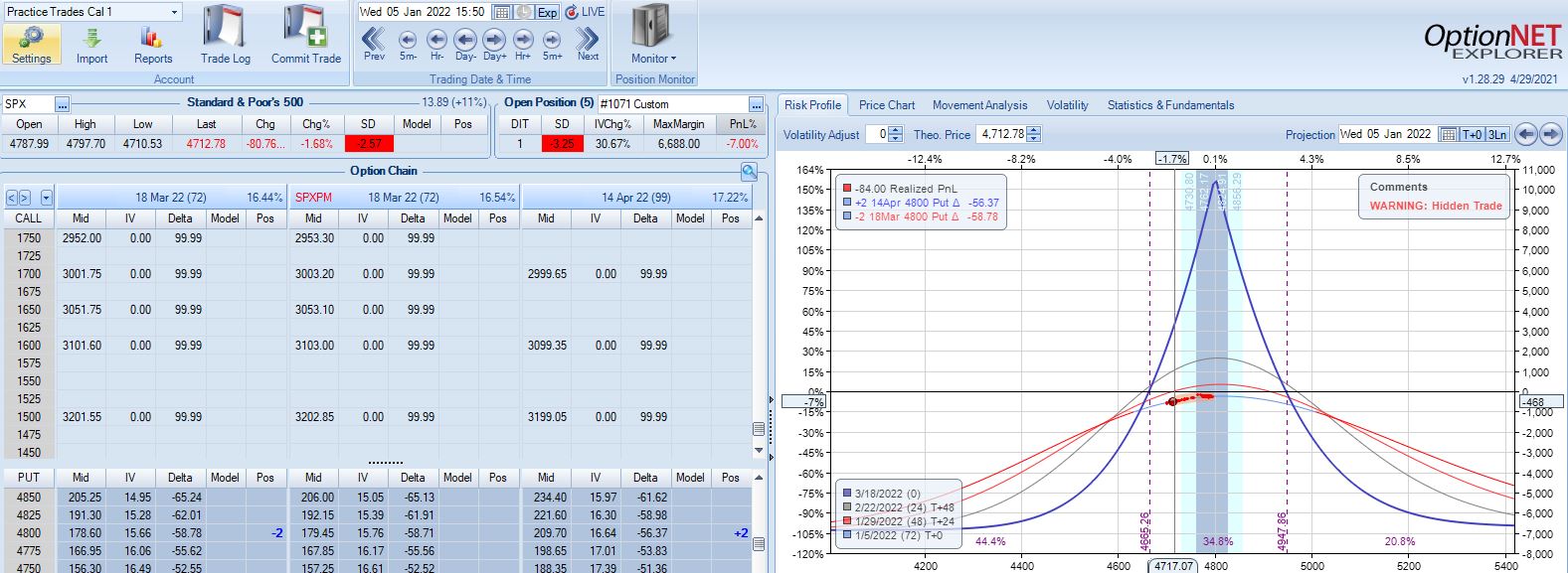
With SPX at 4799, the first trade begins on 1/4/22 at the 4800 strike for $6,688: TD 20, IV 10.6%, horizontal skew -1.1%, NPV 291, and theta 15.6.
The very next trading day, a 2.57 SD move down brings us to the first adjustment point with PnL -7%:
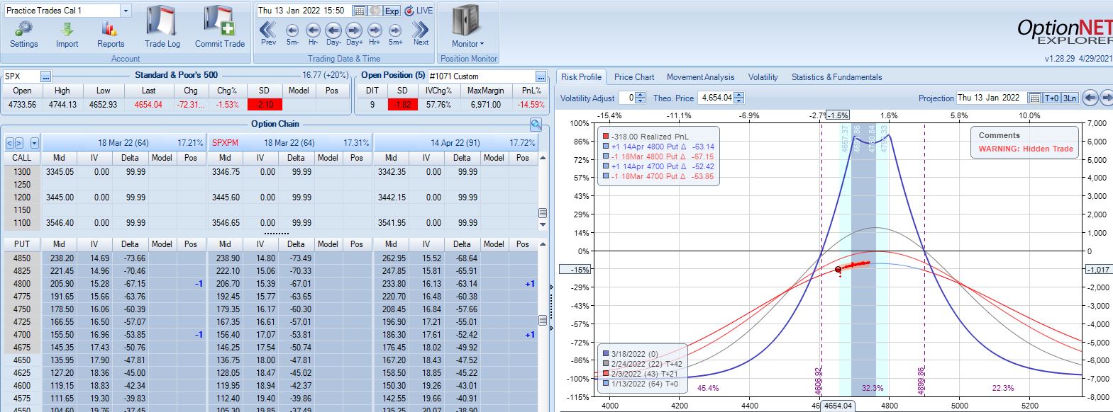
A 2.10 SD move down eight days later brings us to the second adjustment point with PnL -15%:
Max loss is hit five days later on a 2.44 SD move lower:
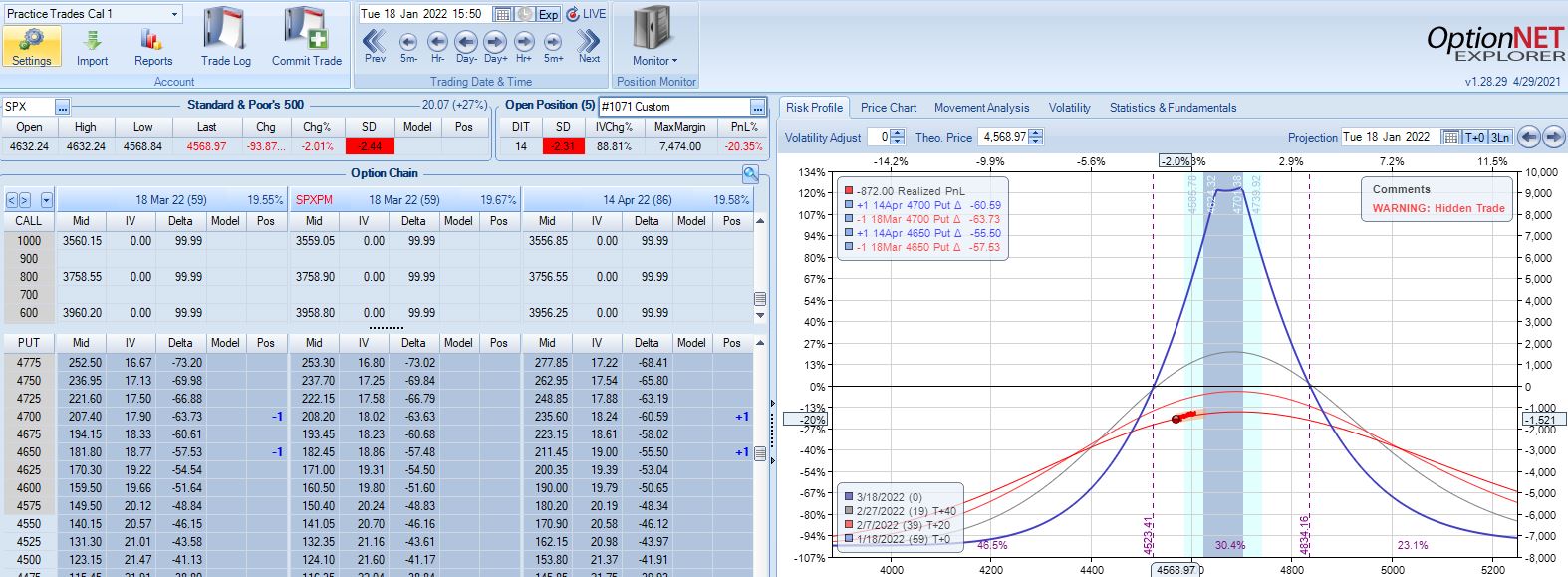
SPX cratering 2.31 SD in 14 days has resulted in a loss of 20.4%. Tough to overcome that! Although horizontal skew increases, it still remains negative while IV spikes ~90%. This suggests IV increase as a partial hedge in this trade.
I will continue next time.
Categories: Backtesting | Comments (0) | Permalink