Backtester Logic (Part 5)
Posted by Mark on August 29, 2022 at 07:14 | Last modified: June 22, 2022 08:34Today I continue to dissect the conditional skeleton of the find_long branch shown near the bottom of Part 4.
L70 – L72 includes eight data type conversions. Early on, I was frustrated with unnecessary decimal output. To fix this, I tried converting applicable fields to data type ‘int'[eger] and some resulted in an error. Doing int(float()) was a successful workaround. I should revisit to see if the readability of output is improved enough to justify the added processing. For curiosity’s sake, I can add a timer to the program and check speed.
L70 filters options by DTE. I can make this more readable by creating two variables for lower and upper bounds followed by one if statement that calls for the variable to fall in between.
As mentioned above, I could add a timer to the program to see if this helps, but I don’t want to get bogged down with repetitive time measurements. If the backtester works, then I’m fine whether it takes 10 minutes 34 seconds or 12 minutes 28 seconds. Either way, I’ll be happy to get the results and spend the bulk of my efforts analyzing those.
Before the program calls for iterating through the data files, I have:
> mte = int(input(‘Enter minimum (>= 2) months (1 mo = 30 days) to long option expiration: ‘))
Suppose I enter 2. At L70, the backtester will search for > 2 * 30 = 60 DTE. This is clear as the lower bound.
The upper bound is more complex because every quarter we get five weeks between consecutive expiration months rather than four. 92 DTE will meet the criteria and be correct only when 92 – 28 = 64 DTE does not follow in the current expiration. Data files are organized from highest to lowest DTE (see Part 1). With the goal to maximize efficiency by having the backtester going through the files once, I can’t have it iterating down and then having to go back up if what it finds below is not a match.
Thankfully, it doesn’t have to be that complicated.
The solution is to select and encode the first passing option but wait to leave the find_long branch until DTE changes. The program can then test whether the subsequent DTE also meets the criteria. If so, dump the values from the former and search for a new match. Otherwise, use the former. Switch to the find_short branch once this is all done.
If the first option meeting the criteria is less than 60 + 28 = 88 DTE, then no circumstance exists where the next DTE to appear will pass. In that case, no second check is even needed.
I will continue next time.
Categories: Python | Comments (0) | PermalinkLessons on Twinx()
Posted by Mark on August 26, 2022 at 06:48 | Last modified: May 17, 2022 15:57I spent the whole day yesterday trying to figure out why I got overlapping axis labels on a secondary axis for my graph. I want to document what I’ve learned about the twinx() function.
Let’s start by creating a df:
Now, I’m going to add two lines. Spread price will be in red and SPX price will be in blue:
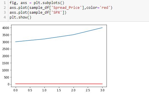
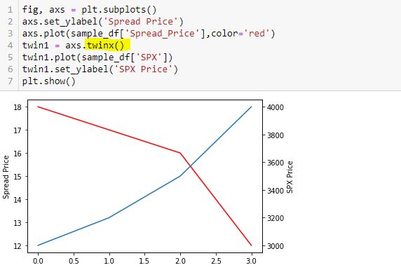
This doesn’t work very well. In order for the y-axis to accommodate both, the spread price looks horizontal since its changes are so small relative to the magnitude of SPX price.
To fix this, I will create a secondary y-axis on the right side:
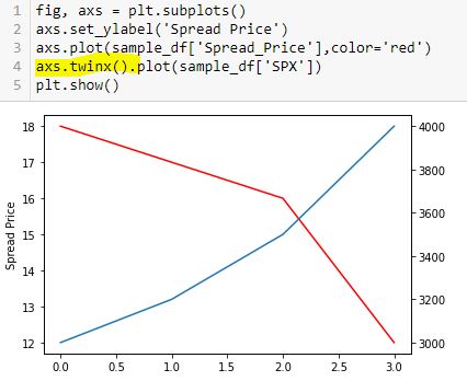
Now, I label the right y-axis:
Whoa! This generates an overlapping set of y-axis labels on the right going from 0.0 to 1.0. What happened?
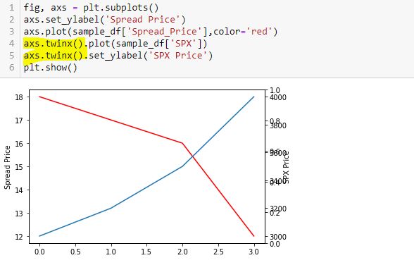
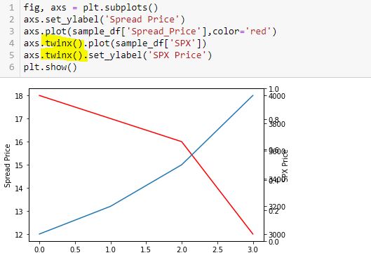
Here is a correct way to do this:
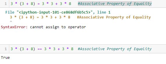
Thinking substitution is what confused me. I saw this solution online but got confused because I interpreted L5-L6 as substitution from L4 and had trouble wrapping my mind around it. I therefore chose to do it the long way:
This is not the way Python works. Python is not algebra.
Had I questioned this [which I didn’t], I could have verified with a truth test:
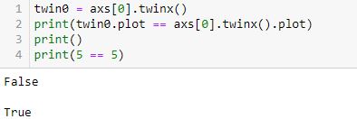
L2 is False (unlike L4, which is obviously True).
twinx() creates a new y-axis each time it is called. Calling more than two can lead to the overlapping labels.
Furthermore, a function or method like twinx gets called each time the function/method name is followed by (). When you see “name()”, you are seeing a function/method call. This is not something I ever read in documentation or in Python articles. To me, this most definitely is not obvious. The third and fourth code snippet above include twinx() once and twice, respectively. This is why the fourth has an overlapping y-axis. The fifth code snippet has twinx() just once: no problem.
Anytime I see a single equals sign, it might help to think “is assigned to.” The variable will retain said value until something dictates otherwise. No substitution is taking place and no properties of equality necessarily apply.
Once more for emphasis:
Backtester Logic (Part 4)
Posted by Mark on August 23, 2022 at 06:34 | Last modified: June 22, 2022 08:34I left off tracing the logic of current_date through the backtesting program to better understand its mechanics. The question at hand: how much of a problem is it that current_date is not assigned in the find_short branch?
Assignment of control_flag (see key) to update_long just before the second conditional block of find_short concludes with a continue statement is our savior. Although rows with the same historical date will not be skipped, the update_long logic prevents any of them from being encoded. Unfortunately, while acceptable as written, this may not be as efficient as using current_date. I will discuss both of these factors later.
The update_long branch is relatively brief, but it does assign historical date to current_date thereby allowing the wait_until_next_day flag to work properly.
Like find_short, the update_short branch begins by checking to see if historical date differs from trade_date. I coded for an exception to be raised in this case because it should only occur when one leg of the spread has not been detected—preumably due to a flawed (incomplete) data file. Also like find_short, update_short has two conditional blocks. At the end of the second block, wait_until_next_day is set to True. This can work because current_date was updated (prevous paragraph).
I have given some thought as to whether the two if blocks can be written as if-elif or if-else. In order to answer this, I need to take a closer look at the conditionals.
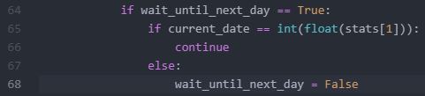
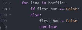
Here is the conditional skeleton of the find_long branch:

Right off the bat, I see that L71 is duplicated in L72. I’ll remove one.
Going from most to least restrictive may be the most efficient way to do these nested conditionals. In the fourth-to-last paragraph here, I discussed usage of only 0.4% total rows in the data file. Consider the following hypothetical example:
- Data file has 1,000 rows of which 4 (0.4%) will ultimately be used.
- 50, 100, and 200 rows meet the A, B, and C criteria, respectively.
- Compare nested conditionals “if A then if B then if C…” (Case 1) vs. “If C then if B then if A…” (Case 2).
- All 1,000 rows get evaluated by each Case.
- Case 1 leaves only 50 rows to be evaluated after the first truth test vs. 200 for Case 2 and Case 2 likely has more rows still left to be evaluated going into the final truth test.
- Case 1 is more efficient.
All else being equal, this makes sense to me.
Other mitigating factors may exist, though, like number of variables involved in the evaluation, data types, etc. In trying to apply this rationale to the code snippet above, I may be overthinking something that I can’t fully understand at this point in my Python journey.
I will continue next time.
Categories: Python | Comments (0) | PermalinkTime Spread Backtesting 2022 Q1 (Part 8)
Posted by Mark on August 18, 2022 at 06:40 | Last modified: May 18, 2022 14:17I will begin today by finishing up the backtesting of trade #12 from 3/14/22.
The next day is 21 DTE when I am forced to exit for a loss of 16.5%. Over 46 days, SPX is down only -0.09 SD, which is surely frustrating as a sideways market should be a perfect scenario to profit with this strategy. I am denied by an outsized (2.91 SD) move on the final trading day. Being down a reasonable amount only to be stuck with max loss at the last possible moment will leave an emotional scar. If I can’t handle that, then I really need to consider the preventative guideline from the second-to-last paragraph of Part 7 because the most important thing of all is staying in the game to enter the next trade.
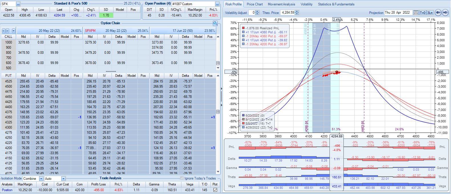
One other thing I notice with regard to trade #12’s third adjustment is margin expansion. The later the adjustment, the more expensive it will be. As I try to err on the side of conservativism, position sizing is based on the largest margin requirement (MR) seen in any trade (see second-to-last paragraph here) plus a fudge factor (second paragraph here) since I assume the worst is always to come. This third adjustment—in the final week of the trade—increases MR from $7,964 to $10,252: an increase of about 29%! The first two adjustments combined only increased MR by 13%.
The drastic MR expansion will dilute results for the entire backtest/strategy, which makes it somewhat contentious. To be safe, I would calculate backtesting results on 2x largest MR ever seen. If I position size as a fixed percentage of account value (allows for compounding), then I would position size based on a % margin expansion from initial. For example, if the greatest historical MR expansion ever seen was 30%, then maybe I prepare for 60% when entering the trade.
With SPX at 4454, trade #13 begins on 3/21/22 at the 4475 strike for $6,888: TD 23, IV 20.0%, horizontal skew -0.4%, NPV 304, and theta 39.
Profit target is hit 15 days later with trade up 11.8% and TD 21. After such a complex trade #12, this one is easy.
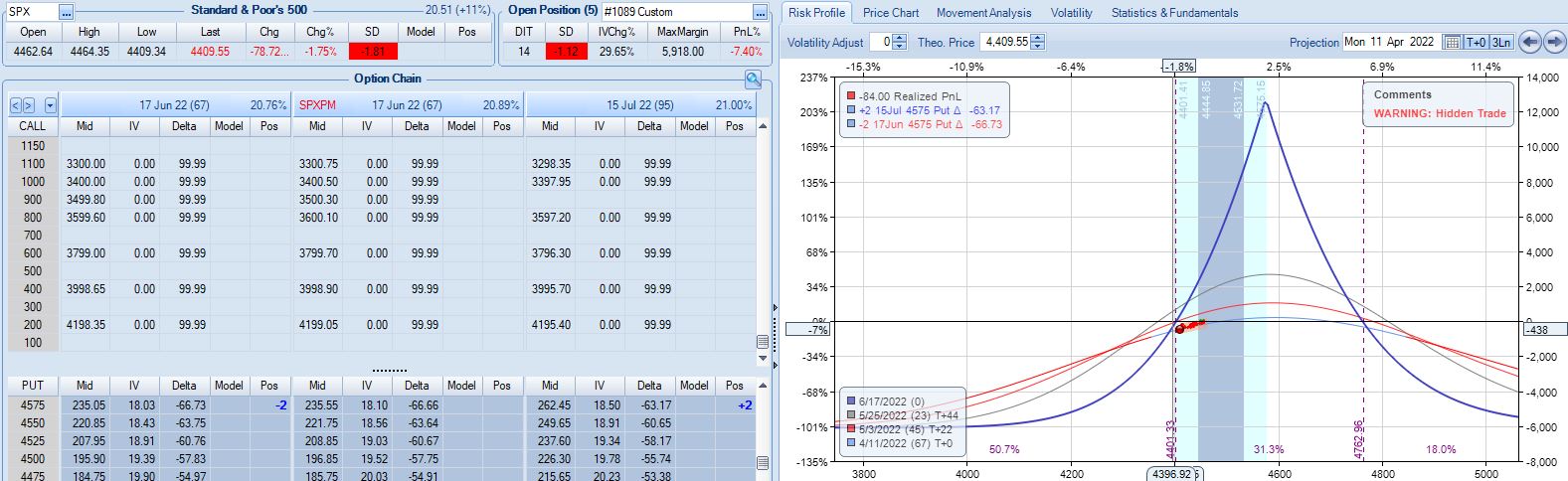
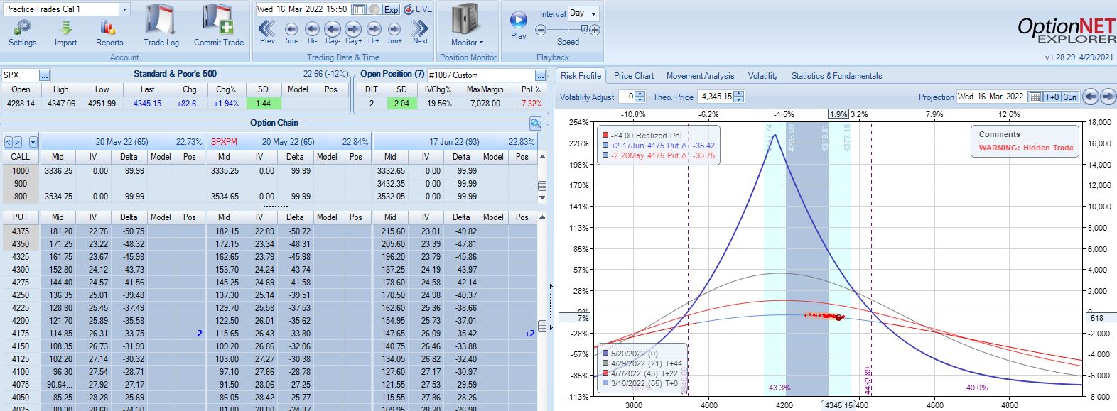
With SPX at 4568, trade #14 begins on 3/28/22 at the 4575 strike for $5,918: TD 25, IV 15.8%, horizontal skew -0.4%, NPV 274, and theta 24.
On 67 DTE with SPX down 1.81 SD, the first adjustment point is reached:
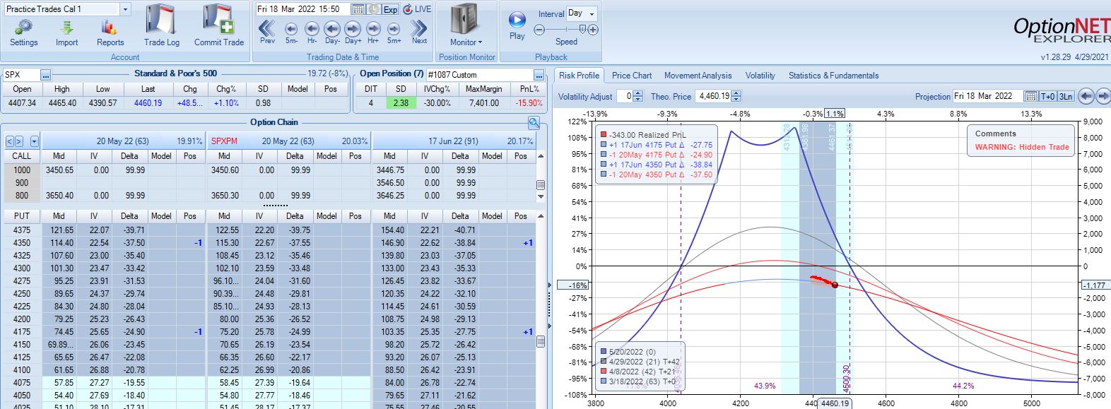
On 56 DTE, SPX is down 2.50 SD and the second adjustment point is hit:
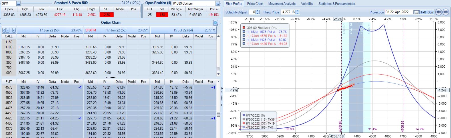
Despite being down no more than 10% before, the trade is now down 19.2% after this huge move. With regard to adjustment, I’m now up against max loss as discussed in the fourth paragraph of Part 6.
I will continue next time.
Categories: Backtesting | Comments (0) | PermalinkBacktester Logic (Part 3)
Posted by Mark on August 15, 2022 at 06:49 | Last modified: June 22, 2022 08:34I included a code snippet in Part 2 to explain how the wait_until_next_day flag is used in the early stages of the backtesting program. I mentioned that once the short option is addressed (either via finding long/short branches or updating long/short branches), the program should skip ahead in the data file to the next historical date.* This begs the question as to where in the program current_date gets assigned. Today I will take a closer look to better understand this.
The find_long branch (see control_flag here) assigns a value to trade_date. Do I need this in addition to current_date? I created trade_date to mark trade entry dates and on trade entry dates, the two are indeed identical. I could possibly use just current_date, eliminate trade_date, and add some lines to do right here with the former what I ultimately do with the latter. This is worthy of consideration and would eliminate what may be problematic below.
The find_short branch has two conditional blocks—the first of which checks to see if historical date differs from trade_date. This could only occur if one leg of the spread is found, which implies a flaw in the data file. In this case, trade_date is added to missing_s_s_p_dict, control_flag (branch) is changed to find_long, and a continue statement returns the program to the top of the loop where next iteration (row of data file) begins. The process of finding a new trade commences immediately because wait_until_next_day remains False.
The other conditional block in the find_short branch includes a check to make sure historical date equals trade_date. This seems redundant since the first conditional block establishes them to be different. I could probably do one if-elif block instead of two if blocks since the logic surrounding date is mutually exclusive. This may or may not be more efficient, but this second conditional block also has some additional logic designed to locate the short option—additional logic that, as above, could pose a problem if the data file is flawed.
At the end of this second conditional block, wait_until_next_day is set to True but current_date is not assigned. This seems problematic because L66 (see Part 2) will be bypassed, wait_until_next_day will be reset to False, and the flag will basically fail as rows with the same historical date will be subsequently evaluated rather than skipped. Remember, for the sake of efficiency, every trading day should include either finding or updating: not both. How much does this matter?
I will continue next time.
*—Historical date is a column of the data file corresponding to a particular trading day.
Time Spread Backtesting 2022 Q1 (Part 7)
Posted by Mark on August 12, 2022 at 07:14 | Last modified: May 2, 2022 13:49I left off backtesting trade #12 from 3/14/22 with the base strategy shown here.
After the second adjustment, SPX peaks 11 days later at 4626 with position looking like this:
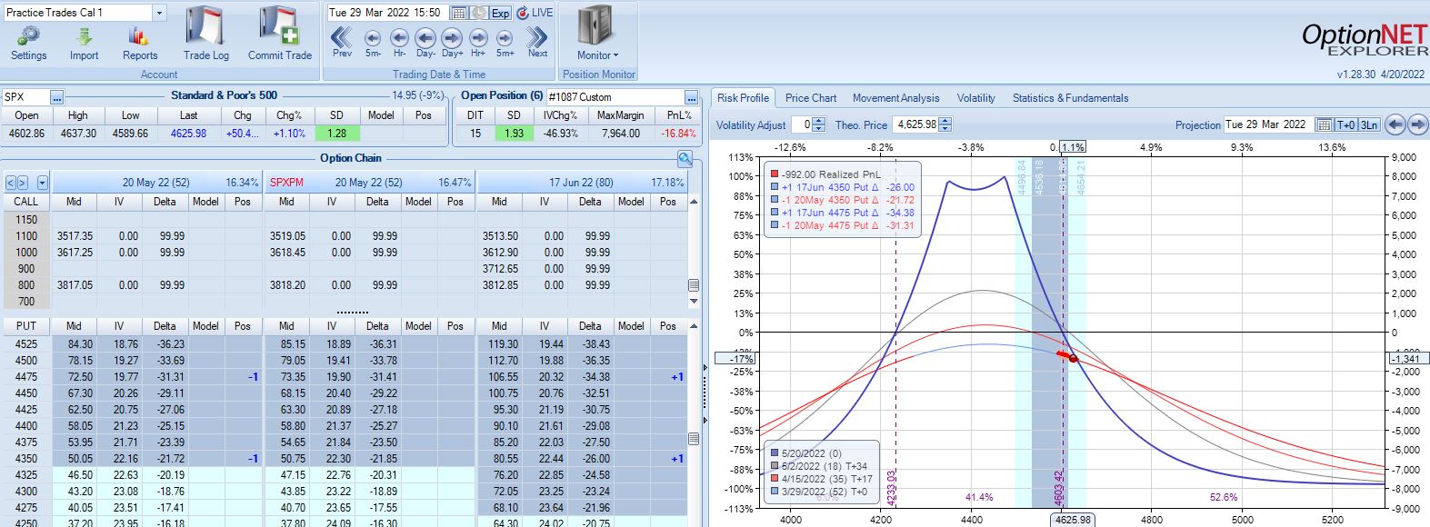
SPX is up 1.93 SD in 15 days and the trade is down 16.9%. The risk graph looks scary, but TD is still 4. Furthermore, having already adjusted twice I have nothing left to do according to the base strategy except wait another day.
On 28 DIT, SPX is in the middle of the expiration tent with trade up 1%.
On 38 DIT, SPX is again near the middle of the expiration tent with trade up 8%.
Three trading days plus a weekend later (24 DTE), the market has collapsed with Avg IV soaring from 19.3% to 28.9%:
This is an adjustment point since the trade had recovered to profitability since the last adjustment.
In live trading, I’d have a tough time adjusting here knowing my exit is three days away. This is a good example of the second deadline discussed in Part 6. I could exit without adjusting and take the big loss, which would still be better than the market going against me [big] again sticking me with an even larger loss.
Anytime I’m staring a big loss in the face, I need to realize it’s just one trade. This is also a big whipsaw (adjusted twice on the way up and then a third time on the way back down). Such whipsaws do not seem to happen often.* Accepting a big loss may be easier when realizing how unusual the situation is to cause it.
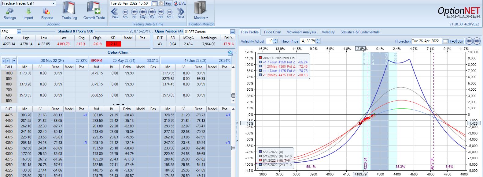
Two trading days later at 22 DTE, I find myself in another challenging spot:
Nothing in the base strategy tells me to exit now, but should I consider it given the way this trade has progressed? It’s hard to say without any data. I am fortunate to be down only 5% with one day remaining after being down 15% twice.** If trading systematically based on a large sample size then I should stick with the guidelines. In all my Q1 2022 backtesting, this is the only trade that has been adjusted three times so finding a large sample size of similar cases may prove difficult.
This particular trade has given me lots to consider! I will finish discussing it next time.
*—If I wanted to add a whipsaw-preventing guideline (or test to see how often this occurs), I could plan
to exit at the center or opposite end of the expiration tent after an adjustment is made.
**—The relevant exit criterion to be tested would be something like “if down more than X% at any point,
lower profit target from 10% to Y%.” Another could be “if under 28 DTE, lower profit target to Z%.”
Backtester Logic (Part 2)
Posted by Mark on August 9, 2022 at 07:11 | Last modified: June 22, 2022 08:34Last time, I discussed a plan to iterate through data files in [what I think is] an efficient manner by encoding elements only when proper criteria are met. Today I will continue discussing general mechanics of the backtesting program.
While the logic for trade selection depends on strategy details, the overall approach is dictated by the data files. The program should ideally go through the data files just once. Since the files are primarily sorted by historical date and secondarily by DTE, in going from top to bottom the backtester needs to progress through trades from beginning to end and through positions from highest to lowest DTE. This means addressing the long leg of a time spread first as it has a higher DTE.
Finding the long and short options are separate tasks from updating long and short options once selected. When finding, the backtester needs to follow trade entry guidelines. When updating, the backtester needs to locate previously-selected options and evaluate exit criteria to determine whether the trade will continue. I therefore have four branches of program flow: find_long, find_short, update_long, and update_short.
Going back to my post on modular programming, I could conceivably create functions out of the four branches of program flow. Two out of these four code snippets are executed on each historical date because opening and updating a trade are mutually exclusive. I do not see a reason to make functions for this since the program lacks repetitive code.*
Whether finding or updating, once the short option has been addressed the backtester can move forward with calculating position parameters and printing to the results file. For example, in order to calculate P_price = L_price – S_price (see key here), the program needs to complete the find_long / find_short or update_long / update_short branches since the position is a sum of two parts. One row will then be printed to the results file showing trade_status (reviewed in previous link), parameters, and trade statistics.
Since every trading day involves either finding or updating, once the short option has been addressed any remaining rows in the data file with the same historical date may be skipped. For that purpose, I added the wait_until_next_day flag. This is initially set to False and gets toggled to True as needed. Near the beginning of the program, I have:
If the flag is True, then the continue statement will return the program to the top where the next iteration (row of the .csv file) begins. This will repeat until the date has advanced at which point the flag will be reset to False.
To complete our understanding of this matter, I need to analyze where current_date is assigned.
I will continue with that next time.
*—Resetting variables is the one exception I still need to discuss.
Time Spread Backtesting 2022 Q1 (Part 6)
Posted by Mark on August 4, 2022 at 06:39 | Last modified: May 2, 2022 10:31Before continuing the manual backtesting of 2022 Q1 time spreads by entering a new trade every Monday (or Tuesday), I want to discuss alternatives to avoid scary-looking graphs (see last post) and cumbersome deadlines.
Scary-looking risk graphs can be mitigated by early adjustment. TD = 3 in the lower graph of Part 5. Perhaps I plan to adjust when TD falls to 3 or less. I used this sort of methodology when backtesting time spreads through the COVID-19 crash. Another alternative, as mentioned in Part 3, is to adjust when above (below) the upper (lower) strike price. To keep adjustment frequency reasonable in this case, I should maintain a minimum distance between the two spreads.
In staying with the ROI%-based adjustment approach, something I can do to limit adjustment frequency is to adjust once rather than twice between trade inception and max loss. The base strategy looks to adjust at -7% and again at -14%. I could adjust only once at -10% and subsequently exit at max loss, profit target, or time stop.
I’ve noticed two types of time spread deadlines that can make for uncomfortable judgment calls. The first is proximity to max loss. When at an adjustment point, if a small market move can still force max loss then I question doing the adjustment at all. For example, why adjust down 17% if max loss lurks -3% away? Even -14% can be questionable because if down just under that one day, I can be down -17% the next, which puts me in the same contentious predicament.
A second awkward deadline I may face is the time stop. Base strategy calls for an exit no later than 21 DTE. Adjustments require time to recoup the transaction fees. At what point does adjustment no longer make sense because soon after the trade will be ending anyway? Rather than adjust at, say, 23 DTE, I could close a bit early in favor of a farther-out spread. Such a condition was not included in the base strategy guidelines but may be worth studying.*
Let’s continue with the backtesting.
Moving forward through 2022 Q3 with SPX at 4168, trade #12 begins on 3/14/22 at the 4175 strike for $7,078: TD 46, IV 28.2%, horizontal skew 0.3%, NPV 270, and theta 50.
First adjustment point is hit two days later with trade down 7%:
Second adjustment point is hit two days after that. SPX is up 2.38 SD in four days with trade down 16%:
I will continue next time.
*—Aside from varying the drop-dead adjustment DTE, I am also interested to see what happens if
the position is always rolled out at adjustment points whenever the front month is under 60 DTE.
Backtester Logic (Part 1)
Posted by Mark on August 1, 2022 at 07:26 | Last modified: June 22, 2022 08:34Now that I have gone over the modules and variables used by the backtester, I will discuss processing of data files.
My partner (second paragraph here) has done some preprocessing by removing rows pertaining to calls, weekly options, deepest ITM and deepest OTM puts, and by removing other unused columns. Each row is a quote for one option with greeks and IV. I tend to forget that I am not looking at complete data files.
As the backtester scans down rows, option quotes are processed from chronologically ordered dates. Each date is organized from highest to lowest DTE, and each DTE is organized from lowest to highest strike price.
My partner had given some thought to building a database but decided to stick with the .csv files. Although I did take some DataCamp mini-courses on databases and SQL, I feel this is mostly over my head. I trust his judgment.
I believe the program will be most efficient (fastest) if it collects all necessary data from each row in a single pass. I can imagine other approaches that would require multiple runs through the data files (or portions therein). As backtester development progresses (e.g. overlapping positions), I will probably have to give this further thought.
The first row and column of the .csv file are not used. The backtester iterates down the rows and encodes data from respective columns when necessary. The first column is never called. Dealing with the first row—a string header with no numbers—requires an explicit bypass. It could raise an exception since the program evaluates numbers. The bypass is accomplished by the first_bar flag (initially set to True) and an outer loop condition:
The first iteration will set the flag to False and skip everything between L58 and L208. The bulk of the program will then apply to the second iteration and beyond.
To maximize efficiency, the backtester should encode as little as possible because most rows are extraneous. Backtesting a time spread strategy that is always in the market with nonoverlapping positions requires monitoring 2 options/day * ~252 trading days/year = 504 rows. My 2015 data file has ~120,000 rows, which means just over 0.4% of the rows are needed.
I will therefore avoid encoding option price, IV, and greeks data unless all criteria are met to identify needed rows.
A row is needed if it has a target strike price and expiration month on a particular date but once again, in the interest of efficiency the backtester need not encode three elements for every row. It can first encode and evaluate the date, then encode and evaluate the expiration month, and finally encode and evaluate the strike price. Each piece of information need be encoded only if the previous is a match. Nested loops seem like a natural fit.
I will continue next time.
Categories: Python | Comments (0) | PermalinkCoffee with Professional Commodity Trader (Part 4)
Posted by Mark on July 29, 2022 at 06:55 | Last modified: April 22, 2022 12:09The sunburn has finally healed after nearly two hours outdoors enjoying a Caramel Frappuccino and conversation with our professional commodity trader NK. Today I will wrap up the miscellaneous notes and talk briefly about future directions.
- One of NK’s big concerns is the market activity of March 2020. I refreshed his memory on the COVID-19 market crash (~35%) a couple years ago and asked why he might expect another crash anytime soon. The quick rebound is what scares him. The Fed came to the rescue, which only furthers belief that the stock market cannot go down in a big way. This belief is like playing with fire because nothing is guaranteed and should the Fed not act dovish we could end up with a lasting, catastrophic decline at some future date.
- NK can work remotely but likes the opportunity to go into the office to share ideas and to see other people.
- NK is a proponent of buying OTM VIX futures—maybe even closer to expiration as opposed to farther out—as a hedge for the overall portfolio.
- NK acts in a broker (agent, perhaps?) capacity for clients—some of whom don’t have the faintest idea about how to place a trade. They pay full service $60-$80 commissions, but it may be well worth it for clients who might otherwise make a mistake and lose many times more as a result.
- NK doesn’t trade client accounts in a discretionary manner where they may not know what his strategy is. Rather, clients usually call with something particular they wish to accomplish (e.g. hedging product) or to get advice on devising a strategy that will match their personal market outlook.
Because incorporating and sticking with new trading strategies has proven to be a herculean task for me, in order to make this discussion useful I should aim to start with something small. To this end, tasks I will ultimately need to complete include:
- Learning the symbols for new futures markets.
- Learning the multipliers and “futures math” for new futures [options] markets.
- Gaining a sense of familiarity for the charts.
- Looking at COT reports weekly.
- Learning the margin requirements and commission structure for futures [options] trading.
- Looking around for futures brokerages in case others may offer a better package than what I currently receive.
- Looking around for futures market data providers.
- Backtesting the new futures markets.
While I have brainstormed everything I can think of at the present moment, I repeat that my goal is really to do one [or two] per week [or month]. “Start small” and “look for continuous improvement” are mantras by which I try to live.
And because I will probably need the accountability of this blog to stay on track, I will probably be keeping you posted!
Categories: About Me, Networking | Comments (0) | Permalink