Short Premium Research Dissection (Part 36)
Posted by Mark on June 24, 2019 at 07:10 | Last modified: January 2, 2019 11:17Picking up right where we left off, our author gives the following [partial] methodology for her next study:
> Expiration: standard monthly cycle closest to 60 (no less than 50) DTE
> Entry: day after previous trade closed
> Sizing: one contract
> Management 1: Hold to expiration
> Management 2: Exit after 30 days in trade (10 DIT)
I think this should be “30 DIT.” The proofreader fell asleep (like third-to-last paragraph here).
Here is “hypothetical portfolio growth graph” #15:
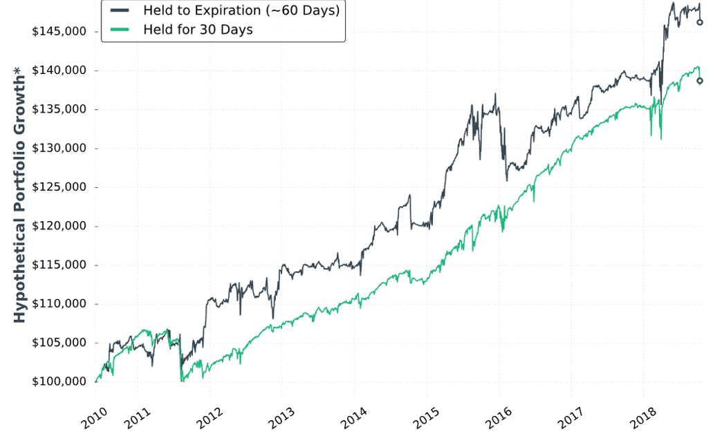
The two curves look different; a [inferential] statistical test would be necessary to quantify this.
She concludes the time stop results in smoother performance and smaller drawdowns. Once again, I’d like this quantified (e.g. the standard battery). I’d also like a backtest of daily trades (rather than non-overlapping) for more robust statistics.
Next, she adds delta stops:
> Management 1: Hold for 30 days (30 DIT)
> Management 2: Exit when short call delta hits +0.60 OR the short put delta hits -0.60
> Management 3: Exit when short call delta hits +0.70 OR the short put delta hits -0.70
I like the idea of a downside stop, but I question the upside stop. With an embedded PCS, we are already protected from heavy upside losses. She does not test downside stop only.
Here is “hypothetical portfolio growth” graph #16:
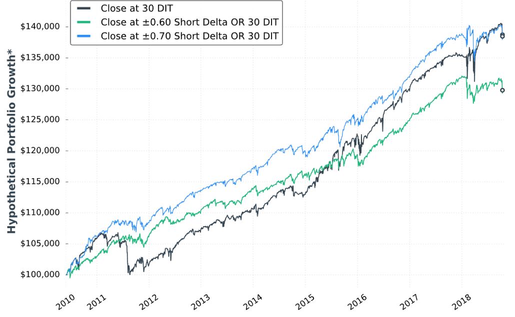
The blue curve finishes at the top and is ahead throughout. The black curve finishes on top of the green, but only leads the green for roughly half the time. Inferential statistics would help to identify real differences.
Thankfully, each of the last two graphs are presented with that “hypothetical computer simulated performance” disclaimer (see second paragraph below graph in Part 34).
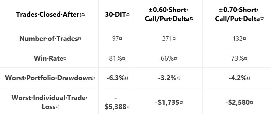
Here are selected statistics for graph #16:
As discussed in the second-to-last paragraph here, percentages are not useful on a graph without allocation. I think relative percentages can be compared, however, when derived on the same allocation-less backdrop.
Unfortunately, we have no context with which to compare total return. As mentioned above, we’re lacking the standard battery (second paragraph) and complement of statistics for daily trades.
As with Part 34, other glaring table omissions include average DIT (to understand impact of delta stops), and PnL per day.
Transaction fees (TF) could adversely affect the delta-stop groups because they include more trades. Our author now mentions fees for the first time:
> …many more trades are made… [with] delta-based exit… we need to
> be considerate of commissions… [At] $1/contract, the ±0.60 delta exit
> would… [generate] $2,168 commissions… if you trade with tastyworks,
> the commission-impact of the strategy could be substantially less…
Unfortunately, she mentions fees only to give a brokerage commercial. Her affiliation with the brokerage is clear because she offers the research report free if you open an account with them. In and of itself, this conflict of interest would constitute a fatal flaw for some.
Discussing commissions but not slippage is sloppy and suspect. It is sloppy because as a percentage of total TF, slippage is much larger than commissions. It is suspect because neither is factored into the backtesting, which makes results look deceptively good.
Thus ends another sub-section with nothing definitive accomplished. She may or may not include time- or delta-based stops in the final system and if she does, then she has once again failed to provide any conclusive backing for either (also see third paragraph below first excerpt here).
Categories: System Development | Comments (0) | Permalink