Short Premium Research Dissection (Part 34)
Posted by Mark on June 18, 2019 at 07:00 | Last modified: December 31, 2018 13:29Continuing with exploration of time stops, our author gives us hypothetical portfolio growth graph #15:
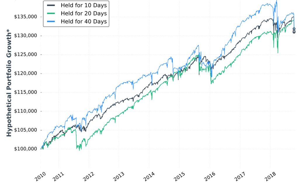
As discussed last time, this is based on one contract traded throughout. The hypothetical portfolio is set to begin with $100,000. This is fixed-contract position sizing. One consequence of fixed-contract versus fixed-risk (fractional) is a more linear equity curve rather than exponential. As discussed [here], the latter reaches higher and looks more appealing despite having greater risk. I have traditionally been a proponent of omitting position sizing from backtesting to allow for what I thought would be apples-to-apples comparison of drawdowns throughout (see here). In these graphs without any allocation, position sizing is effectively eliminated from the equation.
Accompanying the graph is that disclaimer about hypothetical computer simulated performance. This was a big deal earlier in the mini-series when I discussed the asterisk following the y-axis title “hypothetical portfolio growth” (second paragraph here). The disclaimer appeared for the first time in Part 16 and alleviated many pages of confusion. After that, the disclaimer disappeared leaving the asterisk without a referent until the two most recent graphs.
Score a point for completeness—however transient it may be—rather than footnote false alarm and sloppiness.
I can’t discern much with regard to differences on this graph. Final equity is ~$130,000 for all. 40 DIT > 10 DTE > 20 DTE for most of the backtesting interval, which suggests these differences might be significant were inferential statistics to be run.
She gives us the following table:
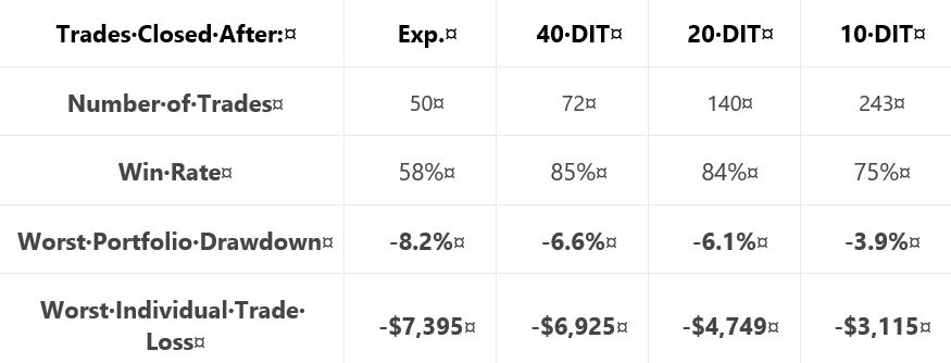
This is not the first time she tells us number of trades, but she falls far short of reporting it every time. Number of trades range from 50 – 243 over roughly eight years. That is ~6 – 30 trades per year or ~0.5 – 2.5 trades per month. On their own, these aren’t tiny samples. Backtesting one starting every trading day (e.g. second paragraph below graph here), though, would give a sample size in the thousands. I think that would be a useful complement to what we have here.
Glaring omissions in this table include average DIT (for the expiration group), total return or CAGR, and PnL per day. A big reason for using a time stop is to improve profitability (either gross or per day): show us! Time stops aim to exit trades earlier: show us [how long they run otherwise]! Nothing is conclusive without these.
Another big shortfall is the exclusion of transaction fees. Number of trades varies 2-5x across groups. The fees could add up.
I would still like to see that lost data [discussed last time] back to 2007.
On the positive side, the table does a decent job of showing performance improvement with max DD and max loss if we assume equal total return as suggested in the graph.
Categories: System Development | Comments (0) | Permalink