Maximum Adverse Excursion Study (Part 2)
Posted by Mark on November 28, 2016 at 06:39 | Last modified: October 4, 2016 12:58Today I will continue discussing the maximum adverse excursion (MAE) study with a different analytic approach.
I once again started with the closing market data from 9/10/1987 through 8/1/2016.
I calculated MAE over periods lasting from 5 – 90 trading days by increments of five. In other words, I calculated the largest negative percent change per day from entry over the course of a hypothetical long trade with period length.
I created 10 deciles for each period by taking the largest-magnitude (all values are < 0 ) MAE and dividing by 10.
I then counted how many MAEs were in each decile and reflected this as a cumulative percentage. For example, the percentage for the Nth decile reflects what percentage of trades had an MAE landing in deciles 1 through N.
The following table shows the cumulative percentage distribution. I arbitrarily color-coded the data as follows:
Pink < 85%
85% < Orange < 88%
88% < Yellow < 91%
91% < Light Green < 94%
94% < Turquoise < 97%
Blue > 97%
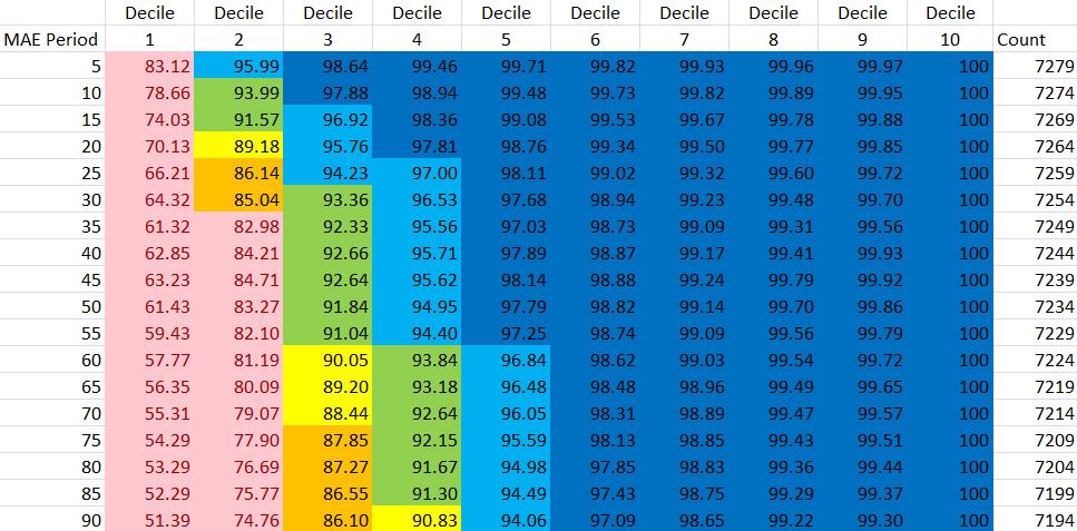
These data do not seem to be homogeneously distributed. If this were the case then I would expect to see 10% in each cell of the Decile 1 column. Instead, these range from 51.39% to 89.12%. I would similarly expect to see 20% fill the Decile 2 column (lowest value is 74.76%) and 50% fill the Decile 5 column (lowest value is 94.06%). I could probably do a chi-squared test to statistically determine heterogeneity.
Here are the same data plotted in a graph:
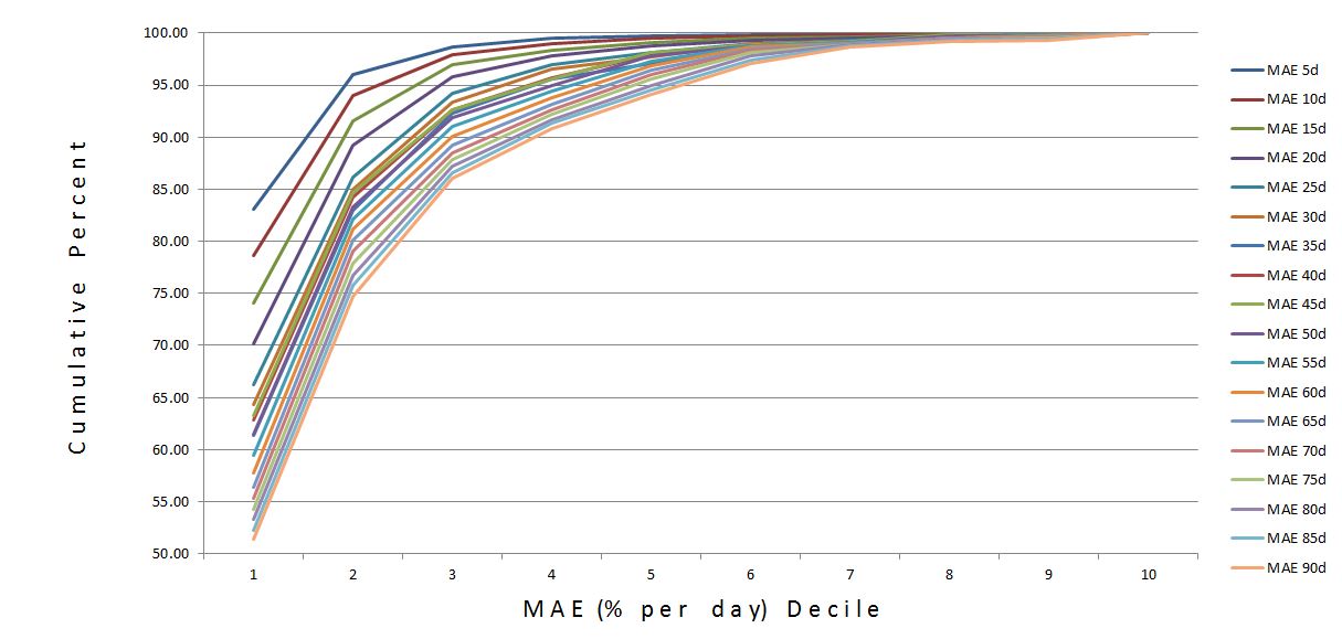
The small MAEs are definitely in the majority. This makes more sense given the market’s previously-described positive drift. Many trades had no MAE, which meant the market went up from inception and never fell below entry price. The percentage of zero-MAE trades ranged from 35.4% for period 5 to 15.6% for period 90.
While MAE distribution is skewed toward relatively small MAEs, the graph suggests a negative interaction by period.
I repeated the analysis for MAE without normalizing for trade length. The distribution is exactly the same. I should have done some simple math to figure out that would happen.
I’m not sure what conclusions are to be drawn from this. I’m open to suggestions.
Short of that, the possibility always exists it will come to me in my sleep!
Categories: Backtesting | Comments (0) | PermalinkMaximum Adverse Excursion Study (Part 1)
Posted by Mark on November 23, 2016 at 07:30 | Last modified: February 3, 2017 09:29Hopefully motivated by my last post, yesterday I took some time and ran a maximum adverse excursion (MAE) study.
MAE is the largest end-of-day drawdown faced during the lifetime of a trade. I blogged on MAE here. MAE may be used to demonstrate the maximum risk ever faced in a single trade. It’s also useful to assess viability of a system with regard to available capital in case an insurmountable margin call were to be historically triggered.
I started by downloading data from 8/10/1987 through 8/1/2016. I then calculated MAE (%) per day for long positions lasting 5 – 90 trading days in multiples of five. I expected period to be proportional to MAE because time is opportunity for a trade to go south. To prevent this relationship from masking other trends I divided by period to normalize the variable.
Here is the summary:
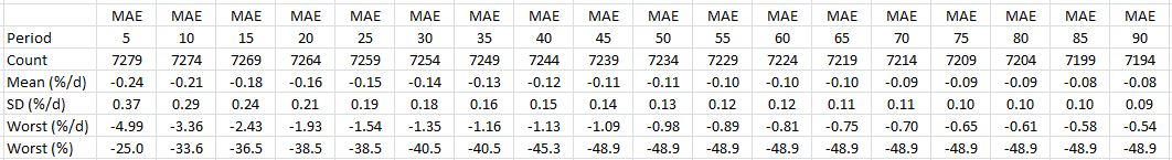
The first thing I noticed was the ~67% decrease in mean MAE/day and ~75% decrease in standard deviation (SD) per day as period increases from 5 to 90. At first I thought this was evidence that mean-reversion increases with time. A decrease in SD/day suggests more consistency and a decrease in MAE/day suggests lower drawdowns.
This is also consistent with the long-term positive drift of the stock market. Longer trades have more chance to profit at a cost of fewer trades per fixed amount of time. Perhaps it’s less about mean-reversion and more about positive drift. Finance would say I must get something extra (return) in exchange for the added risk (e.g. compared with Treasuries) I take with stocks and “positive drift” is that something.
Statistical tables often contain lots of information and I believe critical analysis is essential to understand what the numbers are [not] saying despite occasionally seeming otherwise. The dramatic decrease in MAE/day was initially a surprise. I then added the last row that does not normalize for time. MAE never increases beyond 45 days. Even when it does increase (e.g. -25.0% to -33.6% from 5- to 10-day period), it is less than directly proportional to time.
So yes, I could talk about positive drift or more mean-reversion over longer time periods but it’s also a simple mathematical consequence of being less than directly proportional. The real question is whether this is actionable.
I will continue the analysis in my next post.
Categories: Backtesting | Comments (3) | PermalinkNaked Put Study 2 (Part 6)
Posted by Mark on November 22, 2016 at 06:51 | Last modified: August 31, 2016 07:55Last time I studied longer periods of the equity moving average (MA) filter and settled on 75.
My biggest worry is still a significant slippage setback. Depending on period, 103-159 crossovers were seen in 16 years. Each crossover represents a trade. This would require either closing/reopening the entire inventory of naked puts (NPs) or buying long puts to neutralize. The former is likely to be ravaged by slippage. The latter could be done with significantly fewer contracts but these expensive puts will have a much wider bid/ask spread.
Ideally I want something more akin to the 10-month equity MA. Dating back to 2000, this indicator has supposedly triggered a handful of times and avoided some large market corrections. As previously discussed, something triggering a handful of times is exactly what I need. The problem with the 10-month SMA is that it only triggers at end of month. The NP strategy can lose huge sums of money in days; it demands a more reactive indicator.
Perhaps I could use a MA of underlying prices rather than account value. At the least, this would prevent longer periods from cannibalizing the beginning of the data set since I have access to underlying prices dating back to last century. At most, underlying prices are easier to download than account values are to backtest. Underlying prices are also less volatile than account value due to the price/IV (implied volatility) double whammy. Price declines and IV expansion can both hurt NPs.
In the case of underlying price MA, perhaps I increase the period as much as necessary to halve (at least) the number of crossovers. I could then study efficacy of the filter. This does, however, remove optimization from the process because I am putting an external constraint on period. I believe optimization should be done to prevent fluke. What’s worse is that external constraint is forcing a small sample size, which may not be reliable.
My next steps are to study number of underlying price crossovers by period and to think through a maximum adverse excursion (histogram) study.
Categories: Backtesting | Comments (1) | PermalinkNaked Put Study 2 (Part 5)
Posted by Mark on November 18, 2016 at 06:06 | Last modified: August 31, 2016 06:38Today I continue by extending the equity moving average (MA) to 100 trading days and studying the results.
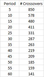
Here is a tabulation of equity MA crossovers by period:
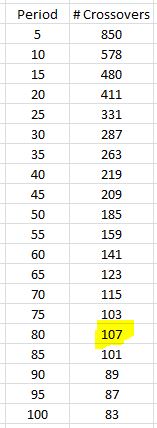
As expected, the number of crossovers continues to decrease as period increases. The 80-day period is an exception.
How did the filter compare? As above, I simply extended the analysis presented in Part 4:
Periods 50-80 show net profits* with the exception of 65. I probably would not make a big deal of this because the performance at 60-65 is in the same neighborhood.
I realized these tabulations do not make for a consistent comparison because longer MA periods mean increased lag time before the indicator becomes active. Performance of the shorter-MA filters therefore includes triggers on which the longer-MA filters cannot participate.
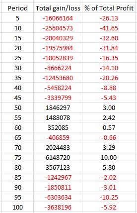
To standardize (i.e. apples-to-apples) the comparison, I recalculated the net profit/loss numbers using triggers after 5/25/01. This is the first day the 100-MA was able to be calculated. The following graph wraps all the data together and brings more clarity:
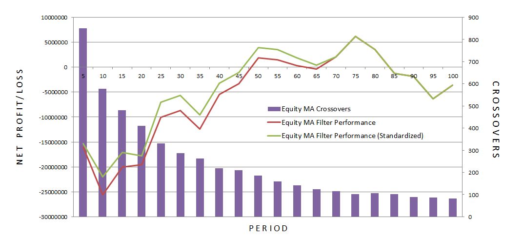
Standardization had minor impact for the shorter-period MA filters as seen on the left side of the graph. The inverse relationship between crossovers and period is clear.
Determining what period offers the best hope for future performance is somewhat arbitrary and speculative. I definitely want to be above 45 and below 85 because the other values are negative. While 50, 55, 75, and 80 all posted net profit > 5%, I would avoid 50 and 80 since they are negative to one side. 55 and 75 have a total of 9.47% and 9.09% profit surrounding them, respectively. Given that and the fact that 75 is the best overall performer, I would probably choose 75.
Slippage, which will undermine filter performance, must be considered for live trading. The calculations above imply that I can turn the trade off without consequence when the filter triggers. This is not true! Closing all open positions will incur maximum slippage. This would also be multiplied by the number of crossovers to calculate total performance impact. Alternatively, I could buy long puts and attempt to neutralize the open positions. This seems preferable and further backtesting would be indicated.
* — Thanks to XOR LX for some very time-saving spreadsheet assistance!
Categories: Backtesting | Comments (1) | PermalinkNaked Put Study 2 (Part 4)
Posted by Mark on November 15, 2016 at 06:55 | Last modified: August 26, 2016 09:52Having completed an initial comparison between naked puts and long stock, I now begin the process of trying to determine how I might be able to improve this system.
I will start by looking to the equity curve itself as an indicator to exit. I had always loved this idea until I read Kevin Davey’s article in Futures magazine, which suggests it may not be the magic bullet after all.
I begin by determining how many times the equity curve crosses its moving average (MA). Significant drawdowns (DD) on the naked puts (NP) performance graph only happen a handful of times. I would imagine excessive triggers will likely cause whipsaw losses. Let’s see how this plays out:
As expected, the number of crossovers decreases as the period gets longer. Even at 60 days, however, the indicator generates 141 crossovers. Only nine major DDs are evident in the performance graph: Sep 2001, summer 2002, fall 2008, Feb-Mar 2009, May 2010, Jul-Sep 2011, fall 2014, Aug 2015, and Jan 2016. Even if I relax my criterion and aim to filter out some smaller DDs, I still see fewer than 20. But 141…!
The next step is to determine the total gain/loss as a result of the equity MA filter. I used Excel to score each trading day as 1 or 0 depending on whether equity was above or below its MA, respectively. When equity crossed above its MA, I calculated a difference to determine whether the filter saved or cost me money by being out of the market during the previous dip. I totaled all gains and losses from the equity MA filter and also represented this as a percentage of the total $61,479,063 gained throughout the NP backtest. Here are the results:
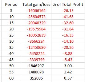
The red numbers are losers and some of these cannibalize significant profit. Keep in mind that aside from total profit, max DD is the rest of the story. So if the filter were to decrease total profit by 40% and max DD by 50% then I could still trade the system with twice the size and post a larger net profit while maintaining constant max DD.
It seems like the 55-day period might be a sweet spot but I’d like to study longer periods to be sure.
I will continue next time.
Categories: Backtesting | Comments (1) | PermalinkFear and Greed: an Interlude
Posted by Mark on November 10, 2016 at 06:18 | Last modified: August 25, 2016 11:32At the root of my last post but never explicitly stated were those darned emotions of fear and greed.
Talking about drawdown (DD) analysis took me back to the idea that options are better than stock. DDs trigger the fear inherent within. This threatens catastrophic loss when I have to close positions at the worst time to maintain sanity. I have argued that long stock can always lose more than the naked put (NP) and is more risky for that reason.
Upside profit is capped with NPs while remaining unlimited for long stock. On the whole, I don’t believe upside movement outpaces NP profit potential very often. This is why I consider long stock more of a gamble as opposed to the more consistent returns generated by NPs.
For those who conceptualize trading as a zero-sum game, the upside is where differences may be recovered. The few times the market goes up strongly and [far] outpaces NP gains makes up for the many times the market goes up a little bit, sideways, or down and the NP trade wins.
I think psychological comfort should be considered when comparing NPs with long stock. As mentioned above, I favor lower DD approaches because fear lurks on the downside. On the upside, greed can take over if I fail to keep pace. A market that remains strong for an extended period of time may cause NP traders to become increasingly frustrated. In a worst case scenario greed takes over, the NP is closed in favor of long stock, and the market proceeds to tank causing larger losses.
Remember the adage “you can’t go broke taking a profit.” I may not profit as much to the upside but I won’t go broke and I will continue to make consistent profits. Anybody who gets so restless and agitated because they aren’t making as much should think about what happens when times flip and the market heads lower. Don’t get caught up in the greed because nothing goes up forever.
Categories: Financial Literacy | Comments (0) | PermalinkNaked Put Study 2 (Part 3)
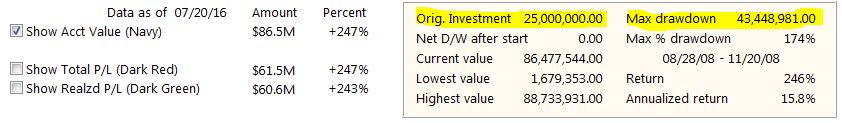
Posted by Mark on November 7, 2016 at 07:46 | Last modified: January 27, 2017 14:24I left off with a drawdown (DD) analysis of my second comprehensive naked put (NP) study.
I believe DD analysis should be applied to any trading strategy. Even without the second table of trade statistics, DD analysis could be done in a few easy steps. First, note the starting equity on the left edge of the graph. Second, measure the largest DD (vertical drop in the chart). Third, compare the two:
The bracket in red on the left margin translates to the 2008 financial crisis, which is the max DD. This is clearly more than the starting equity of $25M. To me, this shouts “danger!” It was just a matter of luck that the DD did not occur earlier else this account would have blown up.
I believe leverage is important to monitor in case of worst-case scenario: a gap down to zero on the next trading day. Nothing close to this has ever happened but Federal/FINRA regulations acknowledge the possibility. I added $5M notional risk per day and the average days in trade was 36.52, which means at any given moment the amount of risk is roughly 365 * $5M * (36.52 / 365) = $182.6M. This equates to an initial leverage factor of about 7.3. By the end it had fallen to 2.3.
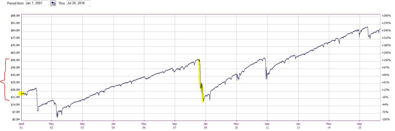
A performance graph of NPs (red line) versus long shares (blue line) is revealing:
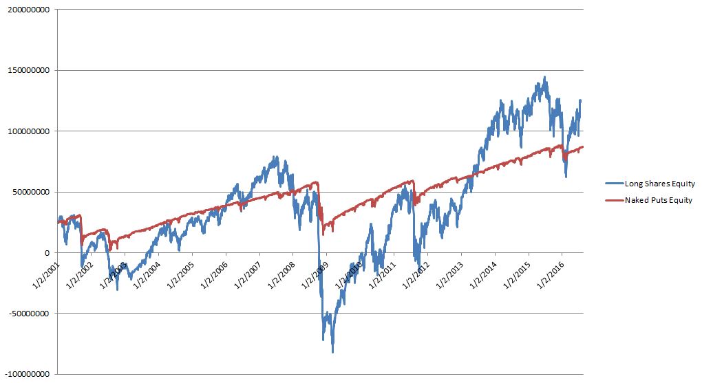
Both lines start at $25M, which is the initial equity of the account. The long shares generated more profit than NPs as evidenced on the right side of the chart.
I mentioned above that DD analysis should always be done and this is because DDs are responsible for catastrophic loss. Clearly in this case the long shares trade is not something anybody could bear. The max DD is longer in length (2187 days vs. 1000 days) and larger in magnitude ($161M vs. $43.4M) than NPs. The long shares account also goes bust: several times (2001-2003 and 2008-2011)!
Calculating risk-adjusted returns leaves long shares trailing NPs by a wide margin. Using DD as our measure of risk and realizing that the max DD is 3.7x larger for long shares, normalizing for risk lowers the net profit of long shares to $27.2M, which is only 44% the net profit of the NPs.
The argument that options are better than stock is alive and well here.
The observation that the NPs were down money after the first eight years, however, leaves me wanting something more.
Categories: Backtesting | Comments (3) | PermalinkNaked Put Study 2 (Part 2)
Posted by Mark on November 4, 2016 at 07:05 | Last modified: August 24, 2016 09:02Last time I began to analyze a second comprehensive naked puts (NP) backtest. Let’s begin with a comparison to shares.
Here are the corresponding trade statistics for long shares:
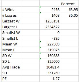
Comparing and contrasting this table to the one in Part 1 reveals many interesting observations.
First, the long shares trade is profitable ~64% of the time versus 90% for the NPs. The more I win, the easier it is psychologically to stick with a strategy.
Second, the largest loss is only 1.86x the largest win for the long shares rather than 11.6x for the NPs. The average-loss-to-average-win ratio is only 1.40 for the long shares rather than 5.77 for the NPs. Losses don’t occur often with the NPs but when they do they can really hurt.
Third, the ratio of standard deviation (SD) of losing trades to SD of winning trades is 2.03 for long shares and 18.2 for NPs. This would appear to be a bonus for the long shares trade except the SD of losing trades is similar for both. The winning trades demonstrate much higher variability in the long shares trade. This suggests the income is not as predictable for long shares as NPs, which is also consistent with the lower winning percentage.
Finally, the average trade is roughly double for long shares. Surprisingly, the profit factor is higher for NPs: 1.58 vs. 1.27. I find it difficult to rectify this difference except to say that the long shares made roughly $100M in this backtest vs. $61M for the NPs.
For the remainder of the post, I will talk only about NPs.
What do you see in the NP performance graph?
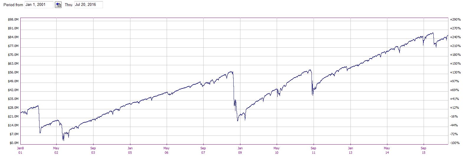
ICYMI, take a look at these trade statistics:
This NP trade has a problem! The maximum drawdown (DD) is greater than the starting equity. The account never went to zero because the max DD occurred roughly halfway through the backtest. Had the max DD occurred earlier, the account could have gone bust. I would not be happy had I started trading NPs in fall 2008.
This is something to keep in mind when thinking about position sizing. Also remember the oft-quoted adage “your worst drawdown is always ahead of you.” Starting this trade with $50M in the account rather than $25M would have avoided Ruin but the annualized return would be cut in half. To be safe, I like to double the max DD and contemplate that as a requirement for starting equity. In this case, the annualized return would be reduced to ~4.5%.
Categories: Backtesting | Comments (2) | PermalinkNaked Put Study 2 (Part 1)
Posted by Mark on November 1, 2016 at 07:39 | Last modified: August 26, 2016 06:04I recently completed a second extensive backtest on naked puts.
This study incorporated three main differences. First, I sold the first strike under delta 0.20. Second, I kept notional risk constant, which I previously discussed in some detail. Also as previously discussed, I used a large enough notional risk to minimize granularity issues. Finally, I recorded daily account equity with the intent of avoiding the drawdown minimization problem shown here.
As done previously, I will begin with some overall trade statistics. I will not do a side-by-side comparison because position sizing was different this time.
I backtested from January 2, 2001, through July 20, 2016: 3,906 trades total.
–90.1% trades (3,520) won
–Mean profit on winning trades: $48,016 [standard deviation (SD) $18,629]
–Largest winning trade: $160,524
–Smallest winning trade: $129
–Mean days in winning trades: 35.8 days (SD 10.3 days)
–9.9% trades (386) lost
–Mean loss on 386 trades: $277,108 (SD $341,504)
–Largest losing trade: -$1,866,403
–Smallest losing trade: -$529
–Mean days in losing trade: 43.6 days (SD 9.2 days)
–Average trade: $15,886 (SD $145,696)
–Mean days in trade: 36.5 days (SD 10.5 days)
–Profit factor: 1.58
Mull over these numbers for a couple minutes. What do you see?
One difference I see from the previous naked puts study is that the average duration of losing trades exceeds the average duration of winning trades. I used no stop-losses here, though, which means all losing trades were held to expiration.
The next thing I see is a profit factor of 1.58, which tells me this has a chance of being a decent system. On over 3,900 trades, winning trades made $1.58 for every dollar lost on the losers. The average trade is positive, which is necessary, but the SD is about ten times the average trade.
That’s a tad eye-popping.
Looking closer, the SD for losing trades is about 19 times that of the winners. I would expect some pretty large losers to cause that and I do see the largest losing trade is over 11 times the largest winning trade. I also see the average losing trade is well over five times the average winner.
Now I question whether I could trade this system live.
I will continue the analysis next time.
Categories: Backtesting | Comments (2) | Permalink