Maximum Adverse Excursion Study (Part 2)
Posted by Mark on November 28, 2016 at 06:39 | Last modified: October 4, 2016 12:58Today I will continue discussing the maximum adverse excursion (MAE) study with a different analytic approach.
I once again started with the closing market data from 9/10/1987 through 8/1/2016.
I calculated MAE over periods lasting from 5 – 90 trading days by increments of five. In other words, I calculated the largest negative percent change per day from entry over the course of a hypothetical long trade with period length.
I created 10 deciles for each period by taking the largest-magnitude (all values are < 0 ) MAE and dividing by 10.
I then counted how many MAEs were in each decile and reflected this as a cumulative percentage. For example, the percentage for the Nth decile reflects what percentage of trades had an MAE landing in deciles 1 through N.
The following table shows the cumulative percentage distribution. I arbitrarily color-coded the data as follows:
Pink < 85%
85% < Orange < 88%
88% < Yellow < 91%
91% < Light Green < 94%
94% < Turquoise < 97%
Blue > 97%
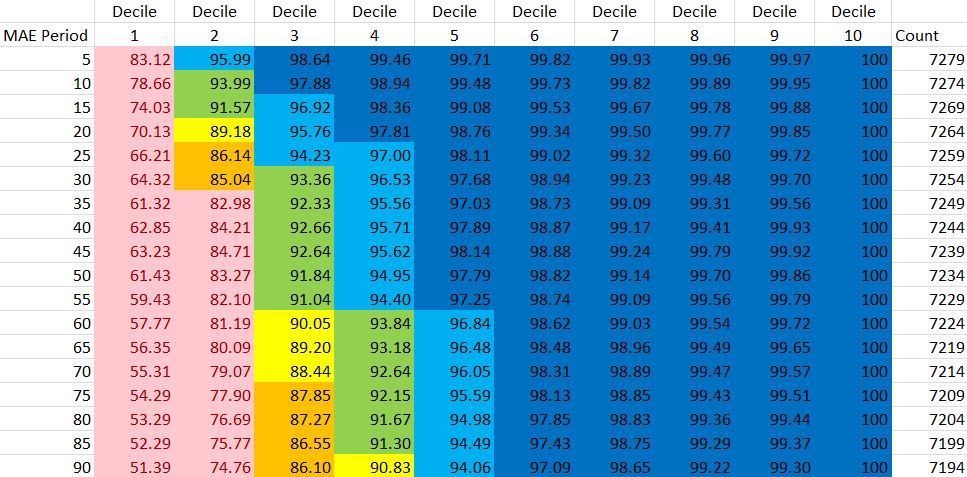
These data do not seem to be homogeneously distributed. If this were the case then I would expect to see 10% in each cell of the Decile 1 column. Instead, these range from 51.39% to 89.12%. I would similarly expect to see 20% fill the Decile 2 column (lowest value is 74.76%) and 50% fill the Decile 5 column (lowest value is 94.06%). I could probably do a chi-squared test to statistically determine heterogeneity.
Here are the same data plotted in a graph:
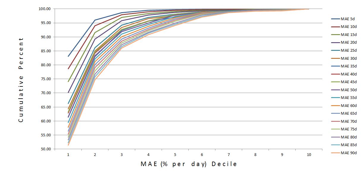
The small MAEs are definitely in the majority. This makes more sense given the market’s previously-described positive drift. Many trades had no MAE, which meant the market went up from inception and never fell below entry price. The percentage of zero-MAE trades ranged from 35.4% for period 5 to 15.6% for period 90.
While MAE distribution is skewed toward relatively small MAEs, the graph suggests a negative interaction by period.
I repeated the analysis for MAE without normalizing for trade length. The distribution is exactly the same. I should have done some simple math to figure out that would happen.
I’m not sure what conclusions are to be drawn from this. I’m open to suggestions.
Short of that, the possibility always exists it will come to me in my sleep!