Backtester Development (Part 10)
Posted by Mark on December 30, 2022 at 06:49 | Last modified: June 22, 2022 08:36I stumbled upon a couple further bugs in the second half of this post. Today I want to at least get started on the first one.
All of this started with the graph below and the highlighted point:
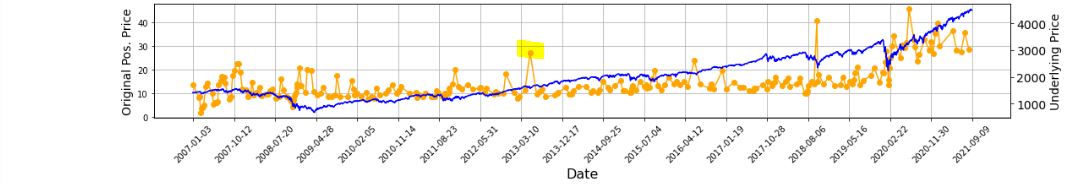
In looking to verify that [locally outlying] trade price, I expected to find early Apr 2013. In fact, the trade in question begins on Jun 21, 2013. Alarmed by the discrepancy, I suspected although the graph appears okay being packed with 255 points (trades), a closer look may reveal the points to be misaligned with dates.
Before going any further, I really should have checked to see if this is true (it is). Let’s do that right now:
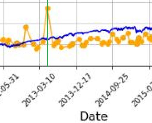
I added a green, vertical line with MS Paint and calculated the distance between the green line and the previous vertical grid line (3-10-2013) as a fraction of the distance from the previous and following (12-17-2013) vertical grid lines. The fraction is 0.208, which places the date at May 5, 2013. The point is off by 47 days. That may not be much for a graph that spans over 14 years, but I thought computers didn’t make mistakes?!
It then occurred to me that while successfully getting the x-axis tick labels horizontally spaced, the points on the graph are also uniform even though the intervals between dates are not.
Once again, before going any farther I should have checked to see if this is true. Look closer at the second graph. Does the horizontal spacing look even to you? To me it doesn’t, but how can I verify?
I could do something like this:
P_price_orig_zeroes = [ 0 for i in P_price_orig_all ]
axs[1] . plot ( trade_list, P_price_orig_zeroes, marker=’o’, color=’g’ )
This creates a shadow line to the orange with equal x-values but all y-values set to zero:
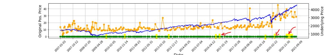
Along the green line at the bottom, I have highlighted in yellow (punctuated by a few red arrows in case the highlighting is unclear) where the points are farther apart and the green line exposed.
As it turns out, the points do not align with dates but the horizontal spacing is not uniform, either. I now suspect the latter is due to the second bug I mentioned in the link from the first paragraph.
With regard to a possible cause for the irregular spacing, the code uses ax.set_xticks(). This is similar to plt.xticks() for which I included some documentation here. Looking closely at the former:
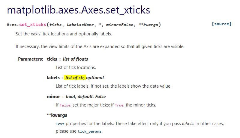
This establishes a list of strings as tick labels. Failure of the points to correctly align with label values (dates) makes sense for arbitrary strings as opposed to meaningful datetime objects. For correct alignment, maybe I can’t use ax.set_xticks() at all.
I want to correctly plot datetimes, but I want uniform tick labels rather than labels only where x-coordinates exist to match.
How can I make that happen?