Final Word on Formatting Datetime Axes
Posted by Mark on January 6, 2023 at 06:42 | Last modified: June 22, 2022 10:26Today I will pick up plotting datetimes with uniform tick labels.
I’ve learned this is not as difficult as I may* have suspected. The x-coordinates are given in trade_list, which is a list of strings. I need datetimes, which can be created like this:
trade_dates_as_datetime = [datetime.strptime(i, “%Y-%m-%d”) for i in trade_list]
Alternatively, I can ago back to pd.date_range() (introduced here) and include the first/last [string] dates from trade_list:
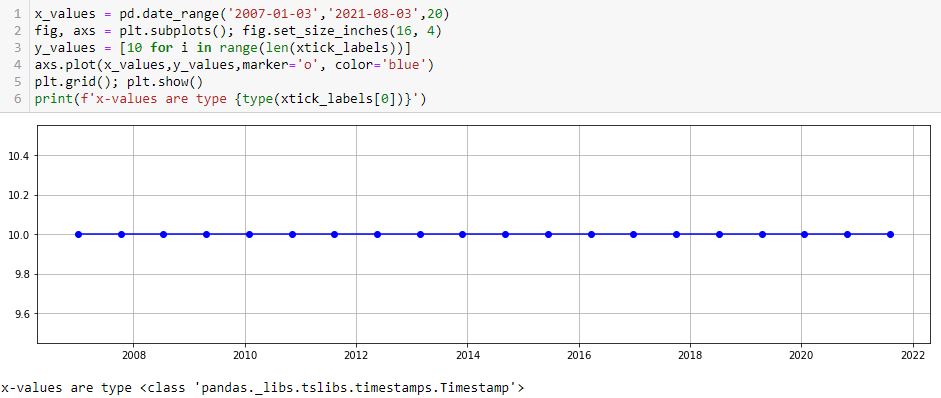
As mentioned in that earlier post, these x-values are type pd.Timestamp, which I believe is a datetime.
One thing I don’t like is the first major tick printing after the first point. I can remedy with the following:
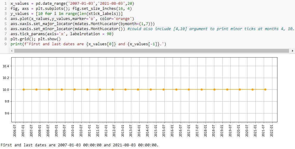
L5 prints major ticks at months 1 and 7. The first (last) major tick is the one preceding (following) the first (last) data point at 2006-07 (2021-08). This is default and leaves ample room to be aesthetically pleasing.
L6 prints minor ticks every month. If so desired, I could specify particular months by including them as a list (e.g. [4,10] would place a minor tick at the other two quarters).
Interestingly, if I put bymonth=(2,6) in L5, then I get something looking like the nasty asymmetry seen in this lower plot:
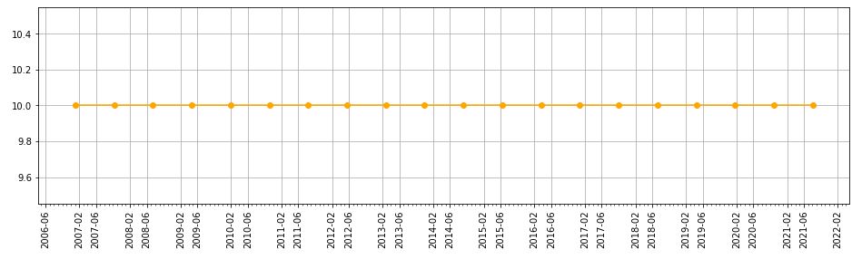
This asymmetry is with major ticks plotted at the same months, though, whereas the earlier one results from major ticks being plotted on the first and 22nd of every month.
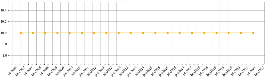
With L7 allowing me to adjust rotation, I can now customize about everything I would want on this graph.
Oh—what if I want to put a three-letter month instead of number? I can add this line:
axs.xaxis.set_major_formatter(mdates.DateFormatter(‘%b-%Y’))
Editing rotation to 45 [degrees] produces this:
* — “May” because this has confused and led me in a complete circle to find a complete solution.