Debugging Matplotlib (Part 2)
Posted by Mark on May 5, 2022 at 07:20 | Last modified: March 15, 2022 11:40In finding matplotlib so difficult to navigate, I have been trying different potential solutions found online. Some have an [undesired] effect and others do nothing at all. Instances of the latter are particularly frustrating and leave me determined to better understand. Today I will begin explaining what I aim to do with visualizations in the backtesting code.
The first graph I wish to present is cumulative backtested PnL on a daily basis. I create a dataframe column ‘Cum.PnL’ to calculate difference between current and original position price. To each entry in this column, I add realized_pnl. Whenever a trade is closed at profit target or max loss, I increment realized_pnl by that amount.
Graphing this results in a smooth, continuous cumulative PnL curve except for one extreme gap. Closer inspection reveals the price of one option on this particular day over $50 more than it should be, which translates to the $5,000+ loss seen here:
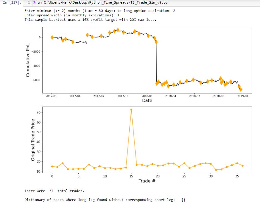
The lower graph shows initial position price and makes it clear that something is way out-of-whack with trade #15. I manually edit that entry in the data file.
The upper graph includes an orange diamond whenever a new trade begins. I endured days of frustration trying to figure out how to do this. To better understand my solution, I will create a simpler example devoid of the numerous variables contained in my backtesting code and advance one step at a time to avoid quirky errors.
First, I will import packages (or modules):
> import matplotlib.pyplot as plt
> import numpy as np
> import pandas as pd
> import random
Next, I will create a random list:
> randomlist = []
> for i in range(20):
> n = random.randint(1,30)
> randomlist.append(n)
> print(randomlist)
This prints out a 20-element list of random integers between 1 and 30. A few iterations got me this:
[30, 24, 3, 29, 20, 7, 29, 25, 25, 20, 15, 24, 8, 13, 9, 14, 19, 30, 1, 5]
I like this example because it has both 1 and 30 in it to demonstrate inclusivity at each boundary.
Next, I will invoke matplotlib’s “simplicity” by generating a graph in just three (not including the blank) lines:
> fig, ax = plt.subplots(1)
>
> ax.plot(randomlist, marker=’.’, color=’b’) #plot, not plt
> plt.show()
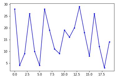
So far, so good!
I now want to fix two issues with the x-axis. Because I did not specify x-values, these are plotted by default as zero-indexed order in the data point sequence. This assigns x-value 0 to the first data point, 1 to the second, etc. I want 1 for trade #1, 2 for trade #2, etc. The other issue is that because all x-values are integers, I do not want any decimals in the x-axis labeling.
My solution will be to create a list of numbers I want plotted on the x-axis. The downside to this, however, is loss of matplotlib’s automatic scaling, which it sometimes does very well as seen on the ‘Date’ axis above. Maybe this will still work with integers. We shall see.
I will continue next time.
Categories: Python | Comments (0) | Permalink