Random Simulation 1 (Part 2)
Posted by Mark on June 22, 2020 at 07:01 | Last modified: May 22, 2020 11:02Today I will conclude analysis of my first random simulation with the new software.
The more strategies I analyze, the more I hope to learn about what components are correlated with viability and profitability. I will also get a better feel for how representative particular results are relative to all strategies that I’ve studied.
Continuing on with the stress testing, the delay test doesn’t look so great:
I’m not sure how concerning this is. This delays entries and exits by x bars. When the strategy exits at the first profitable close or 15 days—whichever comes first—any delay in terms of 1+ bars could be an unrealistically large amount.
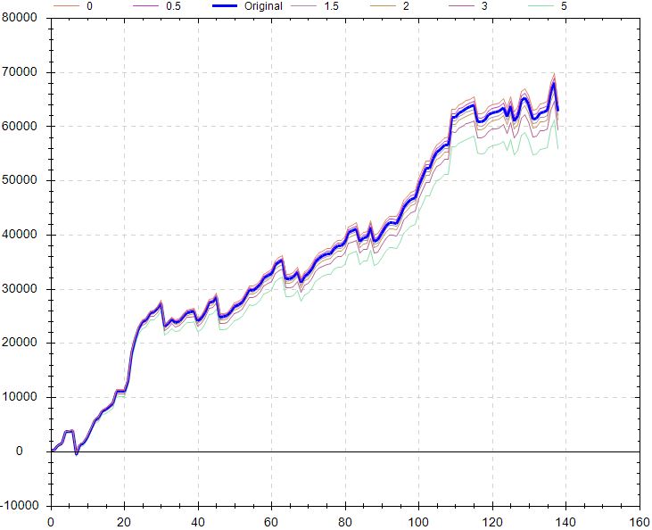
Factoring in worse execution might be more relevant and along these lines, the slippage test looks better:
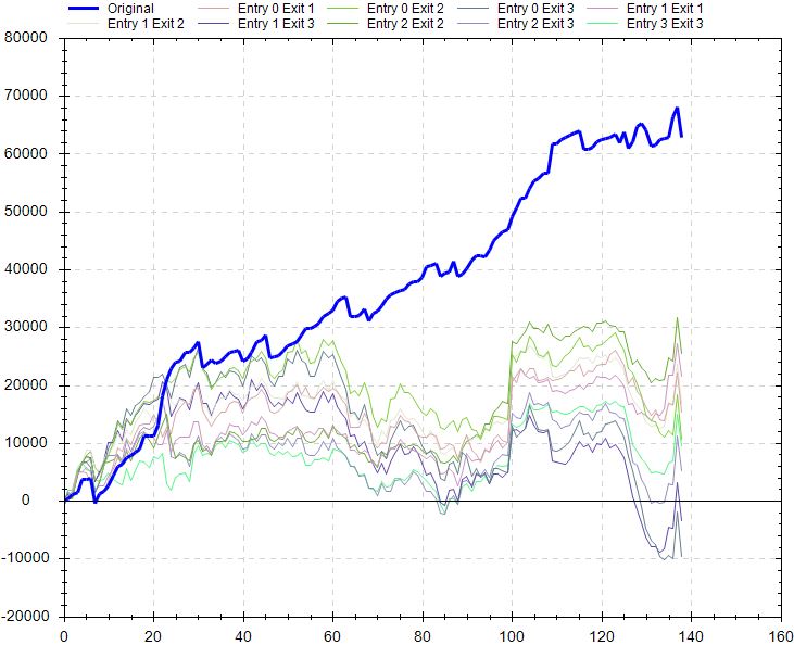
Like the delay test, the liquidity test looks poor (my notes Screenshot 16), but I would pose the same questions. If profitable trades are being held for one day and entry is delayed by a large part of that period, then most of the profit potential evaporates immediately. Significantly poorer performance would be no surprise.
The noise test looks poor:
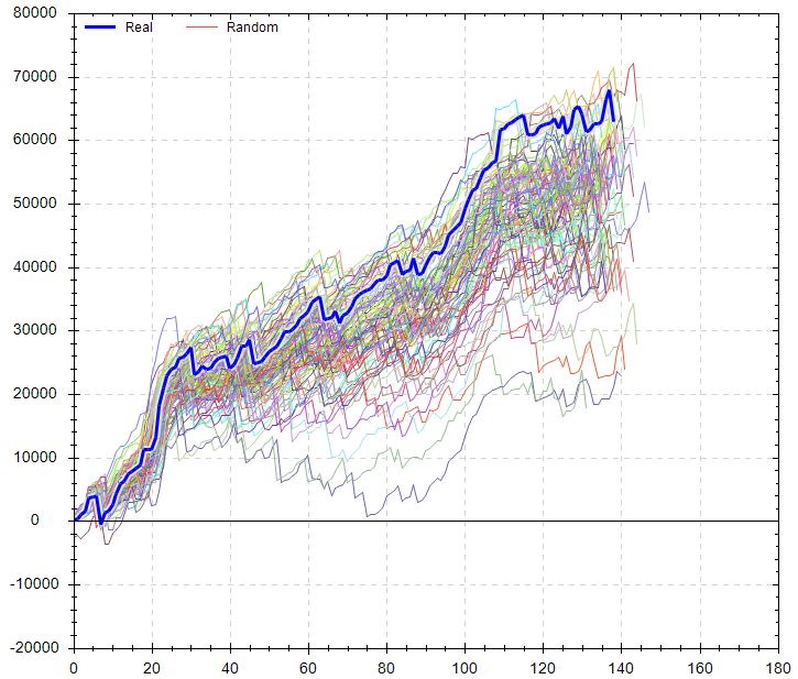
I included up to 25% noise here for OHLC. The actual backtest is pretty much the best equity curve on the graph. At least all the other simulations are profitable, but this suggests I shouldn’t necessarily expect such good performance if traded live.
For me, the second paragraph above especially resonates with something like the noise test. I would think altering the data series in this way would dramatically worsen any trading strategy that is better than random. I expect to better understand the importance and variety of noise test results as I get closer to studying a large sample size of strategies.
Randomized OS graph looks encouraging:
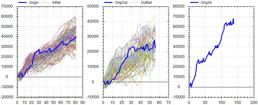
On the OS graph, the actual equity curve is right in the middle of the randomized simulations.
Overall, my initial impression is cautiously optimistic with this strategy. The OS curve looks solid. Performance versus random is solid. Monte Carlo is solid. MFE/MAE looks solid. Slippage test looks solid. The variance test seems pretty solid. Delay, liquidity, and noise tests don’t look so great. The randomized OS simulation looks ideal.
Further directions could include:
- Modifying the simulation dates
- Modifying [canned] exit criteria
- Toggling OS between beginning/end
- Changing fitness function
- Verifying the backtest in TS and studying performance report
- Checking on unseen data (i.e. incubation)
Another exploration would be to vary OS percentage with a caveat. While I think varying OS % may get me different strategies, with a minimum number of trades required, increasing OS % will exclude otherwise-qualifying strategies.