Dynamic Iron Butterflies (Part 4)
Posted by Mark on February 13, 2017 at 06:56 | Last modified: January 6, 2017 10:24My last post was a hodgepodge of information about the dynamic iron butterfly (DIBF) backtest and I’m going to pick up right where I left off.
The differential loss data compounds my concern about the backtest being a combination of two different trades. As a combination, it’s hard to tell to what extent the “dynamic” [put credit spread (PCS)] aspect contributes to the profitability. Worrisome is the fact that 77% of the losses are to the downside: exactly where the “dynamic” aspect can result in greater loss. Let’s take a closer look at the loss distribution:
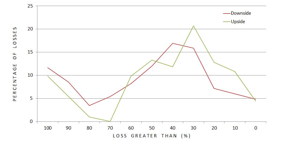
Each data point represents what percentage of upside (green) or downside (red) losses occurred at different magnitudes of loss (ROI %). The difference does not look as dramatic as I expected but it still may be. A greater percentage of downside losses occurred at loss levels exceeding 70% ROI. Furthermore, 66% (51%) of downside (upside) losses were worse than 40%. This is a rather large difference especially considering the fact that 77% of all losses were to the downside.
Plotting number of losses, rather than percentage, looks like this:
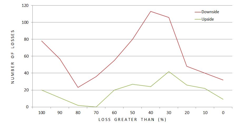
The difference looks more dramatic here. Total dollars lost would mimic this.
While the PCS is an obvious culprit when studying directional loss distribution, we cannot forget that it benefits the position to the upside. More than just “upside,” the PCS benefits the position as long as the market does not fall more from the DIBF short strike than the width of the call credit spread. This is the “dynamic” portion. I don’t need to do the computations to know this is the vast majority of winners. In fact, this will always be the case:
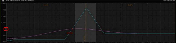
If the market falls an amount equal to the width of the call credit spread, this trade will be losing money as evidenced by the intersection of the red horizontal hashmark and blue line being below zero profit (circled in red on the y-axis). That would be my reason for hypothesizing all winners will have fallen less than this amount even though before expiration, unrealized loss is not as extreme (e.g. purple curve).
In any case, what would be interesting to know is how DIBF performance compares to a symmetrical iron butterfly (no PCS). This is definitely a future direction for study.
Next on the docket, though, is analysis of maximum adverse excursion.