When Performance is Irrelevant (Part 4)
Posted by Mark on April 27, 2017 at 07:11 | Last modified: November 22, 2016 10:37The motivation for this blog mini-series stems from an article on “robo-advisers” by Jaclyn N. McClellan in the Oct 2016 AAII Journal. With regard to performance comparison, she writes:
> A major question many investors ask is, “How
> does the performance of the robo-advisers
> compare to that of traditional advisers?”
> This is not a question that is easy to answer.
>
> Most of the robo advisory services that post
> performance online display backtested or model-
> based results…
That may be inaccurate because live-trading execution can significantly differ from backtesting (or based on models). They would need to present the research methodology (examples given here and here), which is usually not done.
> Each robo-adviser has different inception
> dates, and some don’t disclose those dates.
This is also true with regard to mutual funds, which makes it very difficult to pick up one prospectus and compare with another. Not giving the inception date seems absurd.
> Prospective clients have to search for the
> performance disclosures just to read the fine
> print…
This is consistent with the mutual fund prospectus. None of this is straight-up, transparent disclosure although I’m sure their compliance departments would claim to be meeting regulatory standards.
> Although the lack of sound performance figures
> may seem disheartening, displaying truly
> representative returns is difficult because
> many investors have customized portfolios—
> fees, allocations and rebalancing intervals can all
> be different on an account-by-account basis.
> Clients open accounts at different times, so
> even if the respective risk/reward profile
> categories don’t change, the starting value will.
The countless number of potential permutations of an investment account is another reason why it seems inappropriate to use a single historical record to measure performance.
An alternative to showing a single number for 1-year (5-year) performance, for example, would be to show a distribution of rolling 1-year (5-year) performance records. A fund that has been around for two (10) years has roughly 252 (1,260) rolling 1-year (5-year) periods that may be sampled. I could then look at the mean, standard deviation, and percentiles to make good sense out of these numbers, which constitute a much more robust sample size.
I will continue next time.
Categories: Financial Literacy | Comments (0) | PermalinkWhen Performance is Irrelevant (Part 3)
Posted by Mark on April 24, 2017 at 07:32 | Last modified: November 22, 2016 09:48In this blog mini-series I’m considering the possibility that financial performance reporting is at least misleading and at most irrelevant. As a third example, today I will discuss a prospectus for the T. Rowe Price Value fund.
First, take a look at the following table:
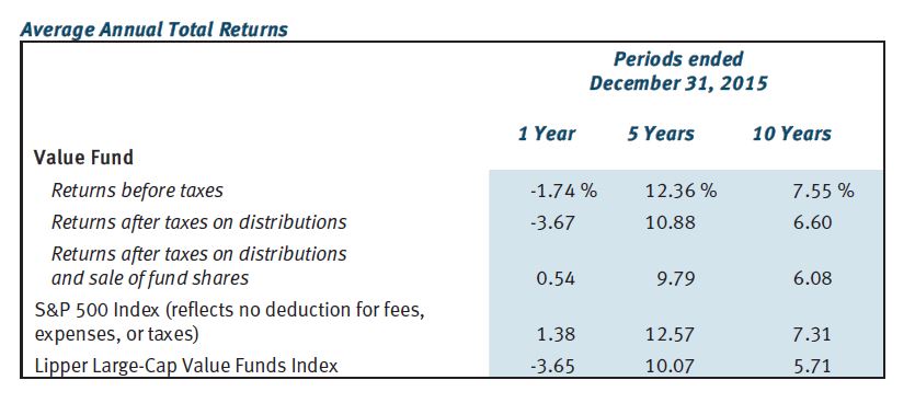
This gives us something against which to compare the fund’s performance. The Value Fund outpaced S&P 500 over 10 years but fell short over one and five. Value Fund beat the benchmark (Lipper Large-Cap Value Funds Index) over all three time frames but operating expenses (0.81%) are not included. Your actual performance would therefore fall short of the numbers reported here.
Once again, why be deceptive? Why not provide a historically accurate report of how the fund performed?
The prospectus also includes the following graph:
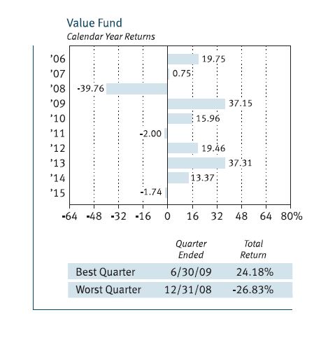
This gives us a 10-year track record to look at, which is better than the two years seen with American Funds Growth Portfolio. Ten is still a small sample size, though.
What may be worse is that each of the 10 samples is itself far too small a sample. I mentioned this with regard to the Vanguard prospectus: we do not see any error bars on the graph.
What happens in any particular calendar year is only one representation of an infinite number of potential occurrences. What if a large bankruptcy had been announced December 29 instead of January 5? What if Friday fell on the 31st instead of the 1st causing a jobs report to be delayed a week? What if a verbal misunderstanding, a dropped call, or a random muscle twitch had resulted in two countries going to war?
The fact that altered events can theoretically result in significant performance differences suggests just how trivial any single sample is. For me this is strong motivation for Monte Carlo simulation.
Monte Carlo simulation is a methodology used to generate large sample sizes. Given a system with many trades, toss the profit/loss numbers into a hat, mix thoroughly, and pick randomly to get different trade sequences. This can be done thousands of times. Robust descriptive statistics may then be used to generate and discuss probability-based future predictions of performance.
Monte Carlo simulation is unfortunately the exception—not the rule. Singular performance numbers based only on specific historical records are routinely reported. Laypeople in droves (along with their investment advisers) make frequent decisions based on these reports that, I would argue, are statistically meaningless.
This is a big reason why I suspect financial performance may be irrelevant.
Categories: Financial Literacy | Comments (0) | PermalinkWhen Performance is Irrelevant (Part 2)
Posted by Mark on April 21, 2017 at 06:19 | Last modified: November 18, 2016 10:26In this blog mini-series I’m considering the possibility that financial performance reporting is at least misleading and at most irrelevant.
Last time I briefly discussed a prospectus for a Vanguard fund. As a second example, let’s look at the American Funds Growth Portfolio prospectus:
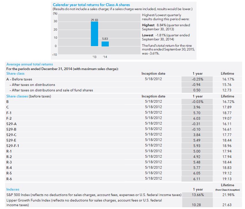
The first thing I noticed here is the short track record. The bar graph only shows performance for two years since the fund opened May 2012. Instead of 10 tiny samples (Vanguard), here we have two tiny samples.
An additional problem is a failure to include the sales charge. The disclaimer “if a sales charge were included, results would be lower” is nice but they don’t tell us how much lower it might be. I would like to see the maximum possible sales charge included as they did in the table. If the worst-case performance is acceptable then I’m more likely to invest. Either way, the point of a graph is to show and they failed to do that because what they graphed is not realistic.
The table indicates that every share class (of which there are many) underperformed the S&P 500 and the benchmark (Lipper Growth Funds Index). This is not encouraging but again, the sample size is sufficiently small here to mean very little. For a quick second I am happy that they at least included the sales charge.
But don’t think for more than a second that they reported the actual performance because other fees are not included. Evidently it does not pay to look only at the performance section because earlier in the prospectus we see:
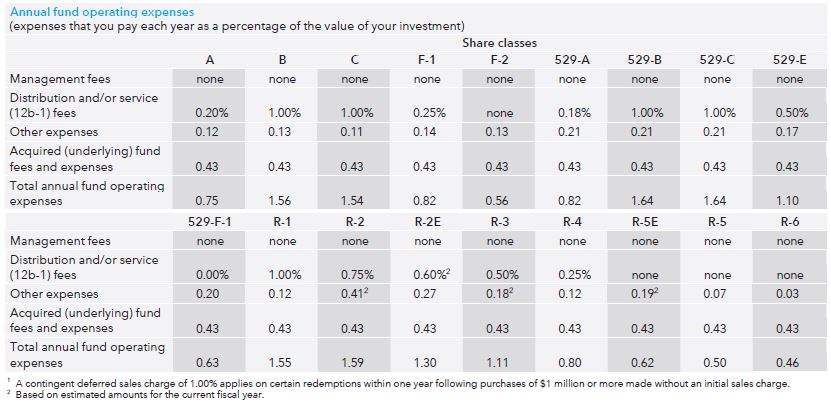
“Operating expenses” range from 0.46% – 1.64% annually. I called to get more information and only Class A and Class C shares are available to me as a prospective retail investor (“individual nonqualified account”). That means I would be stuck with a 0.75% annual fee on top of a 5.75% load (sales charge) and 1% redemption charge or a 1.54% annual fee with no load and a 1% redemption charge. Unfortunately neither annual fee nor redemption charge is included in the graphs or the tables, which means the reported performance numbers are optimistic exaggeration.
Is this deceptive advertising?
I will continue next time with one final example.
Categories: Financial Literacy | Comments (1) | PermalinkWhen Performance is Irrelevant (Part 1)
Posted by Mark on April 18, 2017 at 07:26 | Last modified: November 18, 2016 12:45Plenty of reasonable doubt suggests traditional reporting of financial performance is irrelevant and serves only to mislead.
I am not saying reporters of financial performance are aiming to mislead. This post is not categorized optionScam.com. Reporters may occasionally attempt to mislead but certainly not always. I also believe financial reporters often mean well and do exactly what their compliance teams require (e.g. for mutual funds or hedge funds). This can still fall short of the mark, however, which is why society as a whole needs increased levels of financial literacy.
I begin by taking a look at how investment performance is presented today. I did a search for “mutual fund prospectus” and took three hits from Google page 1. Let’s start with the Vanguard 500 Index Fund:
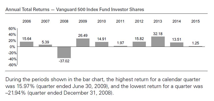
The main critique I have of these numbers is that each year includes only one sample. We don’t see any [standard] error [of the mean] bars here: each number is exactly what the fund returned during that calendar year. People tend to give samples created from a linear combination of historical data added weight and sometimes these historical samples (as opposed to simulated trials) are the only ones people recognize. Statistically speaking it is one and only one sample, however, which makes it the tiniest sample size available aside from zero. I had the same criticism for Craig Israelsen.
The prospectus also includes the following table:
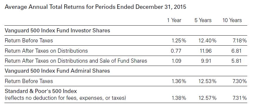
Nowhere does it state that transaction fees are included in the performance numbers. Transaction fees are mentioned in the last row where benchmark performance is given. While this may imply the fees are taken into account above, we cannot assume this.
I will make one tangential observation here about relative performance. The fund underperforms the benchmark for all three time frames whether looking at Investor Shares or Admiral Shares. Critics of actively managed funds sometimes emphasize large losing margins against the benchmarks. The only way to ever beat the benchmark is to actively invest. A passively managed fund is guaranteed to lose every time because of the fees—regardless of how small those fees might be.
I will continue with two more examples in the next post.
Categories: Financial Literacy | Comments (3) | PermalinkDynamic Iron Butterflies (Part 6)
Posted by Mark on April 4, 2017 at 06:42 | Last modified: May 26, 2017 12:53In the spirit of “who ever said making a business out of trading should be easy,” today I will present results on a 50% stop-loss (SL) applied to the dynamic iron butterfly (DIBF).
Backtesting this was actually not too difficult. Once I got started, it did not take much time to redo 526 backtrades. I did have to verify the cost of each trade because over the first few years of the data series, OptionVue had a lot of missing data (filling in with theoretical values is variable because it does so according to what data is in computer memory at that given moment). Thanks, as always, to Ken Dole for expert technical support when needed.
Here are some observations from redoing 526 backtrades:
–Nine trades came up winners
–Upon third check, only four of nine were winners
–Multiple trades would have been setup differently upon replication
These observations are due mostly to the inconsistencies described above. I did not change any backtrade results but I did remove four backtrades because the 50% SL was not triggered upon replication.
Here are some trade statistics with and without the SL:
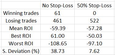
The 50% SL marginally improves results on average as the mean ROI improved 2.11% (all ROI’s are percentages).
Looking at the best and worst trades is an indication of how the range contracted with the SL. This is strongly affirmed by the standard deviation (SD), though, which becomes much smaller. Once again, SD is a measure of risk so this is meaningful.
How does this impact the overall backtest?
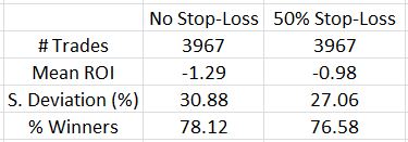
The SL improved the average trade by 0.31% and decreased the SD by over 10%. That’s definitely a win-win despite a lower number of losing trades.
One further thought I had about limiting losses was that the upside on an asymmetrical butterfly already has limited loss. If the SL is not implemented on the upside, trades that would otherwise go on to be winners would not be stopped out for losses. As it turned out, only eight of 61 trades that went on to hit the 10% profit target or went on to be profitable at expiration after being stopped out were hurt on the upside. Four of those butterflies were balanced, though. Not implementing the SL on market moves to the upside where the DIBF was asymmetrical only improved mean ROI by 0.5%. It also increased SD to 9.60%.
Although it did not improve trade statistics much (or at all), I think it makes sense to not implement an upside SL on an asymmetrical DIBF.
Categories: Backtesting | Comments (0) | PermalinkRichard Weissman’s Trading Rules
Posted by Mark on March 30, 2017 at 06:43 | Last modified: December 11, 2016 14:33Over three years ago, I read an article on Richard Weissman’s top trading rules. Weissman has written articles, books, and supposedly consults and/or trains people. What I think is more important is a comment I wrote after these 10 rules: are there situations where every cliché rule does not apply? Let’s go through these one at a time in order to find out.
1) Trade the market, not the money
Is the “market” a technical chart? Is it my unrealized gain/loss? Is “money” a technical indicator or is it my gain/loss? I can come up with a number of contradictory interpretations here.
2) When there’s nothing to do, do nothing
I like this. Overtrading is a frequently-discussed problem. Some people feel they have to trade and get nervous when they don’t. If it’s a consistent problem then a therapist or counselor/coach might help one to feel more at ease during downtime.
3) Stop adjustments can only be used to reduce
reduce risk, not increase it
I think this is a recommendation to only narrow stops and never widen them. If one is using a trading system then I see a potential problem with changing the stop in either direction. Trade like you backtest and do not deviate either way.
4) There are only two kinds of losses: big
losses and small losses. Given these
choices, always choose small losses.
I disagree. Not only are “big” and “small” subjective, the occasional large loss may be part of a viable business model.
5) Don’t anticipate, just participate
I disagree. “Prepare for war in a time of peace.” Anticipate what you are going to do in all cases because if you don’t then when the time arrives to participate you may be like a deer in the headlights.
6) Buy the strongest, sell the weakest
This does not always apply (e.g. option trading).
7) Stagger entries & exits
I like this but it also seems to be personal preference. A workable business plan need not stagger.
8) Look for low risk, high reward, high
probability setups
I think this is one possible trading style but certainly not the only viable one.
9) Correlations are for defense, not offense
Pair traders may disagree because they use correlations to make money (offense). I disagree because during market crashes, even non-correlated markets tend to move together.
10) Be disciplined in risk management and flexible
in perceiving market behavior
I’m not entirely sure how these two fit together. I agree with the former. Whether risk is managed at entry (limiting position size) or with stops, it should be disciplined because catastrophic loss could occur the one time I’m sloppy. With regard to the latter, I’m not a big believer in forecasting future market moves under any circumstances. I would suggest being disciplined when interpreting market behavior and then apply the plan consistently.
Out of 10 trading rules I agree with 1.5 of them. Not great but could be worse. Your mileage, like mine, may vary.
Categories: Wisdom | Comments (0) | PermalinkStatistical Manipulation
Posted by Mark on March 27, 2017 at 06:05 | Last modified: November 15, 2016 12:21Peter Berezin, chief strategist for BCA Research, wrote an article for the September 2016 issue of AAII Journal. Near the end he made some comments about statistics:
> Statisticians like to say that if you torture
> the data long enough, it will confess to
> anything. This old adage is especially relevant
> to the study of stock market anomalies. First,
> there is the risk that any anomaly that is
> unearthed will simply end up being the product
> of data mining. Second, even if an anomaly
> turns out to be genuine, there is a risk that
> it will be arbitraged away once the investment
> community becomes aware of it.
I argued for an increased use of inferential statistics here and I later relayed the opinion of a financial adviser as to why inferential statistics may be relatively uncommon.
I still believe inferential statistics are useful to offer an apples-to-apples comparison but Berezin makes a good point that statistics may be used to manipulate. We can never be sure of an investigator’s underlying motives and unless we do the research ourselves, we also cannot be sure the statistics were correctly computed.
I do believe we can do a couple things to avoid these statistical issues. Data mining involves searching a large collection of data with the purpose of finding significant results. This should be avoided. Give me an indicator and enough data and I can find a snippet of price action for which the indicator works fabulously (fallacy of the well-chosen example). This is unlikely to be profitable in live trading, however. One way to avoid this involves searching the surrounding parameter space for a high-plateau rather than a spike region of profit.
With regard to market edge being arbitraged out over time, I need to monitor my system and have criteria indicating when it might be broken. Walk-forward analysis can help to keep a strategy current thereby increasing the probability it will work with live trading. I may also monitor total profit/loss and stop trading the system when this value falls below the equity moving average. This should be developed through proper validation methodology.
Categories: Wisdom | Comments (0) | Permalink2016 Performance Update
Posted by Mark on March 16, 2017 at 07:10 | Last modified: October 13, 2017 11:04I am very past due for a performance update.
I will focus discussion on the following table:
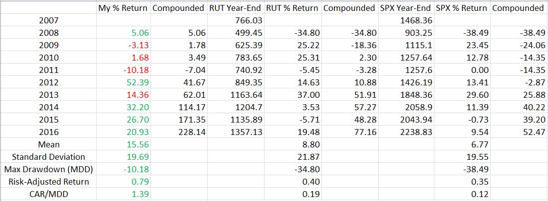
My first full-time year was 2008, which means I now have nine years of trading history. Through that time I have tried a few different things, backtested a lot, and learned tons. Hopefully I have learned most from my mistakes. Only the future can reveal whether that is true.
The table includes three sets of data. I start with my yearly performance and the compounded total return. I then repeated these calculations for the small-cap and large-cap indices. Green (red) numbers indicate where I outperformed (underperformed) the benchmark. Standard deviation is a measure of risk (as discussed here and here) along with max drawdown (MDD) (as discussed here). Risk-adjusted return is total return divided by standard deviation. CAR is compound annualized return, which makes CAR/MDD another risk-adjusted metric.
I have outperformed the benchmark in five out of nine years.
I have generated profit in seven out of nine years.
My average return significantly outpaces the indices. Mostly for that reason, the risk-adjusted returns are much better too.
My biggest disappointment is the relatively high standard deviation. To this end, my 2012 return of +52.39% hurts. I can’t say exactly what was going on with my trading that year without looking back and scrutinizing the records. Yes it’s a great number but my preference would be to have stable returns like I have the last few years.
I very much like the fact that my worst year was limited to just over a 10% loss. This is the kind of stability somewhat lacking to the upside. I experienced three catastrophic losses over the last nine years and the overall performance suggests I have bounced back quite well.
Graphically, the comparison looks like this:
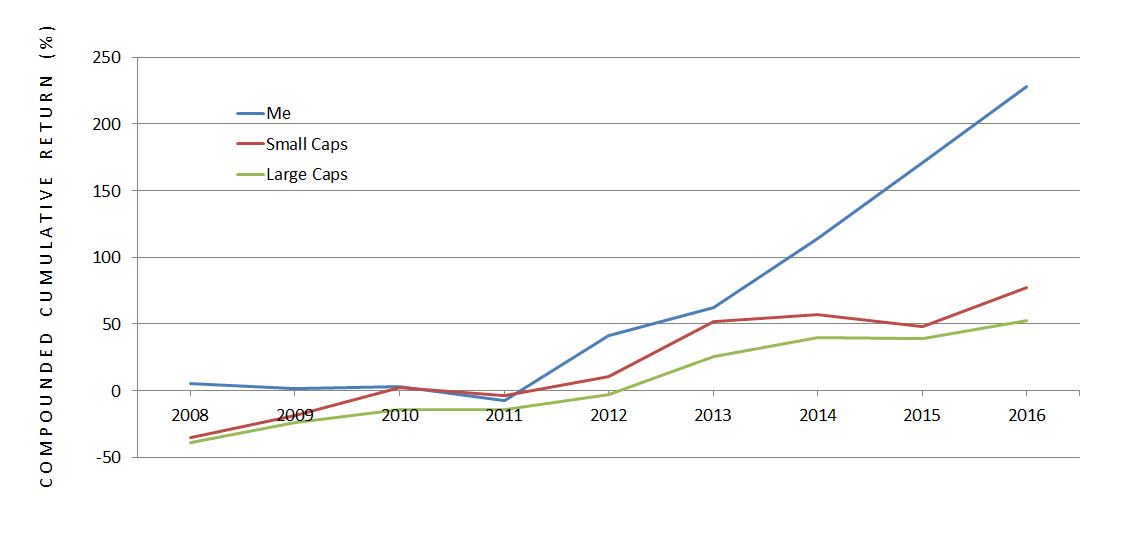
The outperformance is clear.
Although I was in negative territory and underperforming after four years, my preference is to have a relatively flat equity curve in volatile markets as opposed to a curve more jagged than the coastline of Buzzards Bay, MA. This is something I have managed to accomplish thus far.
Categories: About Me | Comments (1) | Permalink