Proprietary Indicators
Posted by Mark on April 24, 2020 at 07:13 | Last modified: April 26, 2020 13:23Proprietary indicators sometimes serve a sketchy purpose in finance.
Check out an article out yesterday (April 23, 2020) on marketwatch.com. The article quotes Sophie Huynh, a Société Générale’s multiasset strategist, who says “investors have likely gotten ahead of themselves… [because] this tech-led recovery… is not sustainable.”
She offers some reasoning to support this prediction. Only in retrospect will we know if she was right or wrong, though, and we will never be able to do anything more than hypothesize as to why.
The article continues:
> Huynh is keeping a close eye on a proprietary indicator that
> tracks positioning of big money managers over a range of
> perceived riskier assets, and so far they are not throwing in
> the towel. “What we’re seeing at the moment is there are no
> signs of capitulation compared to levels seen in 2008, but
> there’s some risk-off that’s settled in,” she said.
Here’s a chart of the indicator:
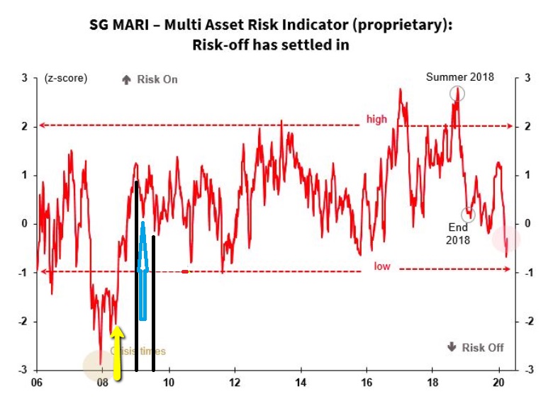
At the end of Dec 2007, the indicator bottomed out near -3. I’ll give benefit of the doubt here because the biggest selling occurred in the first couple weeks of 2008 when the indicator had rebounded (albeit to to a still-very-low value).
Because the current indicator (roughly -0.25) is nowhere near the 2008 levels, Huynh is claiming we are not at the bottom.
Can we believe in the indicator, though? Let’s check some values to find out.
The spike lows near the yellow arrow (down to roughly -2.25 and -2.0, respectively) occurred in the first six months of 2008 (around or before 1/4 of the distance between the ’08 and ’10 hashmarks on the x-axis). This seems discrepant because the heavy selling in 2008 came in Q4 (Oct – Nov).
Looking forward, I inserted the black lines to bracket the first half of 2009. This bear market bottomed out with the two weeks ending March 9, 2009. The lowest value of the indicator around that time is highlighted by the blue arrow where it sits in slightly positive territory. That doesn’t seem right.
Moving forward, the period around the Flash Crash (May 2010) is accompanied by a spike down to roughly -0.9. That’s good.
The period around the 2011 summer selloff (US debt downgrade) is accompanied by a spike down to roughly -1. That’s good.
Around August 20-24, 2015, the Brexit selloff is accompanied by a spike down to roughly -0.7.
Around Feb – Mar 2018 when the market corrected over 10%, the indicator looks to be in positive territory. Not good.
Around Oct – Dec 2018 when the market corrected over 10%, the indicator looks to be in positive territory. Not good.
Overall, this indicator is 50/50 based on a small sample size of occurrences in terms of matching up with major “risk off” market declines. A theoretical coin flip would do just as well.
I see many “proprietary indicators” when reading articles in the financial media. I don’t know if such indicators have been accurate in the past (in this case, I was able to do some cursory backtesting). I don’t know if they have been tested for validity. I wouldn’t know what to look for in terms of validity testing—all because they are proprietary (undisclosed). The article is often marketing for some sort of business. In that case, I certainly want to be on the lookout for the fallacy of the well-chosen example (see middle paragraph here).
Red flags fly, for me, whenever I see something labeled proprietary. Too often, this seems to give authors license to write anything convenient.