Posted by Mark on June 28, 2018 at 06:58 | Last modified: January 4, 2018 06:17
I want to alter course for the day and pick apart a “perfect trade” I recently stumbled upon.
The post reads something like this (cleaned up for grammatical errors):
> There are a lot of stock options trading strategies that have
> been used by hedge funds and successful traders but the question
> is just how conservative do we want to be?
>
> I call my favorite strategy ever the MONSTER TRADE because it
> can’t lose at all and your profit margin is 50% per year.
Guarantees are illegal in the financial industry (probably because no real guarantees exist!). This is a gigantic red flag. A perfectly appropriate course of action would be to run for the hills without doing any further investigation. I continue because I am interested in figuring out puzzles and in learning about how the industry works (for better or for worse).
> The strategy is based on purchasing 100 shares of stock,
> selling monthly call options for one year or less, and
> concomitantly buying a one-year put option as a hedge.
>
> For example, buy 100 shares of XYZ for $50/share. Sell
> one monthly call OTM to collect $100. Repeat this 12 times
> to collect $1,200. Purchase the one-year $50-strike put
> option for $400. Your annual income will be $800
> regardless of whether the stock goes up or down.
Supposing this were all true, $800 / ($50 * 100) = 16% annualized. What happened to the 50% mentioned above?
Let’s consider another potential pitfall given stock price of $100 and IV at 30% with interest rates and dividends set to zero. A one-year ATM put will now cost around $1,200.
Suppose I sell a monthly 105 call for $300 [theoretical value $150]. The very next day, stock crashes to $70 and trades roughly sideways for the month. The short call expires worthless.
With IV now up to 50%, I sell a second monthly call at the 73.5 strike (5% OTM) for $300 [theoretical value $200]. Stock rebounds to $100 the very next day and trades sideways. The short call gets assigned and I sell stock for $73.50/share. Assuming IV falls to 40%, the put with 10 months to expiration is now worth $1,400. Since the stock will go straight up for the rest of the year (future leak), I sell it now for the best price possible.
What do we have in this “can’t lose” trade?
- -$1,200 to buy the initial long put
- -$10,000 to purchase the initial stock
- $600 for the two calls sold
- $7,350 for the stock sale
- $1,400 for the put sale
———————————————–
-$1,850 (-15.4% annualized)
As a second example, consider the same situation where the stock gaps overnight to $150 and gets assigned at $105/share for a $500 stock profit in addition to $300 call premium. The put, [virtually] worthless now, leaves me with a $400 loss.
Oh for two…
I will continue next time.
Categories: optionScam.com | | Permalink
Posted by Mark on June 25, 2018 at 06:57 | Last modified: December 24, 2017 10:43
Taking a few steps back can better help me to identify what still blocks my entry into the wealth management arena.
In November 2017, I called an adviser working for an LPL Financial affiliated firm. I had spoken with a recruiter two weeks earlier who did not provide much information. I wanted to find out more about logistics. Would I be able to work remotely? Would I have to find my own clients? Would I be able to trade options?
Ten minutes was all it took. He believed naked puts (NP) can pay off handsomely and get hurt severely based on his limited trading experience. As have so many others, he congratulated me on my decade of success in leaving pharmacy to trade options for a living. He said LPL is more conservative, though, and would probably not be the place for me. I asked where else I might look and he said this wasn’t his specialty and he really had no recommendations.
Another dead end.
If only as good PR and to engender trust, I think a number of advisory firms and broker-dealers that service non-accredited investors ban derivatives altogether. Derivatives do, after all, have a nasty reputation in the financial history of this country (another example here).
NPs involve great theoretical risk. Since 2001, NP performance has been far superior to that of long shares (i.e. max drawdown 3.7x smaller). Nevertheless, the leveraged approach could theoretically go bust sooner than long shares in the event of a market decline more severe than the 2008 financial crisis.
To be clear, the great theoretical risk with which I currently eat and sleep could be realized in the event of a surprise market crash of huge magnitude. Anything short of this should substantiate NPs as having less risk than long shares, but I would willingly discuss the worst case scenario with potential clients. This could make for a lousy sales pitch.
How do I resolve carrying such great theoretical risk and managing a strategy I believe to be better than stock?
The answer is high net worth (HNW) individuals (i.e. accredited investors). I alluded to this in a previous footnote. Recent experience has suggested my NP strategy be traded with an account no smaller than $250,000. I think strategies like this should be allocated up to 20% of an investor’s total net worth because of their potential to bust sooner than unleveraged alternatives. A HNW individual is likely to meet these criteria whereas non-accredited investors are not.*
I am hard-pressed to find work with an established wealth management firm, which might be my best opportunity to connect with HNW individuals. I have no relevant, credentialed financial education. I have no previous industry experience. I am intent on remaining focused on maximizing investment performance, which excludes me from providing other advisory services. I would insist on having the freedom to manage accounts my way [trading options]. I might insist on working remotely.
If I can’t work for an existing firm then I could take the leap and launch my own. I discussed this in detail here.
On a 2017 Shark Tank episode, Barbara Corcoran explained precisely what has kept me on the sidelines for over two years:
> It’s very hard to invest in a business where you don’t see
> a clear road to the finish line. Because I can’t see a way
> to get my money back, I’m out.
If I believe in myself enough then maybe the answer is to create a business plan, throw down the stacks to launch an IA, and to learn on the fly. I won’t find clients overnight but if I can secure one new $250,000 account per month then I could have $10M under management in four years (assuming 100% retention). That’s not half bad.
And maybe, with a partner who has industry experience with software/back-end technology along with sales and presentation know-how, I would progress even faster.
* The implication is that losing this 20% would still preserve 80% of the investor’s total net worth. In reality, some of the
other 80% would probably be invested in vehicles that would also lose significantly in the event of a market crash. While
I have computed Sharpe ratio, I have never computed correlation between my core strategy and its benchmark.
Categories: Money Management | | Permalink
Posted by Mark on June 22, 2018 at 06:54 | Last modified: January 3, 2018 07:44
Today I will conclude analysis of the investment presentation referenced here.
The third-to-last slide discussed lists managed account formats and related information. Formats exist for “Market Series” and “Factor-Enhanced Series” accounts. This presentation has focused on the latter. Formats include “UMA Sleeve,” “SMA Beta,” “SMA Tax-Optimized,” and “SMA Custom.” Minimum investment ranges from $60,000 to $750,000.
The penultimate slide lists investment management fees. The factor-enhanced “quantitative portfolios” (QPs) range from 0.20-0.25%, which it states is 5-10 basis points above average. This is cheap compared to the standard 1% fee most financial advisors charge, which includes non-investing services. It’s not as cheap based on my incremental value calculations. I think a big difference exists between investment styles, though. This appears to be a passive, plain-vanilla investment offering that generates subpar performance yet still represents significant improvement. Mine is an active investment approach.
The summary slide says the factor-enhanced QPs “deliver the potential for excess return.” This may be the best line of the whole presentation. Many things have potential. This is no guarantee nor is it an exaggerated conclusion drawn from the content provided.
This line suggests everything in the presentation amounts to circumstantial evidence, which relies on inference to support a claim. Plenty of instances have been discussed where incomplete or flawed logic begs inference to overlook. In Part 1, I talked about potential data-mining bias. In Part 2, I talked about incomplete/empty phrases that work well for sales and marketing. In Part 3, I analyzed performance graphs potentially related to but not direct portrayals of the factor-enhanced QPs. In Part 4, I mentioned missing analyses of the very important drawdowns and flat times. In Part 5, I talked about a number of irrelevant labels sounding professional and persuasive.
Circumstantial evidence is one step below direct evidence. I mentioned a lack of supporting evidence several times throughout this dissection. A large emphasis of sales and marketing [advertising] is staging circumstantial evidence to persuade. I suspect many people fail to realize what is missing. People may also get distracted from the fact that the evidence is incomplete. The presenter (or presentation) can achieve this any number of ways such as with establishment of rapport, with emotional appeals or humor, with polished public-speaking skills, etc.
At the end of the day, this is another instance of performance omission by an investment manager. Eleven other such mentions were given in this blog series. At the very least, I think this investment offering is as good as any other. While professional and somewhat convincing, however, given the circumstantial nature I certainly would not bet on outperformance.
Categories: Financial Literacy, optionScam.com | | Permalink
Posted by Mark on June 19, 2018 at 06:50 | Last modified: January 2, 2018 11:53
The next slide continues with the process of portfolio selection.
Starting with a parent index such as the Russell 1000 or Russell 3000:
> PMC uses a proprietary methodology to rank the…
Companies often describe their methods as proprietary. I view “proprietary” as a fancy word that gives the adviser authorization to conceal details. Whether this is acceptable is a topic for later discussion.
> constituents according to momentum and value, well-known
> factors grounded financial [sic] economic theory.
As discussed in Part 1, “well-known,” “grounded,” and “economic theory” are meaningless terms without supporting evidence and/or further explanation.
> Constituents are reweighted according to the factors,
How is this done?
> resulting in the Envestnet Factor-Enhanced Index.
Note the professionally-sounding, marketable product name.
> PMC’s Quantitative Research Group (QRG) and…
“Quantitative Research Group” sounds very official in addition to getting its own abbreviation. I discussed “quantitative” in Part 1. My guideline is to only assign abbreviations when I am going to be using them later.* I see no other references to QRG in this presentation, which makes me think sales and marketing as it seems sophisticated, meaningful, and compelling.
“Research” is misleading because neither supporting evidence nor methodological description is given. In scientific research, investigators provide sufficient details to enable replication by others. Study replication with similar results can represent strong validation.
“Group” enhances credibility because people working together imply better accuracy.
> experienced portfolio managers review the portfolio…
Degree of skill (not discussed) at managing portfolios is more important than experience (not quantified) in doing so.
> to ensure target factor exposures, tracking error
> allowances, and liquidity constraints are satisfied.
What is the target number? How much tracking error is allowed? What are the liquidity constraints? If they don’t provide enough detail to replicate the study then they can claim anything. Realizing this diminishes their credibility.
> The resulting Factor-Enhanced Portfolio model
> is a concentrated portfolio of 75+ positions providing
> exposures to desired factor exposures [sic?].
The performance graphs discussed here were not for the Factor-Enhanced Portfolio. Those graphs were for momentum and value factors and indexes, which themselves are nebulous terms. In truth, they have described an elaborate-sounding investing strategy without providing any concrete [validated performance] reason to invest.
Other questions about the portfolio also come to mind. How often is it rebalanced? Is this the same as “reweighting?” What is the turnover? These are examples of meaningful [performance-related] information that has been overlooked.
The next slide discusses tracking error:
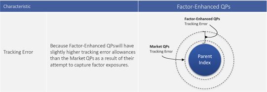
“Tracking error is higher when the strategy outperforms and is very low when the strategy performs in-line with the parent index,” the presentation claims.
I fail to see any pertinence to potential investors, which suggests its inclusion is probably for the purposes of sales and marketing. If I thought this to be important then I would ask how the numbers were calculated. Past performance is also no guarantee of future results and as retrospective analysis that may be curve-fit, tracking error may be meaningless anyway.
The portion reviewed today is heavy on sales and marketing techniques while being light in terms of relevant information.
* Apparently the Chicago Manual of Style advises against abbreviations unless used at least five times in a
manuscript (my posts rarely exceed 500 words, which make for some very short manuscripts).
Categories: Money Management, optionScam.com | | Permalink
Posted by Mark on June 14, 2018 at 06:42 | Last modified: January 2, 2018 08:09
Without doubt, the “Wealth Indexes 1927 – 2014” graph is impressive. The comparator (S&P 500) gets dwarfed by both high value and high momentum curves.
As with the Part 3 line graph before it, though, this graph raises lots of questions. Again, no drawdown (DD) analysis is shown. Graphing “growth of $1” on the y-axis makes it difficult to tell whether any DDs exceeded initial equity value. This is a no-no because merely changing the starting date could mean the difference between survival and Ruin. I think the proper way to backtest a strategy is to use constant position sizing and an initial equity value that exceeds maximum DD [perhaps with a margin of safety, too]. If they did this then supporting evidence should have been given.
Posting index returns raises questions about dividend yield inclusion and taking steps to avoid survivorship bias.
Index benchmarks imply buy and hold (B&H), which raises the tax issue. I asked Longs Peak* how GIPS handles taxes:
> Reporting performance net of tax is not very common so
> taxes themselves will not affect performance. If the strategy
> is different because the accounts are managed in a tax
> sensitive way then… [compare] accounts with similar tax
> situations… many firms create… taxable and non-taxable…
> composites because they implement their strategy in…
> different way[s]… You want to ensure you are making an
> apples-to-apples [comparison]… [via e-mail].
If I knew trades in the test and benchmark accounts involved different levels of capital gains then I might include an adjustment to err on the side of conservatism. For example, I could subtract the long-term capital gains rate from the highest tax rate and decrease equity curve growth by that amount.
Along with DD analysis, another phenomenon often excluded from comparison studies is flat time. Flat time is the [longest] time interval between equity highs (-water marks). Flat times are inversely proportional to new account highs.
While it’s hard to measure precisely given the wide axis scale, the high-momentum case shows at least a couple instances of 5-10-year flat times. It might be difficult for some people to stick with the strategy through these periods. I certainly would not recommend this to anyone looking to trade full-time as a business or for those seeking an optimal investing approach. I do believe people can benefit from a B&H strategy, however. I think this is characteristic of most garden-variety offerings that present significant improvement in the face of subpar returns.
Finally, the exponential y-axis suggests the graph reflects remaining 100% invested. This is either not realistic or carries a greater risk of Ruin (e.g. here or here). I believe optimal investing should allow for the possibility of locking in profits over time, which remaining fully invested does not.
* Sean Gilligan has been very helpful with GIPS compliance questions over the phone and through e-mail.
Categories: Money Management, optionScam.com | | Permalink
Posted by Mark on June 11, 2018 at 06:28 | Last modified: December 25, 2017 10:28
Today I continue studying the investment presentation referenced here.
> …important characteristics of the momentum and value factors
> is their negative correlation… meaning value tends to work well
> when momentum is not… and momentum works well when value is
> idle. So each factor adds value on a standalone basis but
> their negative correlation makes them an excellent combination
> for potentially increasing risk-adjusted returns.
“Negative correlation,” which is arguably the “Holy Grail” of diversification, is a great marketing buzz phrase.
One problem is that correlation changes over time. During some of the most severe market declines, negative correlations have turned positive and approached +1.00. This means everything loses. The presentation says from 12/31/1926 – 12/31/2014, correlation of value and momentum was -0.40. This doesn’t tell us how things look at the extremes (when correlation becomes most positive) or what the overall distribution looks like (how often the negative correlation persists). An unstable parameter with large mean excursions coinciding with big losses is probably not a viable trading concept.
At worst, this could completely invalidate momentum and value factors as edge provided by their investing approach.
Here is their graph of factor performance:
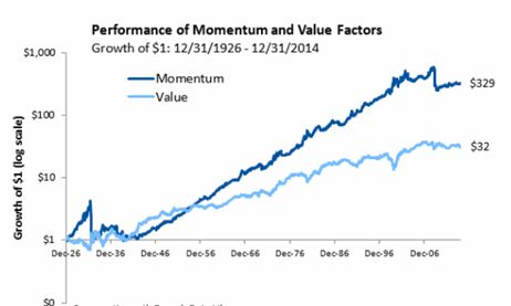
Over 88 years, $1 grows to $329 and $32 for momentum and value factors, respectively. That sounds impressive!
This is a good time to review my general recommendations for viewing an investment presentation:
- Do not be blinded by the light: their job is to make things look good.
- Accept no comparison without assessing the comparator.
- Challenge everything.
- Do not accept any claims without supporting evidence (added after Part 3).
No available comparator violates #2. We cannot see how the investment performed when not tailored toward momentum or value. A terminal value of $350, for example, would be reason to reject both factors.
Drawdown (DD) analysis is important enough to render any presentation lacking it very limited in application. DDs determine whether we can remain invested in a strategy. I have written about the importance of DDs here, here, here, and here.
With regard to #3, I see the graph omits DD analysis by showing growth of $1. The account would never actually start with $1 and the maximum DD of both curves may even exceed the initial value. Any such equity curve would, in reality, be terminated early due to Ruin (account going to zero).
In other words, growth of $1 to $350 simply would never have happened. The initial account would need to be larger to trade this strategy over the entire 88 years. Adding initial equity dilutes returns. Instead of 35,000%, realistic growth could be 3,500%, 350%, or less. The bloom is off the rose.
The presentation continues with this slide:
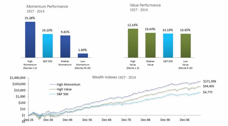
For me, the line graph begs an immediate question: how does this line graph differ from the first one? Both graphs show value and momentum factors. Both show growth of $1. Both cover a similar time interval. Why does momentum in the latter graph only grow to $272 (rather than $329) while value grows to a whopping $44 (rather than $32)? Those are huge differences for a subtraction of one year (or less), which is only a 1.1% difference on 88.
I also wonder why the time intervals are different at all. The first graph is “12/31/1926 – 12/31/2014” and the second is “1927-2014.” Were they just sloppy in reporting the same time interval? If they used the same interval then what/why was the difference in how they defined factors? Did they do their own research or “borrow” data from others?
Consistency breeds credibility and [especially] when consistency is lacking, explanation should be given. None is given here, which violates #4. I question the accuracy of their calculations. I also question their underlying motives. Were they trying to artificially inflate certain numbers to serve their purpose? Remember #1, above.
Categories: Financial Literacy, optionScam.com | | Permalink
Posted by Mark on June 8, 2018 at 07:13 | Last modified: December 23, 2017 11:50
Today I will continue my exemplar of things to watch for when viewing a financial presentation.
Remember my general recommendations:
- Do not be blinded by the light: their job is to make things look good.
- Accept no comparison without assessing the comparator.
- Challenge everything.
The presentation continues:
> A significant amount of academic and industry research has focused…
Incomplete phrases like these are easy to challenge:
- Who determines significance?
- Who did the research?
- Who funded the research?
- What conflicts of interest were present?
- When was the research done?
- What was the research methodology?
All this information can help us to determine validity of the conclusions.
No responsible, advanced trader is going to accept empty claims just because they appear in a presentation. This can only serve marketing/advertising purposes in an attempt to persuade the gullible.*
This same lack of evidence is why I disregard other traders’ claims about their own personal investment success. I have written on this subject here and here. I write about my own performance every now and then to hold myself accountable. I do not expect you to take anything from those posts.
Remember, too, that finance and investing are all about the money. Somehow, I feel this puts us more at risk for fraud than other industries. As a public service announcement, go back and read some of my other posts on fraud to increase awareness and protect yourself (e.g. here, this whole mini-series, or any of my optionScam.com posts).
> …on the tendency for assets that have performed well over the past
> year to continue to perform well over the near term.
I need to know much more to evaluate these claims. Drawing conclusions from one and only one parameter value is shortsighted (e.g. here, here, and here). I would rather see discussion of a range and why they selected 12 months.
These comments regarding momentum also apply to the value factor.
This presentation is clearly intended to be more for marketing and advertising than it is research because the latter would not omit so much critical information. I try to avoid being sold by any presentation lacking critical information. I would highly recommend you do the same.
> Why have we selected momentum and value as the two factor
> exposures we attempt to maximize? Of the several hundred asset
> pricing factors researchers have identified over the past few of
> decades, there are only a few that stand the test of time and
> remain statistically significant through various market cycles.
> Of those few, momentum and value are among the most robust.
I discussed last time why the “several hundred” detail is irrelevant if not damning.
Hard data is needed to fulfill claims that momentum and value have “stood the test of time” and are “statistically significant.”
Again, do not accept hollow statements in a presentation without understanding the supporting (or lack thereof) evidence.
I will continue in the next post.
* This arguably includes many people. The financial industry likely gets away without reporting performance, in large part,
for this reason alone.
Categories: Financial Literacy, optionScam.com | | Permalink
Posted by Mark on June 5, 2018 at 06:56 | Last modified: December 23, 2017 08:15
Investment presentations often sound quite tantalizing. Critical thinking must be applied in order to assess what meat (if any) is actually there. The video referenced here is accessible over the internet. Today I will begin to discuss my thoughts as an exemplar of what to look for in such a presentation.
Here are a few general recommendations to keep in mind. First, do not be blinded by the light: their job is to make things look good. Second, accept no comparison without assessing the comparator. Finally, challenge everything. Anything that can withstand such scrutiny and still come out looking impressive is probably deserving of closer attention.
> Quantitative Portfolios combine the benefits of passive
> investing with the portfolio customization of managed
“Quantitative Portfolios” is a complex-sounding eight-syllable phrase. Capitalizing “portfolios” makes it seem like an advanced product. Quantitative just refers to numerical measurement rather than semantic description. Most portfolios are quantitative because some number is calculated somewhere. “Quantitative Portfolios” could therefore be much ado about nothing.
Passive investing usually misses the benchmark due to tracking error and expense fees. This falls under my category of subpar returns and right off the bat, I suspect this might be a garden-variety offering.*
> accounts… low cost access… with opportunities for
“Low cost” is also suggestive of a garden-variety offering because I don’t believe the intellectual capital (including dedicated quantitative analysts) needed to boost a garden-variety strategy to something more optimal comes cheap.
> personalization and tax management.
I think [portfolio] “customization” and “personalization” are best used as marketing buzzwords.*
Tax management can be useful but hard to measure.*
> Factors are the basic building blocks determining an asset’s
> risk and return… since [1990s], hundreds of… factors have
> been researched.
Researched by whom and to what extent? Some sort of reference would be useful.
The seeds for data-mining bias are planted here. By chance alone, an exhaustive (i.e. “hundreds”) study of historical data will usually turn up at least a couple highly-correlated relationships. Correlation does not imply causation, however. This is not the best way to identify relationships likely to be predictive of the future.
> Both the momentum and value factors have been heavily
> researched for at least 20 years by leading academics and
> industry practitioners and used extensively in practice by
> well-known quantitative investment managers.
I have read about the advantages of focusing on momentum and value over the years. Familiarity breeds credibility. This is important to recognize for the sake of objectivity.
The sentence sounds matter-of-fact and official, which can be very persuasive. Dig a bit deeper, though, and we can see that critical information is omitted:
- Who are these “leading academics?”
- Are they skilled investors (i.e. is there reason to think this might be actionable)?
- To assess quality of the research, what are meant by “extensively” and “well-known?”
- Have the investment strategies outperformed benchmarks and increased AUM for the firms involved?
- What do the drawdown distributions look like?
These unanswered questions can raise doubt about validity.
Finally, most investment categories (e.g. active, passive, hedge funds) represent significant improvement. I [optimistically] assume that at some level, all approaches are managed/developed with “heavily researched” factors and “leading academics” doing the work. This limits the positive impact of the whole statement to something less than optimal.*
I will continue next time.
* These are good topics for future blog posts.
Categories: Financial Literacy, optionScam.com | | Permalink