Short Premium Research Dissection (Part 33)
Posted by Mark on June 13, 2019 at 07:07 | Last modified: December 29, 2018 06:31I continue today with the second-to-last paragraph on allocation.
All graphs from previous sections assume allocation. Some graphs study allocation explicitly (e.g. Part 20). Others incorporate a set allocation to study different variables (e.g. 5% in Part 18). Return and drawdown (DD) percentages may be calculated from any of these allocation-based graphs.
I remain a bit uneasy about the fact that so many of the [estimated] CAGRs seen throughout this report seem mediocre (see fifth paragraph here). I am familiar with CAGR as it relates to long stock, which is why I have mentioned inclusion of a control group at times (e.g. paragraph below graph here and third paragraph following table here).
While [estimated] CAGR has me concerned, CAGR/MDD would be a more comprehensive measure (see third-to-last paragraph here). Unfortunately, I am not familiar with comparative (control) ranges for CAGR/MDD on underlying indices, stocks, or other trading systems. Unlike Sharpe ratio and profit factor—metrics with which I am familiar regardless of market or time frame—I rarely see CAGR/MDD discussed.
The larger takeaway may be as a prerequisite to do or review system development. I would be more qualified to evaluate this research report were I to have the intuitive feel for CAGR/MDD that I have for Sharpe ratio and profit factor.*
With regard to the Part 32 graph, our author writes:
> The two management approaches were profitable… Holding trades
> to expiration was an extremely volatile approach, while closing
> trades after 10 days… resulted in a much smoother ride.
That [green] curve looks smoother, but volatility of returns cannot be precisely determined especially when four curves are plotted on the same graph. This is a reason I promote the standard battery (see second paragraph of Part 19): standard deviation of returns and CAGR/MDD are the numbers I seek. Inferential statistics would also be useful to determine whether what appears different in the graph is actually different [based on sample size, average, and variance].
Now back to the teaser that closed out Part 32: did you notice something different between that graph and previous ones?
For some unknown reason, we lost three years of data: 2007-2018 in previous graphs versus 2010-2018 in the last.
This “lost data” is problematic for a few different reasons. First, 2008-9 included the largest market correction in many years. Any potential strategy should be run through the period many people consider as bad as it gets especially when the data is so easily available. Second, inclusion of system guidelines thus far has been made based on largest DDs and/or highest volatility levels: both of which included 2008 [this isn’t WFA]. Finally, when something changes without explanation, the critical analyst should ask why. Omitting 2008 from the data set could be a great way to make backtested performance look better. This would be a curve-fitting no-no, which is why it raises red flags.
* This is a “self-induced shortcoming,” though. Any mention of CAGR/MDD in this mini-series comes
from my own calculation (e.g. second paragraph below table in Part 20). Our author makes no
mention of these while omitting many others as well.
Short Premium Research Dissection (Part 32)
Posted by Mark on June 10, 2019 at 06:41 | Last modified: December 31, 2018 15:07Early in Section 5, our author recaps:
> In the previous section, we… constructed with a 16-delta long put…
> and long 25-delta call.
>
> The management was quite passive, as trades were only closed
> when 75% of the maximum profit… or expiration was reached.
We now know the rolling was not adopted after all (see second paragraph below first excerpt here).
> …achieving 75% of the maximum profit potential is unlikely… we
> are holding many trades to expiration, or very close to expiration.
> That’s because if the stock price is… [ATM]… most of the option
> decay doesn’t occur until the final 1-2 weeks before expiration.
I addressed this in the last paragraph here.
> On average, trades were held for 50-60 days, which means few
> occurrences were traded each year and the performance of those
> trades sometimes swung wildly near expiration.
We finally get an idea about DIT (part of my standard battery as described in this second paragraph). She also admits use of a small sample size, which backs my concern about a couple trades drastically altering results (e.g. third-to-last paragraph of Part 29). In the paragraph below the first excerpt of Part 31, I talked about that high PnL volatility of the final days.
> To solve the issue of volatile P/L fluctuations when holding…
> near expiration, we can… [close] trades… after a certain
> number of calendar days in the trade. I’ll refer to this as
> Days In Trade (DIT).
Yay time stops! I suggested this in that last paragraph of Part 25.
For the first backtest of time stops, she gives us partial methodology:
> Expiration: standard monthly cycle closest to 60 (no less than 50) DTE
In other words, trades are taken 50-80 DTE. I would like to see a histogram distribution of DTE since these are not daily trades (see Part 19, paragraph #3).
> Entry: day after previous trade closed
> Sizing: one contract
Number of contracts is new. This makes me realize she changed from backtesting the ETF to the index. It shouldn’t matter one way or another, but when something changes without explanation, the critical analyst should ask why.
> Management 1: hold to expiration
> Management 2: exit after 10 DIT
She gives us hypothetical portfolio growth graph #14:
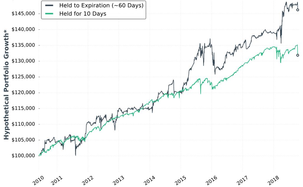
She writes:
> Note: Please ignore the dollar returns in these simulations.
> Pay attention to the general strategy performance. The last
I have wondered about how to interpret these graphs since the second one was presented at the end of Part 7.
> piece we’ll discuss is sizing the positions and we’ll look at
> historical strategy results with various portfolio allocations.
This suggests the graph is done without regard to allocation. With the strategy sized for one contract, I’m guessing the y-axis numbers to be arbitrary yet sufficient to fit the PnL variation. This also means I cannot get meaningful percentages from the graph. As an example, the initial value could be $100,000,000 or $100,000 and still show all relevant information. The percentages would differ 1000-fold, however.
I will now leave you with the following question: as seen above, what unexplained change was made to the graph format that frustrates me most?
Categories: System Development | Comments (0) | PermalinkShort Premium Research Dissection (Part 31)
Posted by Mark on June 7, 2019 at 06:55 | Last modified: December 27, 2018 06:30Our author concludes Section 4 with a study of different profit targets. She briefly restates the incomplete methodology and gives us hypothetical portfolio growth graph #13:
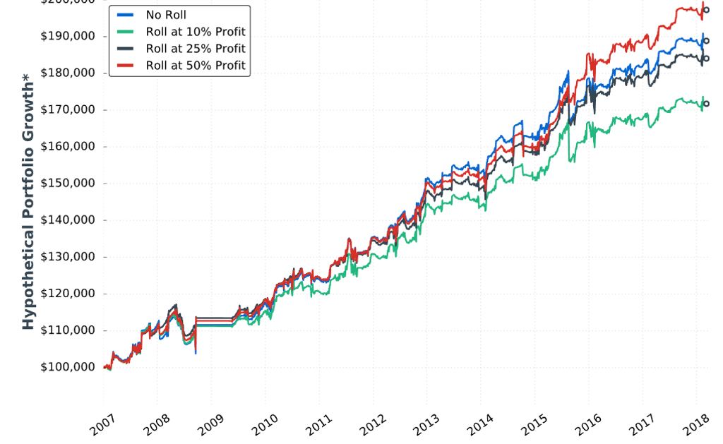
She gives us the following table:
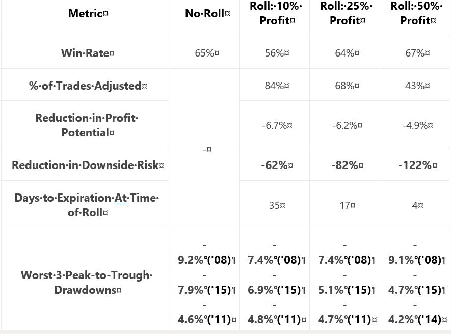
My critiques should be familiar:
- No sample size given
- No inferential statistics provided
- CAGR not given to reveal profitability
- Uncertain DD improvement with four of 18 comparison results unexpected (see second paragraph below table here)
She writes:
> …the downside of waiting until 50% profits is that… long put
> adjustment might not be made at all (which was the case 57%
> of the time), which means the trade’s risk was not reduced. This
> explains why the 50% profit… trigger suffered a very similar
> drawdown compared to… no trade adjustments.
My comments near the end of Part 27 once again apply. This adjustment helps only in case of whipsaw. With the 50% profit trigger, that whipsaw would have to occur inside 4 DTE. If I’m going to bet on extreme PnL volatility, then I would bet on the final four days. However, based on my experience the higher probability choice would be to simply exit at 4 DTE.
I don’t think rolling the put to 16-delta should be part of the final trading strategy. Doing so looks to underperform as shown in the Part 27 graph. If rolling is adopted then, in looking at the above graph, is there any way a 50% profit target adjustment trigger (as opposed to 25%) should not be adopted as well? This would be something to revisit after Section 5 when the completely trading strategy is disclosed.
Criteria for acceptable trading system guidelines should be determined before the backtesting begins as discussed in the second paragraph below the excerpt here. By defining performance measures (also known as the subjective function) up-front, whether to adopt a trade guideline should be clear.
Let’s move ahead to the final section of the report. Our author writes:
> In late 2018, I dove back into the research to analyze
> trade management rules that would accomplish two goals:
>
> 1) Reduced P/L volatility (smoother portfolio growth curve)
> 2) Limit drawdown potential
These should be goals of any trading strategy. Certainly #2 was a focus before because she has talked about top 3 drawdowns throughout the report. I have spent much time discussing it.
I have been clamoring to see standard deviation (SD) of returns as part of the standard battery (see second paragraph here) throughout this mini-series. SD would be a measure for #1.
> In this section, you’re going to learn my most up-to-date
> trading rules and see the exact strategy I use…
What I do not want to see are additional rules added only to make 2018 look better. That would be curve fitting.
I will go forward with renewed optimism and anticipation.
Categories: System Development | Comments (0) | PermalinkShort Premium Research Dissection (Part 30)
Posted by Mark on June 4, 2019 at 06:40 | Last modified: December 26, 2018 06:36I left off feeling like our author was haphazardly tossing out ideas and cobbling together statistics to present whatever first impressions were coming to mind.
The whole sub-section reminds me of something I read from Mark Hulbert in an interview for the August 2018 AAII Journal:
> …people’s well-honed instincts, which detect outrageous
> advertising in almost every other aspect of life, somehow
> get suspended when it comes to money. If a used car salesman
> came up to somebody and said, “Here’s a car that’s only been
> driven to church on Sundays by a grandmother,” you’d laugh.
> The functional equivalent of that is being told that all the
> time in the investment arena, and [responding] “Where do I
> sign up?” The prospect of making money is so alluring that
> investors are willing to suspend all… rational faculties.
As discussed in this second-to-last paragraph, I miss peer review. What our author has presented in this report would have never made the cut into a to a peer-reviewed science journal. I think she has the capability to do extensive and rigorous backtesting and analysis. I just don’t think she has the know-how for what it takes to develop trading systems in a valid way.
To me, system development begins with determination of the performance measure(s) (e.g. CAGR, MDD, CAGR/MDD, PF). Identify parameters to be tested. Define descriptive and inferential statistics to be consistently applied. Next, backtest each parameter over a range and look for a region of solid performance (see second-to-last paragraph here). Check the methodology and conclusions for data-mining and curve-fitting bias. Look for hindsight bias and future leaks (see footnote).
System development should not involve whimsical, post-hoc generation of multiple ideas or inconsistent analysis. Statistics dictates that doing enough comparisons will turn up significant differences by chance alone. We want more than fluke/chance occurrence. We want to find real differences suggestive of patterns that may repeat in the future. We need not explain these patterns: surviving the rigorous development process should be sufficient.
Despite all I have said here, the ultimate goal of system development is to give the trader enough confidence to stick with a system through the lean times when drawdowns are in effect. Relating back to my final point in the last post, a logical explanation of results sometimes gives traders that confidence to implement a strategy. I think this is dangerous because recategorization of top performers tends to occur without rhyme or reason (i.e. mean reversion).
As suggested in this footnote, I have very little confidence in what I have seen in this report. On a positive note, I do think the critique boils down into a few recurring themes.
In the world of finance, it’s not hard to make things look deceptively meaningful. The critique I have posted in this blog mini-series is applicable to much of what I have encountered in financial planning and investment management. In fact, for some [lay]people, the mere viewing of a graph or table puts the brain in learning mode while completely circumventing critical analysis. Whether intentional or automatic, no data ever deserves being treated as absolute.
Categories: System Development | Comments (0) | PermalinkShort Premium Research Dissection (Part 29)
Posted by Mark on May 30, 2019 at 07:40 | Last modified: December 25, 2018 08:14Picking up where we left off, our author writes:
> The previous study tested rolling up the… long put options when
> a 25% profit target was reached. What about rolling up the long
> puts when the stock price rises to a price equal to or greater
> than the long call’s strike price?
Her stated methodology has two differences from the Part 27 study:
- Rolling is only done to 16-delta put
- “Stock price > long call strike” added as second adjustment trigger
She gives us hypothetical portfolio growth graph #12:
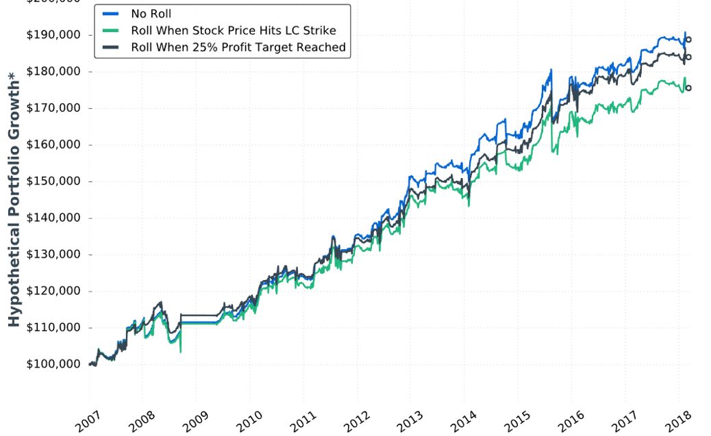
She gives us these statistics:
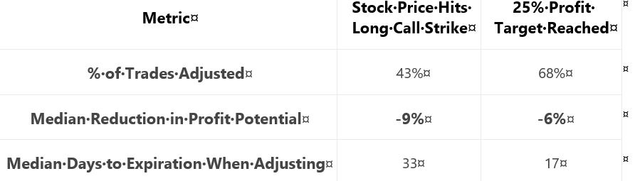
She writes:
> …results can be explained by the fact that… adjustment
> was usually made earlier when adjusting if the stock price
> exceeded… long call strike… With more time until
> expiration, the put-rolling adjustment was more expensive…
> when adjusting at… 25% profit… there was usually less
> time until expiration, which resulted in a cheaper roll.
My criticism of this sub-section will probably sound familiar by now.
The graph is inconclusive: No Roll finishes on top with little difference [throughout the backtesting interval] between curves, lack of inferential statistics to diagnose real differences, and likelihood of any apparent differences being due to 1-2 trades.
Once again, she offers a table with sporadic statistics never before seen.* She does not present the standard battery. I cannot even determine how many trades were adjusted because she does not tell us the sample size and/or distribution (temporally or by PnL) of trades.
As discussed in the paragraph below second excerpt here, I think caution should be applied when explaining results. I have gotten the impression throughout that her studies employ a relatively small sample size. Assuming that to be the case, it would only take a couple trades in the opposite direction to get a reorganization of top performers. This would suddenly make any good explanation look quite foolish. Besides, all her effort may be to explain differences that wouldn’t even classify as real were the [omitted] inferential statistics to fail in rejecting the null hypothesis.
Put another way, why results are what they are really doesn’t matter. We tend to feel better when we have reasons because human nature is to seek out causal relationships even when none may exist. The financial media thrives on this daily (separate topic for a dedicated post).
I will continue next time.
* I like % trades adjusted” and “median DTE when adjusting,” but [doing best Leonard McCoy
impression] for G-d’s sake man either present them consistently for global comparison or
don’t present them at all.
Short Premium Research Dissection (Part 28)
Posted by Mark on May 27, 2019 at 06:48 | Last modified: December 24, 2018 08:10Concluding this subsection on taking cheaper opportunity to reduce downside risk, our author writes:
> …by paying more, the profit potential decreases by a larger margin…
> [A trade-off exists between] risk reduction and profit reduction.
Paying more means rolling to a higher-delta put.
> Personally, I don’t mind keeping some risk on the table in exchange
> for a lower reduction in profit potential. As a result, I like rolling up
> to the 16- [rather than 25-delta] puts as an adjustment strategy.
Once again (see paragraph below the first excerpt here), she makes a subjective decision about system development rather than making use of comparative performance data. I believe system development should be data-driven and objective wherever possible.* In this case, the decision could come from the data if she were to analyze it properly.
As a final critique on this matter, I think she is too indirect about rolling implications. A few times, she mentions that the long put decreases profit potential. She writes, “the primary concern is the cost of the adjustment.” Rolling is a form of insurance. The insurance comes at the cost of theta, which is reflected as PnL per day. As mentioned at the end here, our author doesn’t address this concept. I think it important, though, because a lower PnL per day means more days in trade, a lower probability of hitting the profit target, a higher probability of big market moves while in the trade, probability of more losses, etc.
I think “lower profit potential” candy coats the reality because these direct consequences are more serious.
And once again, use of the standard battery might better illuminate these direct consequences. Her inconsistent reporting of sporadic statistics has resulted in a fuzzy sense about what strategy variants are truly better (if any).
* If this gives her the confidence to implement it (see last paragraph here) then great, but
basing such decisions on a whim isn’t good enough for me and I don’t think it should be
good enough for you either.
Short Premium Research Dissection (Part 27)
Posted by Mark on May 24, 2019 at 07:12 | Last modified: December 24, 2018 10:09I can now continue with our author’s next topic: rolling up the long put (limited-risk strategy).
In effect, this is closing the PCS mentioned here to reduce asymmetrical downside risk. Her goal is to do it for a lower cost. To this end, she discusses rolling after options have decayed and the trade is up 25%.
Like Part 21, she gives us a fuller study methodology. She does not give us exact backtesting dates, number of trades, or [inferential] statistical analysis, however, which limits our ability to discern significant differences.
Here is hypothetical performance graph #11:
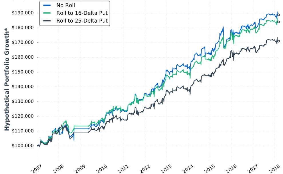
She writes:
> …rolling up the put options resulted in less overall
> profitability compared to not rolling at all. It makes
> sense, as we have to pay to roll up the long put option,
> which decreases the maximum profit potential on the trade.
She then gives us:
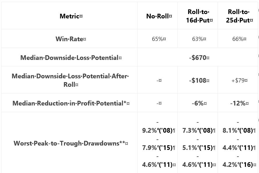
She claims “the adjustment reduced the worst portfolio drawdowns (DD) by notable margins.”
Unfortunately, I’m not sure how notable this is. I would expect DDs to follow the order of No Roll > 16-delta > 25-delta. Seven of nine comparisons (e.g. for three different years, comparing No Roll to 16- and 25-delta along with 16- to 25-delta) follow this order. Why is there no 2011 difference between 16- and 25-delta? Why is DD greater for 25- than 16-delta in 2008? Furthermore, I think DD differences are likely due to 1-2 trades. Recall my repeated concern with curve fitting (last mentioned below the excerpt here). I want to base strategy on what happens with a large sample size of trades.
Aside from omitting inferential statistics, lack of the standard battery (see second paragraph of Part 19) muddles “notable.” We can see from the graph that rolling hurts profitability [a little], the table states rolling decreases DD, but she fails to present CAGR to calculate CAGR/MDD (see third-to-last paragraph here). If DD differences are due to 1-2 trades, then I would like to compare more inclusive statistics like average win/loss, average DIT (should be longer due to adjustment cost), and standard deviation (see third paragraph here).
Another useful comparison might be between just those trades where the roll gets triggered. The roll doesn’t always get done and including identical trades in both groups may mask adjustment differences.
I am happy to see her backtest a rolling adjustment, but this specific choice concerns me. Rolling later in the trade and/or when the market has gone the other way is protecting against a short-term move and/or a large whipsaw—both of which are rare circumstances. I think of it like this:
- In only a limited number of cases does the market fall enough to cause this trade to lose.
- If the market rallies, then the market must fall more in order to cause this trade to lose; this represents a limited number of limited cases.
- If the market trades sideways (or even slightly down) for long enough to trigger the roll, then the market has less time to fall enough to cause this trade to lose; this represents a limited number of limited cases.
I worry this adjustment is like the Band Aid discussed in third paragraph below the graph here: a sign of curve fitting.
I will continue next time.
Categories: System Development | Comments (0) | PermalinkShort Premium Research Dissection (Part 26)
Posted by Mark on May 21, 2019 at 06:36 | Last modified: December 22, 2018 08:14Today I want to wrap up the last six blog posts.
Curve fitting and all, the current version of the limited-risk strategy is described in the second paragraph here. Just below that, our author gives us the graph and table of the strategy.
In Part 21, we get:
> You’ve likely noticed that the returns of the strategy
> above are less substantial than the returns of the
> high-risk strategy discussed in the previous section…
I have been studying this comparison intensely over the last five posts. Contrary to her suggestion, I had not noticed the difference. The only reason I even realized such a comparison was to be made is because one section is entitled “high-risk options strategy” and the next section “limited-risk options strategy.” Aside from that, she could hardly have been less clear.
Being spared the need to trade intraday is, as discussed in her third point (Part 21), a huge potential benefit that does have consequences for execution. Without being around the computer intraday, I may not be able to close trades at EOD when exit criteria are met. Contingent orders have benefits but can be rough on slippage necessary to maintain a high probability of fills. More likely is the possibility that I review trades at night and enter closing orders for the next day: a logistical difference.
After further review, I have no reason to suspect a meaningful impact between trading EOD or next morning. I certainly may see gap moves up/down that take the market NTM/OTM and affect trade profitability. Over a large sample size of trades, I would expect no net effect, though.* I may actually get a slight bump in theta between market close and next morning’s open especially closer to expiration. Since I like to be conservative in drawing conclusions, I am fine with her use of the EOD trades (although less fine with omission of transaction fees as mentioned in this third paragraph).
My last paragraph includes suggestions about improving total return that would probably apply to both limited- and high-risk strategies. Trading that way may come at the cost of having to be home or capable of logging in to make intraday trades.
* If 1-2 trades experience a huge gap sufficient to skew the overall average, then they should
probably be excluded from the data set since this is nothing meaningful about the strategy
itself (with equal likelihood in the future of seeing a gap that offsets the difference).
Short Premium Research Dissection (Part 25)
Posted by Mark on May 16, 2019 at 07:55 | Last modified: December 20, 2018 15:19I left off with the most intense scrutiny of this research report yet.
I undertake this scrutiny as best as I can in lieu of sketchy methodology details (last two paragraphs here) and failure to disclose the standard battery—both issues I have mentioned several times throughout this mini-series.
I am trying to determine whether the worst loss cited in the study described here for a similar high-risk strategy is likely to be part of our author’s data set as well. If this is the case, then why does it subsequently take so little time to rebound to new equity highs [in this graph]?
At the end of the last post, I decided the October 2008 trade should be in the analysis while the November trade should not (volatility filter). By estimating open/close dates for both, I was able to estimate the market moves:

The November drop is slightly larger in terms of price move (percentage). The October drop is worse in terms of volatility. Taken together, I think there’s a really good chance the October trade would be a bigger loser than November and consequently the worst loss overall. This leaves me wondering how it could take less than one year to recoup the losses.
If the largest loss were November, then the VIX filter helps and my concerns are assuaged. If 2008 included consecutive losses, however, then my concerns are magnified. And again, less than one year to recoup losses in a 2009 period when volatility was easing only gradually…
I can’t know anything for certain. Putting together the analysis from the last three posts, all I have is suspicion, doubt, and skepticism: none of which are encouraging for research that cost me good money.
Zooming back out to the end of Part 22, something marketable must come from the lower margin use percentage (MUP) of limited-risk trading. Maybe with the lower MUP, I feel more comfortable to deploy other [non-correlated] strategies in combination. With high risk, MUP must be viewed as something that could easily multiply after a sudden, large market move. None of that matters for limited risk because the largest possible MUP is always staring me in the face.
If nothing else then perhaps a limited-risk strategy saves me from the worst sales pitch ever. This could mean everything.
We need not end with the 10% improvement of CAGR/MDD for limited-risk over high-risk strategies (Part 21 table). Time stops are a good next step for exploration (see second paragraph here ). I suspect X% of maximum potential profit comes sooner whereas the biggest losers come later (exploding gamma). Indeed, a 75% profit target can only be hit with waning days to expiration if and only if the market trades in the vicinity of the short strike (with a -100% max loss lying in wait to greet an outsized market move). As an alternative to time stops, smaller profit targets (e.g. 5-20%) and stop losses (e.g. 10-30%) are more common among similar approaches discussed by other traders.
Categories: System Development | Comments (0) | PermalinkShort Premium Research Dissection (Part 24)
Posted by Mark on May 13, 2019 at 06:51 | Last modified: December 20, 2018 09:03I left off under suspicion of a major data flaw in the short premium research report. Today I take this one step further.
I am really trying to make sense of the fivefold MUP difference and its implications as discussed here. A direct consequence is the possibility of multiplying position size for the lesser, which would give the limited-risk strategy a much better total return. Multiplicative drawdowns (DD) could render this approach unfeasible.
Something still bothers me about the 2008 DD and why it’s only a few percentage points more for high risk. Maybe the small allocation (mentioned last time) and/or VIX filter are sufficient to explain this.
Tasty Trade (TT) has done a wide variety of research on many different concepts. I consider most of this anecdotal because like our author, they fail to disclose complete backtesting methodology.
Nevertheless, I found a segment from August 2015 that looked at high-risk trades closest to 45 DTE from 2005-2017. These trades were held to expiration. Results included:
- Average premium: $666
- Average PnL: $131
- Win ratio: 68%
- Largest loss: -$2679
I am most interested to compare average win with largest loss to see how long it might take to recoup losses from a severe DD. “Average PnL” is going to be weighed down by the losses. Here’s the algebra to solve for average L(oss):
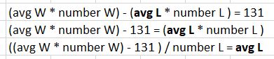
As I vary the average win, the average loss will vary proportionally:
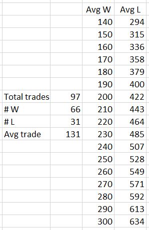
The 97 total trades is 12 years divided by 45 days/trade. The 66 wins corresponds to 68%.
Even assuming an average win of $260 (double the average PnL), the largest loss is still 10.3 times greater. Our author uses a 75% profit target with 60 DTE trades. The losses (and winners falling short of the profit target) will go a full 60 days. Per table here, if the 83% winners (exaggerated because some will likely fall short) take 75% of the total duration and the 17% losers take 60 days, then the average trade length would be 47.5 days. Ten trades (rounding down) to recoup the largest loss would take 475 days, which is over one year three months. That is with exaggerated assumptions. The Part 15 graph, however, shows it taking less than one year to reach new equity highs once trading resumes.
Another red flag appears for me, then, if the largest loss is not filtered out. The high-risk strategy’s 2008 drawdown should be worse than that shown.
With the limited data and methodology given to us by our author, I can’t prove anything wrong here. Maybe 75% winners take less time. Perhaps the largest loss is filtered out. Just by eyeing the VIX chart:
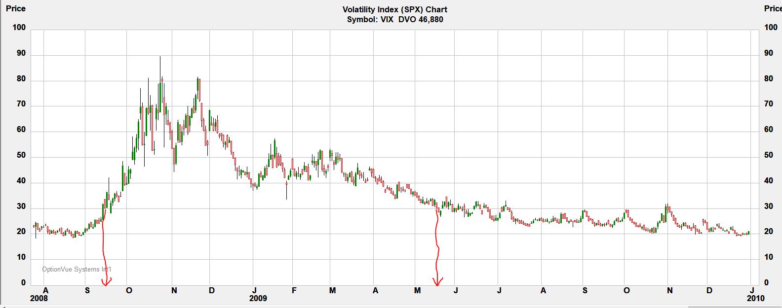
I have drawn (sorry, no straightedge available!) red arrows to the x-axis to bracket the high-volatility period. The period begins after the October (expiration) trade was placed. The November trade would be avoided. These are the two biggest losses in 2008. Which one corresponds to TT’s -2679?
I will continue the analysis next time.
Categories: System Development | Comments (0) | Permalink