Dissection of an Investment Presentation (Part 3)
Posted by Mark on June 11, 2018 at 06:28 | Last modified: December 25, 2017 10:28Today I continue studying the investment presentation referenced here.
> …important characteristics of the momentum and value factors
> is their negative correlation… meaning value tends to work well
> when momentum is not… and momentum works well when value is
> idle. So each factor adds value on a standalone basis but
> their negative correlation makes them an excellent combination
> for potentially increasing risk-adjusted returns.
“Negative correlation,” which is arguably the “Holy Grail” of diversification, is a great marketing buzz phrase.
One problem is that correlation changes over time. During some of the most severe market declines, negative correlations have turned positive and approached +1.00. This means everything loses. The presentation says from 12/31/1926 – 12/31/2014, correlation of value and momentum was -0.40. This doesn’t tell us how things look at the extremes (when correlation becomes most positive) or what the overall distribution looks like (how often the negative correlation persists). An unstable parameter with large mean excursions coinciding with big losses is probably not a viable trading concept.
At worst, this could completely invalidate momentum and value factors as edge provided by their investing approach.
Here is their graph of factor performance:
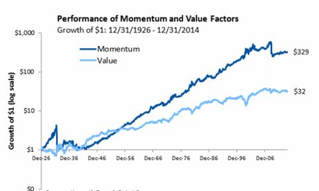
Over 88 years, $1 grows to $329 and $32 for momentum and value factors, respectively. That sounds impressive!
This is a good time to review my general recommendations for viewing an investment presentation:
- Do not be blinded by the light: their job is to make things look good.
- Accept no comparison without assessing the comparator.
- Challenge everything.
- Do not accept any claims without supporting evidence (added after Part 3).
No available comparator violates #2. We cannot see how the investment performed when not tailored toward momentum or value. A terminal value of $350, for example, would be reason to reject both factors.
Drawdown (DD) analysis is important enough to render any presentation lacking it very limited in application. DDs determine whether we can remain invested in a strategy. I have written about the importance of DDs here, here, here, and here.
With regard to #3, I see the graph omits DD analysis by showing growth of $1. The account would never actually start with $1 and the maximum DD of both curves may even exceed the initial value. Any such equity curve would, in reality, be terminated early due to Ruin (account going to zero).
In other words, growth of $1 to $350 simply would never have happened. The initial account would need to be larger to trade this strategy over the entire 88 years. Adding initial equity dilutes returns. Instead of 35,000%, realistic growth could be 3,500%, 350%, or less. The bloom is off the rose.
The presentation continues with this slide:
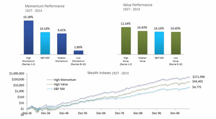
For me, the line graph begs an immediate question: how does this line graph differ from the first one? Both graphs show value and momentum factors. Both show growth of $1. Both cover a similar time interval. Why does momentum in the latter graph only grow to $272 (rather than $329) while value grows to a whopping $44 (rather than $32)? Those are huge differences for a subtraction of one year (or less), which is only a 1.1% difference on 88.
I also wonder why the time intervals are different at all. The first graph is “12/31/1926 – 12/31/2014” and the second is “1927-2014.” Were they just sloppy in reporting the same time interval? If they used the same interval then what/why was the difference in how they defined factors? Did they do their own research or “borrow” data from others?
Consistency breeds credibility and [especially] when consistency is lacking, explanation should be given. None is given here, which violates #4. I question the accuracy of their calculations. I also question their underlying motives. Were they trying to artificially inflate certain numbers to serve their purpose? Remember #1, above.
Categories: Financial Literacy, optionScam.com | Comments (0) | PermalinkReal Risk of Naked Puts (Part 2)
Posted by Mark on February 6, 2018 at 06:41 | Last modified: November 1, 2017 20:02Trading naked puts (NP) carries significant risk that often goes unnoticed. I left off discussing what it would take for me, as a wealth manager, to trade NPs in a client account.
Merely having clients sign a waiver of responsibility would hardly be enough to placate my conscience into trading their money with undefined risk. Also, with regard to protecting me, they could always say the waiver was signed out of duress. As discussed last time, whatever I did to ensure they would never claim ignorance in retrospect would make for the WORST. SALES. PITCH. EVER.
And because even the “worst sales pitch ever” is no guarantee they would later admit to full understanding of all the risks (imagine a case where amnesia or dementia caused them to not only forget the harrowing discussion we had beforehand but also to reject acknowledgement of how I virtually tried to SCARE THEM OFF from letting me trade NPs in their account), I might have trouble being a part of something like this.
Ideally all wealth managers know the mortifying possibilities and therefore act in accordance with high standards to protect client capital. While this may not be the case, I have always been ambitious with a high motivation to outperform.
Making all this even scarier is that while a huge market crash can force unrealized losses to approach Reg T margin requirements, far less would be required to wipe out accounts with much lower leverage ratios.
None of this is to say that I would never trade NPs for a client but as a wealth manager I would feel a responsibility to protect from the downside even at the sacrifice of assets under management or performance metrics. I have previously opined that no more than 20% of a portfolio should be allocated to short premium strategies. Knowing this were the case would make me feel comfortable.*
A better way to eliminate catastrophic is to be net long puts at all times. This might allow me to allocate more than 20% to the strategy, too.
* I believe part of the reason Regulation D (Rule 505) biases hedge funds toward accepting only accredited investors is to increase probability that capital invested in hedge funds remains a reasonable fraction of total net worth.
Real Risk of Naked Puts (Part 1)
Posted by Mark on February 2, 2018 at 07:23 | Last modified: November 1, 2017 19:59Trading naked puts (NP) involves significant risk that people may not realize.
I have written multiple posts on this topic including a nice mini-series beginning here and a more recent exploration here.
NPs can generate respectable total return in a non-crashing market given a high enough leverage ratio. Under portfolio margin (PM) they can be leveraged up to 13:1 or more.
I don’t believe Reg T margin should be considered the real risk of these positions. T + 0 usually floats far above the expiration curve at significantly lower values of the underlying.
Nevertheless, I believe the Securities and Exchange Commission would say even as potential loss, Reg T margin must be acknowledged as real. This seems consistent with “your worst drawdown is always ahead” (mentioned here, here, and here).
Consider the following doomsday scenarios where Reg T margin could closely approximate [un]realized loss:
• A nuclear bomb is dropped and the market opens down 1400 points
• Alien invasion causes VIX to spike 100 points
• NP trader killed by a drunk driver days before expiration as a market correction begins
Excuses might be good enough to rationalize personal losses but I would hold myself to a higher standard when managing wealth for others. I mean really… imagine conversations like, “I’m sorry that I lost your retirement savings, Mr. X, but:
• My full-time job precludes me from watching the market intraday.”
• That was a larger loss/volatility explosion than anyone expected” [LTCM anyone?].
• The hurricane knocked my power out for a few weeks and I was not able to make necessary adjustments.”
None of these would ever be acceptable! Especially with the media refreshing the doomsday thesis on a weekly (daily?) basis, any professional should be aware of the possibilities and have contingencies in place.
The only case where I could accept such an excuse might be one where the risks were made totally clear beforehand. Salesmanship and persuasion are sometimes dubious practices where distraction and deception are used to make people agree to things without complete understanding of risk. I would therefore have to do more than gloss over the possibility of total loss. I would have to hammer it home by having them:
• Listen to me repeat “you may lose everything” over and over and over again.
• Write (pen and paper) “I understand that I may lose everything” 10-50 times.
• Dwell on the catastrophic scenario and share their vision of a life following this catastrophic event.
I will continue next time.
Categories: Financial Literacy | Comments (0) | PermalinkCause / Effect Illusions
Posted by Mark on January 25, 2018 at 07:26 | Last modified: October 24, 2017 11:28In 2008, Jennifer Whitson at UT-Austin and Adam Galinsky at Northwestern University published an article in Science that is relevant to trading the markets.
One study involved two groups of subjects watching two sets of images on a computer screen.
The first set of images was a series of paired symbols. Subjects were told the computer used a rule to generate the pairs and were asked to identify the rule. Group #1 received no feedback throughout the series whereas group #2 was randomly told “right” or “wrong” regardless of how they answered. This experimental design attempted to make subjects in the second group feel less confident for what was to come next.
The second set of “images” was nothing more than white noise. Upon flashing, all subjects were asked whether they saw anything and if so then what? The vast majority of responses were negative from subjects in the first group while subjects in the second group were significantly more likely to say yes.
Having experienced failure during the first set of images, group #2 approached the second set lacking a sense of control over its surroundings and was significantly more likely to falsely identify patterns.
In discussing the study, Whitson said:
> All of these false/illusory patterns are connected. All of
> them are influenced by lacking control so when people lack
> control, they are more likely to see stock market trends that
> don’t exist… they’re more likely to see conspiracies in the
> world around them that don’t exist because it’s our instinctive
> sense to try and react to the situation in which we lack
> control by making sense of it and understanding it even if it’s
> a false sense of understanding… this effect could explain why
> religion is so successful among the poor or disenfranchised.
> Whenever people feel like their lives are out of control, G-d
> helps them make sense of things… there is a lot of randomness
> in our lives. There is a lot of chaos. There are many, many,
> many things we do not control. And so we have to pick out of
> that chaos things that are meaningful to us to make a sensible
> story out of our lives.
In conclusion, the brain seems more likely to identify patterns in what would otherwise be viewed as randomness when it feels out of control.
As traders never have control over what the market does, we should be careful about seeing definitive patterns that may not actually exist.
Categories: Financial Literacy | Comments (0) | PermalinkTasty Statistics
Posted by Mark on January 8, 2018 at 07:33 | Last modified: October 11, 2017 08:48In December 2015, I posted on statistics and trading. In March 2017, I critiqued Tasty Trade’s (TT) “Market Measures” (MM) segment for omitting critical information. Today I present an August 2015 e-mail correspondence I had with the TT research team about a failure to include statistics when presenting backtesting results.
My initial e-mail was as follows:
> I’m a numbers guy, which is one reason I love the
> MM segment. One thing I would like to see are tests
> of statistical significance.
>
> For example, in a screenshot from 8/12/14, the
> takeaway is printed on the slide (16% and 3%). My
> training suggests if these numbers aren’t statistically
> significant then they aren’t very meaningful. I’d like
> to see how significant they are (e.g. p-value).
They responded the next day:
> I completely understand what you mean about adding
> statistical significance to studies… this is something
> we are trying to work into future studies. We have
> several members of our team who are very capable and
> have a strong history with… statistical analysis. I believe
> the major positive to including these numbers would be…
> more validity to our methodologies and studies… As for
> a potential negative, our main concern… would be
> barriers to entry. We want our MM and other segments
> to be accessible and, while complex, understandable to
> new and seasoned traders…
>
> Thank you so much for the feedback!
I responded a few days later:
> [With regard to the potential negative, you have] a
> very legitimate point. Statistics is difficult for many.
> I believe it provides essential information for those who
> understand, though. When a study compares two
> results, one is almost always going to be greater
> than the other… without the p-value, it’s impossible
> to know whether the difference is meaningful. Small
> mean differences and large standard deviations are not
> significant and only statistics can show us that.
>
> I totally get what you’re saying about being audience
> friendly… it doesn’t take much statistical discussion
> to get many people to gloss over and tune out.
>
> At the same time though, consider Tom Preston’s
> recent praise of work done by the research team:
>
> When they put results out there, we can
> stand by them both from a data accuracy
> and conceptual point of view.
>
> Can you without providing the statistics? Omitting
> statistics misrepresents the reality, in some cases,
> by suggesting meaningful differences exist when in
> fact they may not.
>
> Scientific analysis can always be scrutinized. I
> believe statistics should at least be presented.
> Omitting them may substantially undermine the Tasty
> Trade mission (to combat misinformation and lack of
> information provided by the financial industry), which
> Tom Sosnoff literally pounds the table to support.
Their final response:
> Thanks again for the feedback.
>
> Once again, I 100% agree with you that adding hard-
> hitting statistical numbers will add to studies for those
> who understand them. We are trying to implement this
> going forward… I have passed your ideas onto the team
> and emphasized that there are viewers… that want to
> see this kind of analysis.
I felt that was a promising e-mail exchange.
Nearly 30 months have now passed and I have yet to see a p-value reported on MM, though. I have seen every single episode.
I had one other controversial idea not shared in the e-mail:
> Maybe people who don’t or can’t understand statistics
> should not be trading. Or perhaps part-time trading in
> in small/hobby size is okay as opposed to trading full-
> time as a business.
I did mention critical thinking and statistical background in my post on prerequisites for trading as a business.
Categories: Financial Literacy | Comments (0) | PermalinkHindsight Bias
Posted by Mark on January 5, 2018 at 06:21 | Last modified: October 10, 2017 10:20By the way, Happy New Year, everyone! Today I will discuss a cognitive fallacy capable of ensnaring us all: hindsight bias.
Here is a forum post from July 2015:
> Why would anyone have their portfolio weighted with long puts in
> a major downtrend preceding 9/11? It makes no sense. Karen said,
> “stick with the trend.” A proper portfolio preceding 9/11 would
> have been selling calls on each rally and EXTREMELY LIGHT on the
> put side, if at all. Just look at the monthly chart; look at the
> size of the candles each selling month. Anyone selling naked puts
> in this scenario needs to look at the bigger picture first and
> understand the context of the current market they are in.
I responded as follows:
> I mean no personal insult but I think this is a very ignorant post.
>
> I claim ignorance because hindsight makes it easy to determine
> trend. How likely is your approach likely to work in the future?
>
> I don’t know what rules you suggest for use on a monthly chart
> but simply using a monthly chart means the number of occurrences
> is limited from the outset. If you don’t have a sufficiently
> large sample size then your approach may fall prey to curve-
> fitting: works in the past but not in the future.
>
> Discretionary guidelines can always be bent to fit pre-existing
> biases. What you have described (e.g. “monthly charts,” “size of
> candles”) is very nonspecific.
>
> Being specific means objective definition of rules. Only then
> can you backtest and begin validation. Author Kevin Davey
> suggests a good system may be found for every 100-200 tested.
> Do not believe it so easy to come up with a set of technical
> criteria capable of predicting the next big fall.
>
> You may say, “I can be wrong an extra time or two as long as
> I’m out before the fall.” I think this is a good point but
> realize that whipsaw losses can be significant and this may
> render adherence to your system very difficult. When it
> comes to losses, traders can be a fickle lot.
Hindsight bias [which also reminds me of future leak] is a common logical fallacy that must be recognized in trading and investing discussion/literature. The fallacy underlies artificially inflated performance claims. To stay on the path of consistent profitability, our challenge is to debunk such fiction and to minimize its consumption of our precious time and resources.
My Take on Asset Managers
Posted by Mark on November 21, 2017 at 06:38 | Last modified: July 12, 2021 08:16Today I want to discuss my dynamic attitude toward the asset management industry.
I consider the following terms to be synonymous: asset managers, wealth managers, and investment advisers.
Throughout the course of this blog, I have not been so kind toward the asset management industry. Examples of posts where I have expressed a negative bias are here, here, and here.
I was a big more neutral toward asset managers here.
I was more positive and understanding when I decided to challenge my previous claim that the financial industry has brainwashed America.
After some further deliberation, I reached some logical conclusions here.
The asset management industry is far from perfect. Some advisers are shady and others are fraudulent. Some advisers incorrectly assert that options are too risky for retail investors while others are ignorant about derivatives altogether. Although this may represent a breach of fiduciary duty, an alternative perspective is warranted.
Without the services of asset managers, many people would basically be storing their money under a mattress. Interest rates were close to zero for nearly a decade while the average annual stock return is upwards of 11% (S&P 500 since 1926). If not for wealth managers, stocks would be an inaccessible vehicle because so many are clueless about how to do it.
I probably have two paths if I choose to bypass the asset management industry: trade for myself or bed mattress [crawl space]. One need not be a genius to be a self-directed trader but I have discussed some prerequisites. Also, as CJ suggested with the analogy of brushing teeth, the average worker may lack the flexibility to do this altogether.
Asset managers may be flawed but in the end I believe they are necessary. Regardless of their ignorance about derivatives, their consequent lower performance, and their expensive fee structure (debatable), the difference between mattress and stocks is significant. Net-net, they have a wide margin for error beyond which they can still provide a valuable service and achieve their advertised goals.
Categories: Financial Literacy | Comments (0) | PermalinkMusings on Naked Puts in Retirement Accounts (Part 4)
Posted by Mark on July 27, 2017 at 07:05 | Last modified: October 14, 2017 07:21If a vertical spread lowers the standard deviation (SD) of returns and max drawdown (DD) compared to a naked put (NP) then its résumé is bolstered as an alternative candidate for retirement accounts. This was an unlikely result in the first example studied.
Rather than quintupling position size for the vertical spread, what if I double it? The potential return would be $4 (rather than $10), which is a 33% increase over the NP. The NP risk is now cut by 80% (rather than 50%) to $20K, which is the breakeven for both trades.
The risk graph now looks like this:
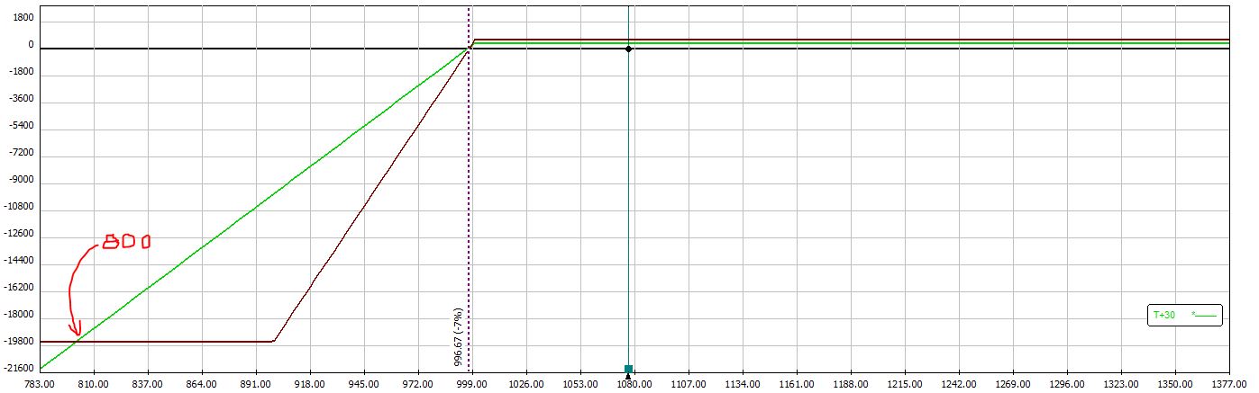
Like the previous example, the vertical spread outperforms if the market rises or if the market falls less than 7%. If the market falls between 7% and 20% then the naked put outperforms. If the market falls more than 20% then the vertical spread outperforms. A market correction over 20% is more likely than a market correction over 50% and this is where the risk metrics (SD of returns and max DD) would be improved by the vertical spread.
Of course, the vertical spread could be traded in equal position size to the NP. This would generate the first graph shown in Part 3. In that case, no gap of underperformance exists for the vertical spread and any market correction over 10% would generate better risk metrics for the vertical spread.
So going back to my statement in Part 1, does the vertical spread actually improve risk metrics?
The largest market crashes (e.g. fall 2008) will give rise to a lower SD of returns and a lower max DD for vertical spreads.
Unfortunately, these severe crashes occur so rarely that it’s hard to plan a trading strategy around them. The vertical spreads may or may not yield improved risk metrics depending on whether the market corrects, how often it corrects, and the exact magnitude of corrections during the time interval studied.
Compared to NP’s, vertical spreads may improve risk metrics. This is far from guaranteed.
Categories: Financial Literacy | Comments (0) | Permalink